
Do you think people spend time thinking just how great the Gmail mobile app is? No.
The best app design is one that users are unaware of, the one they don’t even notice. Sadly, it’s only the bad ones that users remember.
To come up with an app design so good that it gets ‘unnoticed’, designers need to have a deep knowledge of devices, user psychology, and the will to discard what they have learned and start from scratch again. Unfortunately, many designers underestimate these complexities, leading to design blunders.
The bad news is — users are in no mood to engage with poorly designed UIs. In fact, a staggering 75% of users delete an app within 90 days of installing it.
To ensure your app doesn’t end in the trash bin, and the efforts of your designers are not wasted — focus on the UI. This means finding out the design flaws which can potentially put your app at risk in 2018.
Importance of Responsive Design
As mobile devices evolve, ensuring apps are responsive has become even more pressing. A responsive design adapts perfectly to different screen sizes, providing a consistent experience whether users are on a smartphone, tablet, or desktop. This adaptability is essential for maintaining engagement and app performance across various device types. By investing in responsive design, developers guarantee that every user, regardless of their device or screen resolution, enjoys a seamless interaction.
Here are 5 app design mistakes to avoid in 2018:
1. Forgetting the power of the ‘thumb’
Users navigate mobile apps mostly with their thumb, any UI which demands more than that will be seen as ‘effortful’. A study conducted by Josh Clark, Author of Designing for Touch, shows 75% of mobile interactions are thumb-driven.
Ignoring the thumb will present another big challenge for designers in 2018. The average screen size in 2017 was somewhere between 4.7- inch to 5 – inch. With new smartphones having a screen size ranging from 5.1-inch to 5.5-inch, thumb navigation is going to become a more complex and necessary UI element.
Tip: At the development stage, carry out thumb mapping: a visual representation to identify areas which are accessible by a single thumb. Place your buttons (CTAs) in those areas.
However, pay attention to the button size. Too big buttons can make the UI look ugly, too small makes it difficult to click. To avoid confusion, follow the recommended target size of 7-10mm.
2. Aesthetically inconsistent
A different color and typography on every page will confuse users to the extent they might get frustrated and ultimately delete the app. A non-standard set of design elements increases the learning curve, making your app less-intuitive.
Consistency in app design also means being in-sync with the overall brand theme. Your mobile app cannot be treated as a separate entity, in fact, it should be seen as an extension of your brand.
Tip: To enable seamless movement from one color or typography to another, the visual progression should move from heavy to light.
Here’s one way to do it.

3. Absence of app walkthroughs
Often, clients expect designers to come up with absolutely intuitive UIs where users won’t need any instructions. The problem is no app can be absolutely intuitive; with new features rolling out, apps designs are bound to become more complicated with time. This is where walkthroughs come in.
A walkthrough is a process of deliberately revealing the functionality to a user. The main idea behind it is to educate users on what your app can do.
However, walkthroughs need to be contextual and should fit naturally with the overall app design. The inconsistency makes it difficult for users to understand your gestures, leading to a poor user experience.
Tip: To come up with app walkthroughs that add value to the user experience, follow these three design principles:
- Keep it engaging. Walkthroughs will get faster user buy-ins when they are well integrated to the UI.
- Keep it visually appealing. Use graphics and animations to ensure better recall value.
- Keep it optional. Users do not want a helping hand in every interaction. To offer relevant support without frustrating the customers, make walkthroughs mandatory for the first time, after which turn it to optional.
While animations can enhance user interface aesthetics, overdoing them can be distracting.
Too much animation might slow down app performance, especially on devices with lower resources. Designers should carefully consider where animations truly add value, maintaining balance and ensuring the app’s main functions remain prominent.
Below is a great template for an efficient walkthrough.

4. Cognitive overload

Cognitive overload occurs when too much information is dumped on users simultaneously, leaving them mentally exhausted. The fact that people are finding it difficult to stay on top of your app beats the entire purpose of your UI design.
The cognitive processing capacity differs for each person, some can grasp complicated UI instantly while for others it’s a bit time consuming. The trick is to dumb-down your app design because user’s IQ is split into various other tasks; while using your mobile app people might be multitasking like crossing the street, talking to someone else, etc.
Tip: Here are a few ways to reduce the cognitive overload while keeping the UI rich and interactive — ensuring users do not churn.
- Use progressive disclosure technique. Sequence information and actions across multiple screens to avoid content getting accumulated on one page.
- Keep design elements to the minimum. Avoid using too many elements, instead, try to make the most of the ‘white space’.
- Microcopy. These small bits of content copies make complicated action simple while keeping the UI clean.
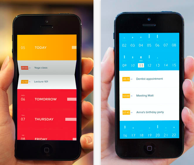
The simple yet effective app design of Peek Calendar makes for quick user onboarding.

Accessibility Considerations
Designing for accessibility can dramatically broaden your app’s audience.
Features like adjustable text sizes and screen readers make apps usable for those with disabilities. Incorporating elements like voice commands and haptic feedback enhances inclusivity, creating a more welcoming environment for everyone.
Designing with accessibility in mind is not just ethical but also a smart business move.
5. Cloning your competitors
Often, designers forget the difference between inspiration and plagiarism. In trying to beat the competition, they clone the UI to the exact dot, making the app design nothing but a cheap rip-off.
Taking a few elements from your peers is not a bad idea, in fact, it should be welcomed. After all, it’s better to replicate something which is tried and tested. However, don’t fall into trap of copying everything, and I mean everything; from the color, typography, theme, template, so forth and so on. It’s probably why Pablo Picasso had famously quoted:
Good artists copy, great artists steal.
Tip: Learn from what your competitors are doing right, use them and combine it with your ideas. Likewise, you can also see the UI flaws in your competitors and accordingly make improvements to your app design.
Designing for Offline Use
Enabling offline capabilities in apps makes them more versatile.
Users often encounter situations with limited connectivity. Allowing them to access core app functionalities without an internet connection can greatly enhance user satisfaction.
Features like saving data locally to update later when online keep the user engaged, regardless of connectivity constraints.
Winding up
Although the field of mobile app design has come a long way from its infant stage, 2018 like any other year will see a great number good and bad apps. Even the apps which make it in 2018, there’s no guarantee they will make the cut in 2019.
It’s all about constant change. Designers have to keep updating their knowledge about user trends and the psychology that drives these behaviors. Indeed, it’s a real challenge, but if your asking users to spend their time on your app rather than the competitors — you have to stand up for the challenge, period.
User Feedback and Iterative Design
Listening to user feedback is important in refining app design.
Incorporating real-world insights allows developers to adjust design elements dynamically, enhancing user satisfaction. Iterative design processes build on continuous testing and feedback loops, which means regular updates based on user reactions.
This ensures designs remain relevant and user-centric. Successful apps often thrive by adapting swiftly and aligning closely with user expectations.
Author bio
Niraj is the founder of Hiver, a powerful email management and collaboration tool. When not working at Hiver on programming or customer support, Niraj likes to play guitar. Niraj can be reached on Twitter @nirajr.

0 thoughts on “5 App Design Mistakes to Avoid in 2018”