Digital marketing strategies are constantly evolving to meet the growing needs of the online user. This wasn’t always the case though. Once upon a time, simply having a website earned mega bonus points. In the present day, businesses as a standard need to ensure that they have a responsive website in place so that users can access their online offering wherever they are, regardless of their device – whether that be a mobile, tablet, or desktop computer.

Having a functional, easy to use website that can be accessed via the conventional desktop is never going to go away, yet when it comes to mobile, the tide is turning away from the once loved responsive world to the new highly engaging and fascinating world of Progressive Web Apps.
Responsive design wasn’t always a thing
When the world was first introduced with the 3G internet connection, it gave consumers a taste of what it could be like to access the internet, shop online and digest information no matter the time or place, so long as you had access to a mobile you could get online and it wasn’t exactly slow.
Mobile websites haven’t always responsive though, in fact, the earliest examples mobile sites weren’t anything remarkable compared to the offering of today. So, on the web development scene, there was a rush to develop sites specifically for mobile, and it was gold dust; offering the opportunity to create something new and flashy for clients that would enable users to quickly load a great looking website from their mobile whilst having an aesthetically pleasing desktop equivalent.
Responsive design gained traction with the rise of smartphones and tablets, necessitating websites that adapted to different screen sizes. The introduction of CSS media queries in 2010 was a game changer, enabling developers to style web pages dynamically based on device characteristics.
This advancement marked a significant shift in web design, focusing on flexibility and accessibility for users on a variety of devices.

By creating a responsive layout, a different version of the main desktop site would load depending on the device used to access it. For the user, this meant no more awkward, difficult to navigate desktop version of a site loading on their mobile phone but instead a website that was tailored to them, their needs and their device.
The popularity of the responsive design soon meant that what was once a stylish and somewhat expensive addition to your online offering quickly became a standard part of any brief and project.
But as we’ve already touched said, the digital world never really sits still. So what’s the next development that is set to take the mobile world by storm and push its responsive cousin into the background?
Mobile is now a huge marketing channel
With an increasing number of businesses now recognising the need for a digital presence that focuses heavily on the mobile experience, it is an area that is improving and evolving on an almost daily basis.
Google has also been paying very close attention to the growing mobile world and has implemented a series of updates that aim to improve the mobile browsing experience ensuring consumers are put first. Any businesses that operate online at a minimum are required to have a mobile-friendly version of their website.
Mobilegeddon (as it was affectionately known) was one such update in April 2015 that was designed to give a boost to mobile-friendly pages in their search results and in turn punish those who weren’t offering a mobile experience.
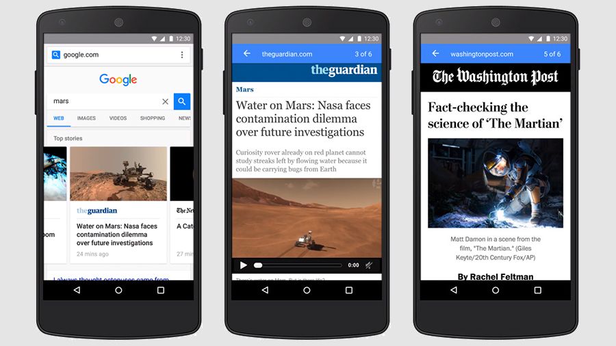
This was the big push that led the mobile development world to shift to web strategies that included a mobile version as standard. After providing the correct foundations for a business – further work is carried out ensuring quick load speeds and an incredible experience throughout. However, this still wasn’t enough for Google, when is it ever enough for Google? More recently, there came a huge push for AMP (Accelerated Mobile Pages) which opened up the opportunity for webmasters to create pages were designed to load on mobiles almost instantly.
Websites which utilise AMP essentially serve highly stripped back or trimmed pages that limit complex functionality on the coding side of things. Further improvements are suggested, such as reducing image sizes or using lazy loading in order to guarantee the fastest possible load times. There is a great article on mobile experience on Think With Google which explores the topic further and is definitely worth a read.

Source: TNW
There’s no doubting the fact that Google loves the mobile world, and as the largest and most popular search engine, it’s no real surprise. Google will work with what the people want, and with the growing number of mobile searches and the change from traditional desktop to mobile, it will always look favourably in terms of rankings to those companies that put the greatest emphasis on this aspect of their digital presence.
What is next for mobile web design?
Once you take all of these advancements in web design standards into consideration, there is already a sense that Google has a master plan for their next big development in line for mobile users and businesses alike.
Actually, it’s been around for a while now. Introducing the wonderful world of the Progressive Web App’s (PWA).

Source: Google Developers
Seen as the pinnacle of mobile web design, PWAs were initially proposed by Google back in 2015 however it is only now that they are really coming to the fore.
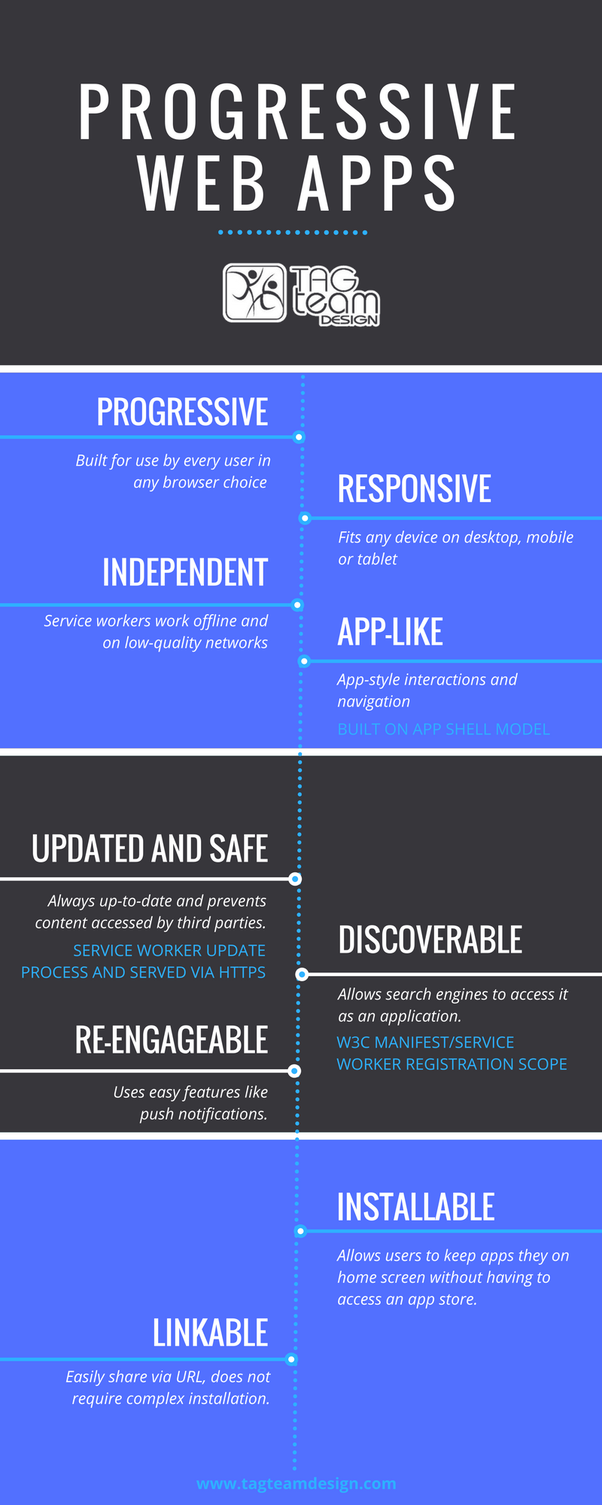
A Progressive Web App essentially bridges the gap between the browser and the native mobile app in a very discreet and delicate manner. Offering an app like experience from within a browser, a PWA looks like an app, functions like an app but doesn’t require the user to actually download it.
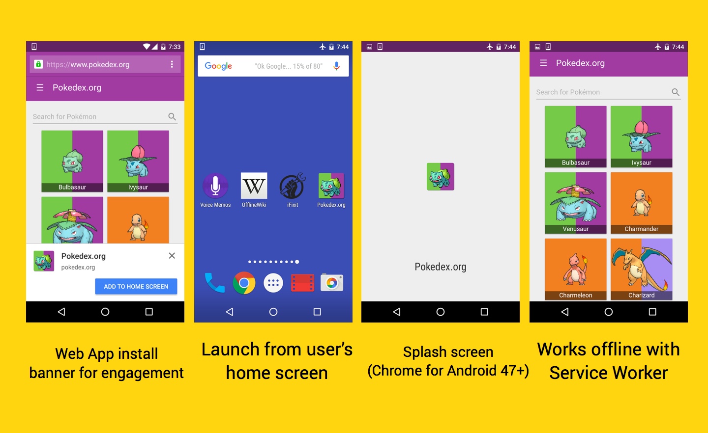
Progressive Web Apps bring several important features to the table, setting them apart from traditional websites. They can operate offline thanks to service workers that cache data, ensuring seamless access even without an internet connection.
Push notifications keep users engaged, offering updates and news directly to their devices. Furthermore, PWAs can be installed on a user’s device, providing an app-like experience without the need for an app store download.
These features collectively enhance user interaction and retention.

So when you think about responsive design, does it have a place in the web design world anymore? Or should businesses be shifting their attention towards the PWA to replace their mobile website?
Case Studies on PWA Benefits
Prominent examples of successful PWA implementation include Twitter Lite and Forbes. Twitter Lite significantly improved load speeds and data consumption, leading to increased user engagement.
Similarly, Forbes experienced a swift increase in session times and saw substantial improvements in loading speed by adopting PWA technology. These case studies illustrate the tangible benefits of PWAs, such as enhanced performance and greater user interaction.
Is a PWA the best solution for your mobile offering?
A PWA will load within their browser in the same way that a responsive site would yet it can offer far more flexibility, allowing for more creativity in terms of design- putting your website head and shoulders above the competition who still struggle to offer the best they can do within the parameters of a responsive development.
With 53% of users abandoning a website if it doesn’t load within 3 seconds, speed is most certainly of the essence. A PWA loads almost instantly, even quicker if you decide to utilise AMP, yet it offers all the features and more of your website- so no more compromising on aesthetically pleasing mobile sites to appease Google!

Source: Bagha Shams
Benefiting from the look and feel of a native app, users will undoubtedly be drawn into your PWA thanks to the popularity of apps today and, when you combine this with its immersive user experience, reliability even in poor mobile connectivity regions and smooth navigation, it will stand you in good stead to achieve those all-important conversions.
With Google continuing to promote and look favourably on those businesses who offer an incredible mobile experience to the user, a Progressive Web App is most certainly the next step forward for your company.
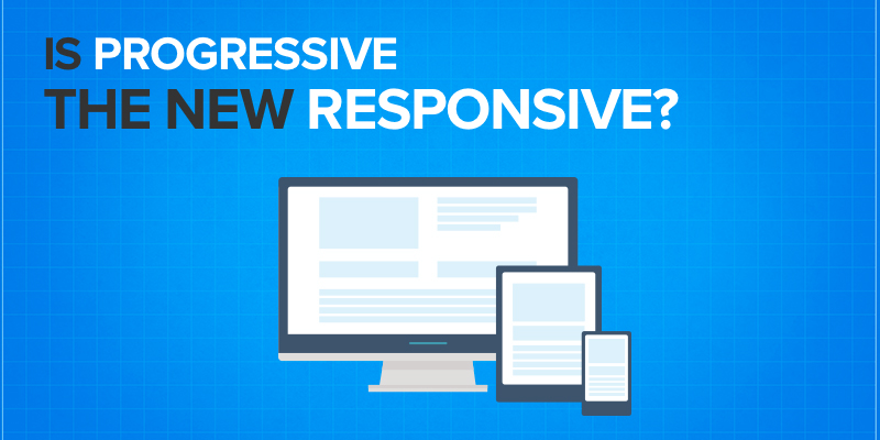
Progressive is the new responsive, so don’t delay, get ahead of the game and ensure your digital offering includes PWA to put you a cut above the rest.
To learn more about the PWA features supported by AppInstitute, click here.
Want to build a PWA from scratch? Check out Snipcart’s guide: A PWA Example: Build an E-Commerce Progressive Web App with Gatsby
Technical Requirements for Implementing PWAs
Developing a Progressive Web App requires several technical elements. A secure HTTPS connection is necessary to guarantee data safety and integrity.
Service workers handle caching and offline capabilities, while a web app manifest provides metadata, enabling an app-like presence on user devices. These elements ensure the PWA is both efficient and secure.
Comparison of PWAs and Native Apps
Comparing PWAs to native apps reveals distinctive advantages. PWAs often demand less maintenance and lower development costs, as they work across multiple platforms without needing separate versions for each operating system.
Conversely, native apps offer deeper integration with device hardware. While native apps might provide superior functionality in specific contexts, PWAs deliver a flexible, cost-effective solution for many businesses, particularly when aiming for a broad audience.

0 thoughts on “Is Progressive the New Responsive?”