
Building a color palette for your app is about more than just aesthetics – it directly impacts user experience, trust, and engagement. Research shows that 62% to 90% of first impressions are based on color, and these judgments happen in just 90 seconds. Here’s how to create a palette that aligns with your app’s purpose and audience:
- Start with Color Theory: Understand hues, tints, shades, and tones. Warm colors like red and orange energize, while cool tones like blue and green calm.
- Align with Your App’s Goals: Choose colors that fit your app’s function. For example, blue conveys trust (great for finance apps), while green signals growth (ideal for wellness apps).
- Consider Your Audience: Preferences vary by age, gender, and culture. For instance, younger users prefer vibrant tones, while older audiences lean toward muted palettes.
- Pick a Primary Color: This sets the tone for your design. Pull from your branding or use tools like Coolors.co to explore new options.
- Build a Full Scheme: Use complementary, analogous, or monochromatic schemes. Add neutral tones (60%), secondary colors (30%), and accents (10%) for balance.
- Ensure Accessibility: Test contrast ratios to meet WCAG standards and account for color blindness using tools like WebAIM.
Our Tip: Test your palette across devices and lighting conditions to ensure consistency. A well-designed color scheme strengthens your brand and improves usability. We’ve seen apps gain higher engagement from nothing more than a colour palette refresh. Users judge visual trust in under a second – colour is your first impression!
For a hands-on approach, platforms like AppInstitute let you apply and test your palette easily. Focus on clarity, functionality, and user needs to create a design that works.
Colour palettes for Mobile Design (Intro guide)

Color Theory and App Goals
Color Psychology Guide for App Design: Meanings and Use Cases
Color Theory Basics
When creating a color palette, everything starts with a hue – like pure red, blue, or yellow. From there, you can adjust it using tints (adding white for lighter versions), shades (adding black for darker versions), and tones (mixing with gray to soften the intensity).
Each adjustment plays a role in how the color feels and functions. For example, warm colors like reds and oranges are energizing, while cool colors such as blues and greens are calming. This distinction is crucial because the colors you choose directly impact how users feel while navigating your app. Picture a fitness app: warm reds and oranges can inspire urgency and motivation. On the other hand, a meditation app might lean on cool blues and greens to foster relaxation.
“If your palette doesn’t match the emotion of your product, you’re fighting an uphill battle. Colour is the quickest way to communicate mood before a user reads a single word.” Becky Halls, SEO Strategist
By mastering these basics, you can make deliberate design choices rather than relying on guesswork. A well-thought-out palette uses vibrant, high-contrast colors for key actions (like buttons) while softer, muted tones work better for secondary elements like backgrounds. With these principles in mind, you can build a color scheme that not only looks great but also supports your app’s goals and audience.
Define Your App’s Purpose and Audience
Once you’ve nailed the fundamentals, the next step is aligning your color palette with your app’s purpose and user base. This starts with two simple but essential questions: What is my app designed to do? and Who is it for?
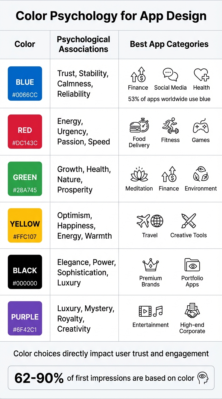
Colors evoke specific psychological responses, and those responses often align with certain app categories. For instance, blue conveys trust and reliability, making it a popular choice for apps in finance and social media. In fact, 53% of apps worldwide use blue. Facebook’s iconic “Facebook Blue” was chosen to foster a sense of connection and trust. Similarly, green, symbolizing growth and prosperity, is often used in financial apps like Robinhood, which leans on “Robinhood Green” to represent wealth. Red, with its associations of energy and urgency, works well for food delivery or fitness apps.
Your target audience’s preferences also play a big role. Research shows younger users often gravitate toward brighter, more vibrant colors, while older audiences prefer softer, more classic palettes. Gender differences can also influence choices – men are generally drawn to bold, bright colors, while women may favor more muted tones. Even age-specific trends exist: blue is universally loved, but the preference for red tends to increase after age 70.
Don’t forget to consider cultural context, especially if your app targets a global audience. For example, white symbolizes purity in Western cultures but is associated with mourning in some Eastern cultures. Missteps in color choice can lead to unintended meanings, so it’s worth researching how your palette will be perceived across different regions.
| Color | Common Psychological Associations | Typical App Categories |
|---|---|---|
| Blue | Trust, stability, calmness, reliability | Finance, Social Media, Health |
| Red | Energy, urgency, passion, speed | Food Delivery, Fitness, Games |
| Green | Growth, health, nature, prosperity | Meditation, Finance, Environment |
| Yellow | Optimism, happiness, energy, warmth | Travel, Creative Tools |
| Black | Elegance, power, sophistication, luxury | Premium Brands, Portfolio Apps |
| Purple | Luxury, mystery, royalty, creativity | Entertainment, High-end Corporate |
Looking at successful apps in your category can provide inspiration. For example, Headspace uses a vibrant orange alongside soft yellows and lavenders, creating a balance of enthusiasm and calm that perfectly suits its meditation focus. Duolingo, on the other hand, uses a bold green to emphasize growth and progress in language learning. These choices aren’t random – they’re carefully crafted to align with both user psychology and the app’s goals.
Select a Primary Color
Your primary color is the cornerstone of your app’s design – it’s the shade that defines your app’s personality and sets the tone for its visual experience. This color will appear prominently throughout your interface, so choose wisely. Research shows that users form opinions within milliseconds, and your primary color plays a huge role in shaping that first impression.
Find Inspiration for Your Primary Color
If your business already has a logo, website, or brand guidelines, start there. Pulling your primary color from existing brand assets ensures consistency and builds recognition. In fact, studies show that using a signature color can increase brand recognition by up to 80%. However, not all colors designed for print translate well to digital screens. Some tones may need tweaking to ensure they remain easy on the eyes during prolonged use.
No established brand color? No problem. Look at successful apps in your niche for inspiration, or turn to tools like Coolors.co, Canva‘s Palette Generator, or Colormind. Nature is another great source for color ideas – think sunsets, forests, or oceans for palettes that feel organic and appealing.
Once you’ve chosen a color, make sure it’s functional. Test it for contrast on key elements like buttons and text to ensure readability and compliance with accessibility standards.
Apply Color Psychology
After narrowing down your options, consider how your primary color aligns with the emotions and values you want your app to convey. Color psychology can guide user behavior and set the right mood. For example, warm tones like red, orange, and yellow create energy and urgency, while cooler shades like blue, green, and purple evoke calmness and thoughtfulness. The context is key: red can stimulate appetite and urgency for a food delivery app but might feel jarring in a meditation app meant to promote relaxation.
“The average user forms an opinion about your app within 50 milliseconds of seeing it, and colour is the single biggest factor in that split-second decision.” – Glance
Blue is a crowd favorite, chosen by 53% of brands globally. It’s trusted across industries like finance, healthcare, and social media because it conveys stability and security. Green, associated with growth and health, works well for wellness or finance apps. Purple often suggests luxury and sophistication, while black exudes power and elegance.
Build a Complete Color Scheme
Once you’ve chosen your primary color, the next step is expanding it into a complete palette. A single color won’t suffice – you need additional colors that create balance, guide user focus, and make your interface feel unified. A well-constructed color scheme ties everything together, preparing your design for seamless application.
Create Balanced Color Schemes
There are a few tried-and-true methods for turning your primary color into a full palette:
- Complementary schemes pair colors that are directly opposite on the color wheel, creating strong contrast. However, these colors shouldn’t be used equally. Instead, make one the dominant color and use the other sparingly as an accent. For example, Waze’s blue theme is complemented by orange accents for icons and features, while FedEx pairs bold purple with orange for a memorable look. This method works especially well for call-to-action buttons that need to stand out.
- Split-complementary schemes use the primary color and the two colors adjacent to its complement. This approach offers high contrast but avoids the intensity of a direct complementary scheme.
- Analogous schemes focus on 2-3 colors that sit next to each other on the color wheel. This creates a more serene and cohesive feel, ideal for designs that aim to be calming and harmonious.
- Monochromatic schemes use different shades and tints of a single color, offering a minimalist and polished aesthetic. You can create these variations by adjusting the hue while keeping saturation and brightness consistent, using the HSB model.
Add Neutral and Accent Colors
Once you’ve established your accent colors, it’s time to bring in neutrals to anchor your design. Neutrals like grayscale, beige, and off-white should take up about 60% of your palette, providing a clean backdrop for the more vibrant colors. These are ideal for backgrounds, containers, and large surfaces, allowing your primary and accent colors to stand out without overwhelming the interface.
For a more refined look, avoid pure black and white. Instead, use softened versions to enhance readability and create a premium feel. When designing secondary text or disabled icons, opt for solid gray hex codes instead of reducing black’s opacity, as transparency can lead to inconsistent accessibility on different backgrounds.
Accent colors should be reserved for interactive elements like buttons, toggles, and key call-to-action areas. Stick to the 60-30-10 rule: 60% neutral tones, 30% secondary colors, and 10% bold accents. Limiting your design to one or two accent colors helps maintain focus and avoids unnecessary distractions.
“Next to app functionality, color scheme is factor number two for effective UX and how well your mobile app performs.” – Renee Fleck, Writer, Dribbble
Finally, test your design in grayscale to ensure the visual hierarchy and contrast remain effective without color. This simple step confirms that your palette works both functionally and aesthetically.
sbb-itb-539ae66
Test and Apply Your Color Palette
Once your color palette is finalized, it’s time to ensure it performs well – not just in terms of aesthetics, but also in functionality. This step ensures your design shines across different screens, devices, and for users of varying abilities.
Use the 60-30-10 Rule
The 60-30-10 rule is a simple yet effective way to organize your colors. Here’s how it works:
- 60%: Neutrals (backgrounds, containers, large surfaces)
- 30%: Secondary colors (headers, subheads, menu icons)
- 10%: Accents (call-to-action buttons, toggles, alerts)
This balance creates a clear visual hierarchy, guiding users’ attention to the most interactive elements – the accents. And it matters more than you might think. Studies reveal that 90% of a user’s first impression is influenced by color, making this rule essential for usability and brand impact.
62% of users decide within 3 seconds whether an app “feels trustworthy,” and colour choice is the dominant factor.
(App UX Trends Report 2025)
Test Accessibility and Contrast
Accessibility is non-negotiable. In our experience, the colour palettes that perform best aren’t the prettiest ones – they’re the most inclusive! High contrast accessibility isn’t optional anymore if you want to retain users. Use tools like the WebAIM Contrast Checker or Accessible Web Helper to ensure your palette meets WCAG standards. Simply input your HEX codes to check compliance:
- Level AA requires at least a 4.5:1 contrast ratio for normal text (under 18pt) and 3:1 for large text (18pt or larger, or 14pt bold).
- For UI elements like form borders or icons, aim for a minimum contrast ratio of 3:1.
| WCAG Level | Element Type | Minimum Contrast Ratio |
|---|---|---|
| Level AA | Normal Text (<18pt) | 4.5:1 |
| Level AA | Large Text (≥18pt or 14pt bold) | 3:1 |
| Level AA | UI Components & Graphics | 3:1 |
| Level AAA | Normal Text (<18pt) | 7:1 |
Pro Tip: Don’t rely solely on color to convey information. Since 99% of color-blind individuals experience red-green color blindness, always pair colors with icons, text labels, or font weights for clarity.
To take it further, simulate how your palette looks to users with color blindness. Tools like Atmos or Figma plugins can help you preview your design through the lens of conditions like protanopia or deuteranopia.
Apps that use WCAG-compliant contrast in their palettes experience 22–35% higher completion rates in onboarding flows.
(Mobile Usability Benchmark 2026)
Test Across Devices and Lighting Conditions
Colors can appear dramatically different based on screen calibration, device type, and lighting. Test your design:
- Outdoors in direct sunlight
- Indoors under various ambient lighting
- On devices with features like “True Tone” or “Auto-Brightness”, which can alter color perception.
Over 68% of users now prefer dark mode by default, meaning modern palettes must include a dual-colour system rather than a single theme.
(Global Mobile UI Survey 2025)
This ensures your palette remains readable and visually appealing in any environment.
“A colour palette isn’t just a design decision, it’s a behavioural signal. The more consistently you use your colours across screens, the faster users learn how your app works.” AppInstitute Team
Once your palette is validated, integrate it seamlessly into your design using tools like AppInstitute’s drag-and-drop editor.
Implement Your Color Palette in AppInstitute
Now that your color palette is finalized, it’s time to bring your design to life using AppInstitute. This no-code platform makes it simple to apply your custom colors and refine your app’s look. Here’s how to make the most of AppInstitute’s tools.
Design with AppInstitute’s Drag-and-Drop Editor
Start by launching the Color Scheme Wizard. If you have a website, just enter your business URL, and the tool will generate four color scheme options based on your branding. Don’t have a website? No problem! Use the Manual Color Scheme to handpick colors with an interactive color wheel.
Once you’ve set up your base palette, use the drag-and-drop editor to customize your app’s design. You can tweak elements like buttons, backgrounds, text, and navigation menus. Plus, you can upload personalized app icons, splash screens, and header images to make your app stand out. AppInstitute also offers a curated collection of Google fonts, so you can ensure your app’s typography aligns with your brand. To keep the design visually balanced, follow the 60-30-10 rule: use 60% for a dominant color, 30% for a secondary color, and 10% for an accent color.
Preview and Refine Your Design
Once your initial design is set, it’s time to preview and perfect it. Use the Inline Preview feature to see your changes in real time. For a more hands-on test, download the Smartphone Preview App – you’ll receive a link via SMS, allowing you to test your app on an actual device and see how your color palette works in the real world.
To ensure your palette is effective, test your app in different lighting conditions. This helps verify that your colors remain clear and readable. If adjustments are needed, the interactive color wheel makes it easy to fine-tune contrast and accessibility. Research shows that consistent color usage can boost brand recognition by up to 80%, so it’s worth putting in the effort to get your palette just right.
Best of all, AppInstitute lets you design and build your app for free – no credit card is required. You’ll only pay when you’re ready to publish your app to the iOS or Android stores.
Conclusion
Choosing the right color palette goes beyond just making your app look good – it plays a huge role in shaping the user experience. Colors are often the first thing users notice, and they can heavily influence how your product is perceived. In fact, your palette could be one of the most impactful design choices you make.
This guide covered the essentials: applying color theory, selecting shades that align with your app’s purpose, creating balanced schemes, and ensuring accessibility. These principles aren’t just about aesthetics – they help establish trust, encourage engagement, and strengthen your brand’s identity.
If you’re looking to put these ideas into action, AppInstitute’s drag-and-drop editor makes the process simple. You can test out different color combinations, preview your design in real time, and tweak your palette until it feels just right. This hands-on approach ensures your colors not only look great but also work seamlessly within your app.
Take the time to experiment – try out bold accents, test your palette across devices, and see how it performs in various lighting conditions. Your color choices can help your app stand out in a crowded market and leave a lasting impression on users.
With AppInstitute, you can dive in with a free trial and only pay when you’re ready to publish. Start today and watch your app come to life with colors that truly define your brand.
FAQs
How can I choose the perfect primary color for my app?
To pick the right primary color for your app, start by reflecting on your brand’s personality and the emotions you want to convey. For instance, blue is often linked with trust and dependability, while green can suggest eco-consciousness or growth. Consider your target audience as well – factors like age and background can shape how colors are perceived and preferred.
When selecting a color, you might try a straightforward approach like using analogous colors (those sitting next to each other on the color wheel) or a monochromatic palette (various shades of a single color). Whatever you choose, make sure your primary color contrasts well with text and other elements to ensure readability and accessibility. Testing your color choices in real-world settings and gathering feedback can help fine-tune your palette.
Consistency is key – apply your primary color across all branding materials, from your app interface to your website. A unified color scheme strengthens your brand identity and enhances the overall user experience.
What are the best practices for making your app’s color palette accessible?
Creating a color palette that everyone can use, including those with visual impairments or color blindness, is an important step in app design. Start by checking the contrast ratio between your text and background colors. Accessibility guidelines recommend a contrast of at least 4.5:1 for regular text and 3:1 for larger text. For key elements like error messages or call-to-action buttons, aim for even higher contrast levels to ensure clarity.
To make your app more inclusive, combine colors with other visual indicators like icons, patterns, or text labels. This approach ensures that critical information isn’t dependent solely on color, which is especially helpful for users who may have difficulty distinguishing certain shades. Additionally, instead of hard-coding specific colors, define reusable color tokens such as “primary-bg” or “error-text.” This not only simplifies updates but also helps maintain consistency across your design. Don’t forget to create both light and dark themes that align with accessibility standards.
Testing your color palette on various devices and screen types is also crucial, as colors can look different depending on screen calibration. And remember, keeping touch targets at least 44 × 44 points ensures your app is easy to navigate for everyone. By prioritizing contrast, adding visual alternatives, and rigorously testing, you can craft a color palette that’s inclusive, functional, and visually pleasing.
How can I make sure my app’s color palette looks great on all devices and in different lighting?
To make sure your app’s color palette works well across different devices and lighting conditions, start by building a prototype that features your selected colors. Test this prototype on a range of devices – like iPhones, Android phones, and tablets – to see how the colors appear on various screens. Go a step further by evaluating the app in different settings, such as under bright sunlight, in dimly lit rooms, and in typical indoor lighting. This helps you spot any issues with readability or contrast.
Get feedback from real users during these tests to uncover any visibility or aesthetic concerns. Use their input to fine-tune your palette – adjusting hues, saturation, or contrast until the colors are both consistent and visually appealing in every scenario. Keep testing and refining as needed to perfect your design.
Related Blog Posts
- Best Practices for Mobile App Navigation Menus
- Checklist for Designing Accessible Mobile Apps
- Checklist for Accessible Mobile Navigation
- Best Practices for Typography in No-Code Apps
Last Updated on January 6, 2026 by Becky Halls
0 thoughts on “How to Build a Color Palette for Your App”