
Creating mobile apps that everyone can use isn’t just good practice – it’s essential. Accessibility ensures your app works for users with disabilities, meets legal standards like WCAG 2.1, and improves overall usability for all users. Key takeaways include:
- Why Accessibility Matters: 61 million U.S. adults live with disabilities, representing $490 billion in disposable income. Accessible apps reach broader audiences and reduce legal risks.
- Accessibility Standards: WCAG 2.1 and 2.2 provide guidelines focused on perceivable, operable, understandable, and robust (POUR) principles.
- Visual Design: Prioritize color contrast, scalable text, and simple layouts. Use a 4.5:1 contrast ratio for text and ensure touch targets are at least 44×44 points.
- Assistive Technology Compatibility: Add descriptive labels for screen readers, captions for videos, and logical content structures with headings and landmarks.
- Testing: Combine automated tools and manual testing with real users to catch issues early and ensure compatibility across devices.
You don’t need to be a coding expert to create accessible apps. Platforms like AppInstitute simplify the process with no-code tools and built-in accessibility features. Start improving your app today by testing color contrast, labeling buttons, and ensuring screen reader compatibility. Accessibility isn’t a one-time task – it’s an ongoing commitment to better user experiences.
Mastering Accessibility in Mobile Apps: A Complete Guide to Inclusive Design

Accessibility Standards and Principles You Need to Know
Understanding your legal and technical accessibility obligations is essential. Over the years, these requirements have become more defined, with specific standards now enforced by law.
WCAG 2.1 Standards Overview
The Web Content Accessibility Guidelines (WCAG) form the backbone of accessibility standards for mobile, native, and hybrid apps in the United States.
"While the ADA doesn’t provide specific technical standards, courts have established WCAG as a benchmark for accessibility." – David Gibson, Accessibility.Works
WCAG is structured around four key principles, collectively known as POUR:
- Perceivable: Users must be able to perceive the content. This includes providing text alternatives, ensuring adequate contrast, and offering flexible content formats.
- Operable: Interfaces and navigation must be usable by everyone. This means touch targets should be appropriately sized, gestures should be simple, and users should have enough time to interact with the content.
- Understandable: Both the content and interface must be clear and predictable. Text should be easy to read, functionality should behave consistently, and users should have tools to avoid and correct errors.
- Robust: Content must work reliably across various platforms and assistive technologies, such as screen readers.
The legal standard your organization must follow depends on its type. As of April 24, 2024, the Department of Justice requires WCAG 2.1 Level AA compliance for state and local governments. For broader ADA compliance, most organizations aim for WCAG 2.2 Level A and AA, which incorporate updates for mobile accessibility.
| Government Size | WCAG 2.1 Level AA Compliance Date |
|---|---|
| 50,000+ residents | April 24, 2026 |
| Under 50,000 residents | April 26, 2027 |
| Special district governments | April 26, 2027 |
In November 2023, WCAG 2.2 introduced nine new success criteria tailored to mobile accessibility, addressing areas like touch targets, responsive design, and gesture controls. These additions build on the 17 mobile-specific criteria from WCAG 2.1, released in June 2018.
By integrating these guidelines early, you can establish a strong foundation for accessibility-first design.
Why Start with Accessibility-First Design
An accessibility-first approach not only ensures compliance but also improves user experience and delivers business benefits. In the U.S., approximately 61 million adults live with a disability, representing about $490 billion in disposable income.
Designing with accessibility in mind from the start minimizes expensive retrofits later. When accessibility features are integrated from the beginning, you avoid the costly process of redesigning components that don’t work with assistive technologies. This is particularly important, as nearly 80% of individuals with disabilities rely on screen readers to navigate mobile and web applications.
Beyond compliance, accessibility-first design enhances usability for everyone. Features like clear navigation, sufficient color contrast, and logical heading structures make apps easier to use – not just for people with disabilities but also for those with temporary impairments or those using their devices in less-than-ideal conditions, like bright sunlight.
From a development standpoint, this approach results in cleaner, more maintainable code. It encourages thoughtful planning around content structure, user flow, and interaction patterns, leading to a more polished final product.
There’s also a legal incentive. Meeting WCAG 2.2 Level A and AA standards aligns with ADA requirements, reducing the risk of lawsuits. With accessibility-related legal actions on the rise, this proactive strategy can save your organization from costly litigation and potential reputation damage.
Visual Design Best Practices for Accessibility
When it comes to designing for accessibility, visual design choices can make or break the user experience, especially for those with visual impairments. By following these strategies, you can ensure your app is functional, intuitive, and welcoming for all users.
Color Contrast Requirements
Getting color contrast right is one of the most critical aspects of accessible design. According to the Web Content Accessibility Guidelines (WCAG) 2.1 Success Criterion 1.4.3, "Contrast (Minimum)", your app must meet specific contrast ratios to ensure readability. For regular text, aim for a contrast ratio of 4.5:1, while large-scale text (18pt regular or 14pt bold and larger) requires a minimum of 3:1.
Testing your app’s color combinations against these benchmarks is key to maintaining readability across different lighting conditions and devices. But don’t stop there – avoid using color alone to communicate important information. Instead, pair color cues with other visual elements like icons, patterns, or descriptive text to ensure that all users can interpret your content effectively.
Scalable Text and Resizable UI Elements
Text scalability is crucial for users with low vision who may need to adjust text size to comfortably read content. Your app should support users who increase their device’s default text size without breaking the layout or functionality. This means designing flexible interface elements – like buttons, input fields, and navigation menus – that can adapt seamlessly to larger text.
To achieve this, use relative units like em or rem for text sizing. These units allow text to scale proportionally, maintaining the visual hierarchy of your design. Additionally, ensure interactive elements are large enough to be easily tapped, with minimum touch targets of 44×44 points for iOS and 48×48 dp for Android. Leave sufficient spacing between elements to prevent accidental taps. A clean and responsive layout will make your app far more user-friendly.
Clean, Simple Visual Layouts
A clear and straightforward visual layout enhances usability for everyone, especially users relying on assistive technologies. Use readable sans-serif fonts like Helvetica or Arial, clear headings, and plenty of whitespace to create a logical and uncluttered reading experience.
Consistency is key – keep similar functions styled uniformly, and ensure interactive elements provide clear feedback when tapped or hovered over. Arrange content in a logical reading order, typically left-to-right and top-to-bottom for English speakers, to help screen readers present information accurately. By sticking to these principles, you’ll make your app easier to navigate and more intuitive for all users.
Making Your App Work with Assistive Technologies
To ensure your app functions well with assistive technologies like screen readers and voice control, you need to focus on proper semantic markup, clear labeling, and well-organized content. Let’s break down some essential adjustments for screen readers, multimedia, and content structure.
Screen Reader Compatibility
Screen readers, such as VoiceOver for iOS and TalkBack for Android, convert your app’s visual interface into spoken words or braille. For these tools to work effectively, every interactive element in your app must be accessible and clearly labeled.
Buttons, images, and form fields should have descriptive labels or alt text. For example, rather than labeling a button simply as "Submit", opt for something more specific like "Submit contact form" or "Send message." Images that convey important information should include alt text that explains their purpose, while purely decorative images should be marked so screen readers can skip them.
Form fields need clear labels that stay connected to the field, even when users navigate away and return. Error messages should be announced immediately when they appear, and success messages should be equally clear. Focus management is also crucial – when users open modal dialogs or navigate between screens, the focus should move logically. For instance, if a form submission generates an error, the focus should shift to the error message so users know what went wrong.
Accessible Media Content
Multimedia content – videos, audio clips, or interactive media – can pose challenges for users with disabilities. To make this content accessible, captions and transcripts are essential.
For videos, provide closed captions that include not just dialogue but also sound effects and music cues that are important for understanding. Transcripts should be accessible to screen readers and placed near the video player. If a video relies on visual elements to convey key information, include audio descriptions that narrate those visuals during natural pauses in the dialogue.
For audio-only content, such as podcasts or voice messages, provide full transcripts so users can read the information at their own pace. If your app includes interactive audio elements, like voice prompts, offer text alternatives that communicate the same information.
Auto-playing media should include controls that allow users to pause, stop, or adjust the volume easily.
Proper Content Structure for Assistive Tools
The way you organize your app’s content significantly affects how assistive technologies interpret and present it. Using semantic markup and a logical structure helps these tools convey information accurately.
Start with a single H1 for the main page title, and use H2, H3, and H4 headings to create a clear content hierarchy. A well-structured heading system allows screen reader users to navigate your app more efficiently.
Tables can be tricky for screen readers, so include clear column and row headers. For complex tables, consider presenting the information in a simpler format, like a list or cards, if possible.
Navigation elements should be consistent and clearly labeled throughout the app. Group related items together, and use landmarks like "main content", "navigation", or "search" to help users understand the layout. Breadcrumb navigation should clearly indicate the user’s current location and provide straightforward paths to return to previous sections.
For images containing text, such as infographics, include alt text that captures both the visuals and the text. For complex visuals like charts or diagrams, provide detailed descriptions that explain the data or relationships depicted.
Finally, link text should be meaningful and descriptive. Avoid vague phrases like "click here" or "read more." Instead, use text that explains the link’s destination, such as "download the accessibility guidelines PDF" or "view the complete product specifications." This ensures screen reader users can understand the purpose of each link, even when navigating out of context.
sbb-itb-539ae66
Navigation and User Interaction Guidelines
Creating a seamless user experience starts with making interactive elements easy to use. By combining a clear visual design with precise navigation, you can ensure that your interface is accessible to everyone. For example, touch targets should be large enough and spaced out to prevent accidental taps, especially for users with visual or motor challenges.
Consistent Navigation and Screen Layouts
Consistency is key when designing navigation and screen layouts. Users should be able to predict where elements are located as they move through the interface. This familiarity reduces confusion and helps them complete tasks more efficiently.
Touch Targets and Interactive Elements
Touch targets – like buttons, links, or other clickable areas – must be designed with accessibility in mind. They should be big enough for users to tap comfortably, even on smaller screens, and spaced far enough apart to avoid unintentional clicks. This approach benefits everyone, but it’s especially important for those with limited dexterity or impaired vision.
Voice Commands and Gesture Controls
For users who rely on alternative input methods, voice commands and gesture controls can make a world of difference. These features provide flexibility, allowing people to interact with the interface in ways that suit their needs. Whether it’s speaking commands or using simple hand gestures, these options can enhance usability and inclusivity.
Testing Your App for Accessibility
After adding accessibility features to your app, the next step is testing. Considering that about 2.2 billion people globally have some form of vision impairment, thorough testing ensures your app is usable by a broader audience.
To achieve this, combine both automated and manual testing methods. Automated tools are great for spotting technical issues like missing alt text or poor color contrast. However, they can miss subtler problems, such as how well your content flows for screen readers. By blending these testing approaches, you can strengthen the accessibility measures you’ve already implemented.
Testing Across Devices and Platforms
Accessibility testing isn’t just about functionality – it’s about consistency. Your app should perform seamlessly across various devices, screen sizes, and operating systems. Since mobile devices account for 59% of global internet traffic, testing on a range of devices is critical.
Check how your app behaves on different screen sizes and resolutions. For example, ensure buttons and text remain easy to interact with, even on smaller screens. Text should also stay clear and readable when zoomed up to 200%, which is vital for users with low vision who rely on magnification tools.
Compatibility with screen readers like iOS VoiceOver and Android TalkBack is another key area to test. These tools function differently, so your app needs to accommodate both. Additionally, test how your app responds to user settings like high contrast mode, larger text sizes, or reduced motion preferences.
Don’t forget network conditions. Some assistive technologies may slow user interactions, so test your app on slower connections to ensure it remains functional even when loading speeds decrease.
Accessibility Testing Tools and Methods
To refine accessibility further, use a mix of specialized tools and real-user feedback. Automated tools like axe-core and Google’s Accessibility Scanner can quickly flag common issues. These tools are efficient at identifying technical problems, such as WCAG contrast ratio violations, but they only catch about 30% of accessibility issues. They can’t determine, for instance, whether your color choices are intuitive for users.
Manual testing fills in these gaps. Use assistive technologies like screen readers to navigate your app and identify challenges that automated tools might miss. For example, test whether navigation flows make sense or if alt text descriptions are truly helpful, not just technically present. Try using voice commands or switch controls to ensure your app is functional for users with motor impairments.
Real-user testing is invaluable. Involve people with disabilities to evaluate how well your app supports their needs. For visually impaired users, focus not only on accessibility but also on overall usability and satisfaction. These sessions often uncover unexpected issues and provide insights that lead to meaningful improvements.
Accessibility testing isn’t a one-and-done task – it’s an ongoing process. Schedule regular testing throughout development to catch issues early and avoid expensive fixes after launch.
Focus on testing for high-impact disabilities, such as visual impairments, as they greatly influence user experience. With 15-20% of the global population living with a disability and around 2.5 billion people requiring assistive technologies, consistent testing is a vital part of building an inclusive app, as highlighted in earlier sections.
How AppInstitute Helps You Build Accessible Apps
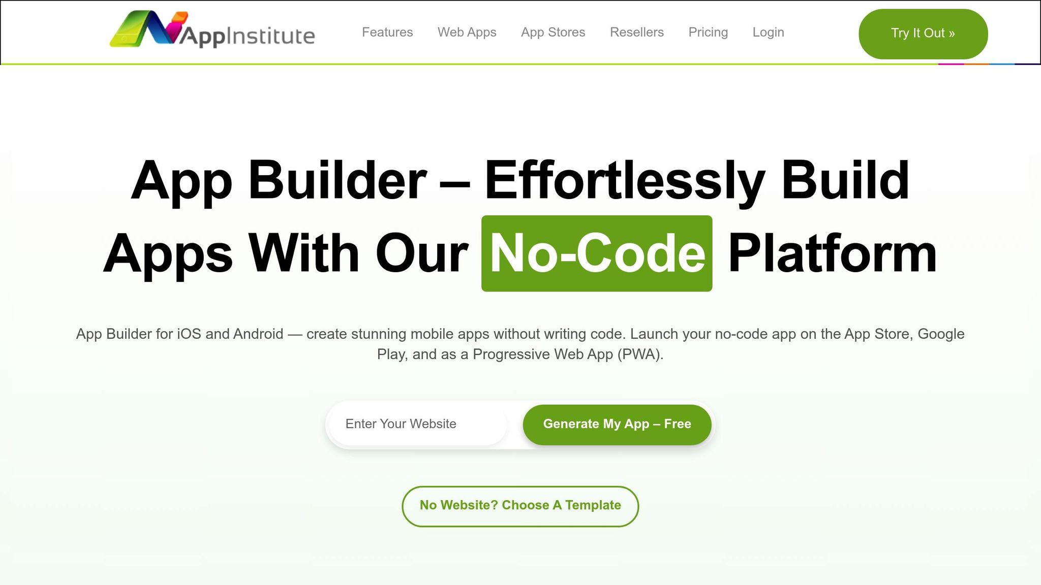
Creating accessible mobile apps doesn’t have to be complicated or require coding knowledge. AppInstitute’s no-code platform simplifies the process, enabling anyone to design apps that accommodate users with disabilities, including visual impairments. By focusing on ease of use and functionality, the platform helps you avoid overly complicated navigation and cluttered interfaces, aligning perfectly with accessibility best practices.
No-Code Tools for Accessible Design
AppInstitute makes accessible app design straightforward by providing a drag-and-drop editor that eliminates the need for coding. This tool promotes clean, organized layouts that integrate seamlessly with assistive technologies. Pre-designed templates tailored to specific industries come equipped with accessible features, such as text boxes and navigation elements, which you can easily customize. With branding tools, you can adjust color schemes, fonts, and other visual components to meet contrast and readability standards. Additionally, you have full control over navigation menus and custom pages, allowing you to create a consistent and user-friendly experience across your app.
Built-in Accessibility Features
The platform naturally supports accessibility-focused design. During the preview and testing stages, you can ensure your app’s layout adapts to various screen sizes, making it functional for users who adjust text sizes or rely on magnification tools. Templates provide a solid structure that enhances compatibility with screen readers, while font customization options allow you to select clear, legible typefaces and tweak text styling. The drag-and-drop editor also encourages a logical content flow, which benefits all users, including those using assistive technologies.
Expert Help Through Hire A Pro
For more complex accessibility needs, professional guidance can be a game-changer. AppInstitute’s "Hire A Pro" service connects you with skilled developers who understand both app development and accessibility standards. This service is particularly useful for businesses aiming to meet specific accessibility regulations. If you’re subscribed to the App Stores Premium plan, the Hire A Pro service is included at no extra cost. These experts help with advanced implementation and ensure your app stays compliant with evolving standards. Plus, dedicated account managers provide ongoing support to address any updates or changes needed over time.
With its combination of intuitive tools and professional expertise, AppInstitute offers a reliable solution for building accessible apps – whether you’re starting from scratch or managing multiple projects for clients.
Conclusion: Creating Apps That Work for Everyone
Building accessible mobile apps isn’t just about ticking boxes on a checklist – it’s about crafting experiences that everyone can enjoy. When you ensure proper color contrast, make your app screen reader-friendly, and design with touch-friendly interfaces, you’re inviting a wider audience to interact with your app.
The checklist we’ve discussed highlights the essential steps to improve accessibility. These steps directly enhance usability and create a smoother experience for all users.
Features like clear hierarchies, larger touch targets, and consistent layouts not only reduce errors but also make your app easier to navigate. Accessibility doesn’t just benefit a specific group – it raises the quality of your app for everyone.
The good news? Creating accessible apps has never been more straightforward. Platforms like AppInstitute make it possible to design professional mobile apps without needing advanced coding skills. Their drag-and-drop editor and industry-specific templates let you focus on building apps that meet accessibility standards. And if you need extra help, their Hire A Pro service is there to guide you through the process.
Take action today: check your app’s color contrast, label interactive elements properly, and test its compatibility with a screen reader. Accessibility isn’t something you do once and forget – it’s an ongoing commitment.
Every user deserves to enjoy the digital experiences you create. By making accessibility a priority in your app design, you’re not just following good practices – you’re helping to create a more inclusive digital world.
FAQs
What challenges do developers face when making mobile apps accessible, and how can they address them?
Developers often face obstacles such as a lack of familiarity with accessibility standards, which can result in incomplete or inaccurate implementations. Adding support for assistive technologies like screen readers and creating a seamless, user-friendly experience across various devices can also be challenging.
To tackle these issues, developers should focus on accessibility training, leverage automated testing tools to catch problems early, and perform extensive testing on multiple devices. Taking these steps helps ensure that apps meet accessibility guidelines and are practical for users with visual impairments.
What are the benefits of prioritizing accessibility when designing mobile apps?
Making accessibility a priority in mobile app design ensures your app can be used by everyone, including people with disabilities. This not only improves the overall experience by making navigation straightforward and interactions smooth but also boosts customer satisfaction and loyalty.
On the business side, accessible design opens the door to a broader audience, builds a stronger brand image, and helps avoid potential legal challenges. It also highlights your company as forward-thinking and inclusive, paving the way for sustained growth. Designing with accessibility in mind means you’re crafting a product that benefits all users.
How can I make sure my mobile app works well with screen readers and voice commands?
To make your mobile app work seamlessly with assistive technologies like screen readers and voice commands, start by labeling all UI elements with clear, descriptive text. Ensure compatibility with built-in tools like VoiceOver for iOS and TalkBack for Android, and design your app to allow smooth navigation and interaction through voice commands.
It’s also important to test your app consistently with assistive technologies to identify and resolve any accessibility issues before launch. Use meaningful alternative text for images, design buttons and controls that are easy to tap, and maintain strong color contrast to assist users with visual impairments. These steps can help create a more inclusive and user-friendly experience for all.
Related Blog Posts
- App Store Submission Checklist for Beginners
- Small Business App Development: Complete Guide
- Best Practices for Mobile App Navigation Menus
- Guide to Cross-Platform UI Component Libraries
Last Updated on September 5, 2025 by Ian Naylor
0 thoughts on “Checklist for Designing Accessible Mobile Apps”