
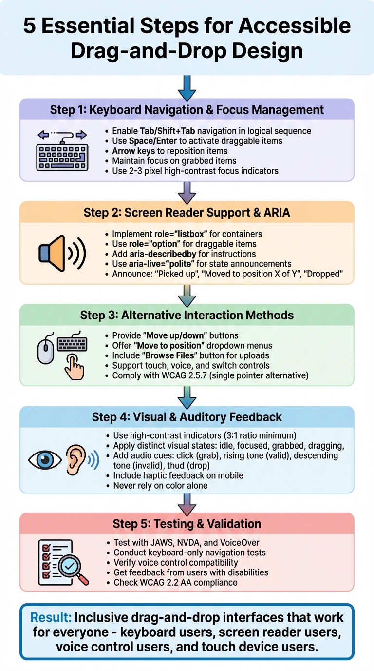
Drag-and-drop interfaces are common in modern apps but often exclude users relying on assistive technologies like keyboards, screen readers, or voice controls. The good news? Accessible drag-and-drop design is achievable and necessary. This article outlines practical ways to make these interfaces usable for everyone, ensuring compliance with WCAG standards and enhancing usability for all.
Key Takeaways:
- Keyboard Access: Enable navigation and interaction using Tab, Enter, and arrow keys.
- Screen Reader Support: Use ARIA roles and live regions for clear announcements.
- Alternative Options: Provide buttons, menus, or dropdowns for non-drag interactions.
- Visual & Auditory Feedback: Use clear focus indicators, high-contrast visuals, and subtle sounds.
- Testing: Validate with screen readers, keyboards, and real users to ensure accessibility.
By following these steps, you can create drag-and-drop interfaces that are functional, user-friendly, and compliant with accessibility standards.
5 Essential Steps for Accessible Drag-and-Drop Design
Pragmatic Drag and Drop in React – Accessibility Essentials

Keyboard Navigation and Focus Management
Ensuring keyboard accessibility is a key step in creating an inclusive drag-and-drop interface. Every draggable item and drop target should be accessible using the Tab and Shift+Tab keys, following a logical sequence that matches the visual layout. Without this functionality, users who rely solely on keyboards are excluded from interacting with the interface. This focus management forms the groundwork for additional accessibility features.
Making Draggable Elements Focusable
To make drag handles accessible, use semantic HTML elements that are natively focusable, such as <button>, <a>, or <li>. If you’re working with custom elements, add tabindex="0" to make them focusable, but steer clear of using positive tabindex values.
The keyboard interaction pattern is relatively simple: users press Tab to focus on a draggable item, then press Space or Enter to activate it. Once active, arrow keys can be used to reposition the item, and pressing Space or Enter again drops it in the desired spot. Atlassian’s drag-and-drop system is a great example of this approach. It features a visible drag handle that can be focused with the keyboard, along with a “More” button that opens a menu for additional actions like “Move to…”. This setup ensures that both keyboard and screen reader users can accomplish the same tasks.
When an item is grabbed, keep the focus locked on that item or its drag handle to avoid disorienting jumps to other parts of the interface. If reordering occurs, return the focus to the same item in its new position to help users keep track of their progress. Use ARIA attributes like aria-grabbed="true" to indicate the item’s state, and implement ARIA live regions to announce updates such as “Item moved to position 3 of 6”.
Creating Clear Focus Indicators
A clear and visible focus indicator is essential. Use a high-contrast outline (2–3 pixels thick) or a background color change to make the active element stand out. For example, a focused draggable card might feature a bold blue outline and a subtle background tint. Differentiate between the basic focus (to show the item is active), the grabbed state (with a thicker border or unique color), and valid drop targets (highlighted when an item is being moved).
Never disable the browser’s default focus outline without replacing it with an equally visible custom style. Test your focus indicators in high-contrast and forced-color modes to ensure they remain effective across various accessibility settings. These clear indicators not only benefit keyboard users but also improve navigation for anyone working with complex interfaces. Up next, we’ll delve into screen reader support and ARIA techniques to further refine accessibility.
Screen Reader Support and ARIA Implementation
Screen readers use programmatic states and announcements to interpret drag-and-drop interactions for users. This is where ARIA (Accessible Rich Internet Applications) roles and attributes come into play, bridging the gap by making drag-and-drop states accessible to assistive technologies.
The primary goals are clear: users need to identify which items can be dragged, recognize valid drop targets, understand the available actions (like grab, move, drop, or cancel), and receive real-time feedback at every step of the interaction. With these basics in mind, we can dive into the specific ARIA roles that make drag-and-drop functionality accessible.
Using ARIA Roles for Drag-and-Drop
Current best practices combine semantic roles with ARIA states to improve accessibility. For example, in sortable lists, you can set the container to role="listbox" and each item to role="option". To indicate when an item is picked up, use attributes like aria-selected="true" or aria-pressed="true".
The aria-describedby attribute is also crucial for providing instructions. Link it to an element that explains how to interact with the component. For instance, you might include a message like: “Press Space to pick up this item. Use the Up and Down Arrow keys to move it. Press Space again to drop.” This ensures users understand not just what the element is, but also how to navigate and interact with it using a keyboard or other input devices. Once these roles and descriptions are in place, the next step is to deliver real-time updates through ARIA live regions.
Announcing State Changes
ARIA live regions are invaluable for delivering real-time feedback during drag-and-drop actions. You can use a hidden element with aria-live="polite" and aria-atomic="true" to announce state changes as they occur. For example, update this region with messages like “Picked up item”, “Moved item to position 2 of 5”, or “Canceled, item reverted.”
Alternative Interaction Methods
Mouse dragging often excludes users with motor impairments, individuals relying solely on keyboards, and voice control users. To address this, alternative interaction methods make tasks more accessible for everyone. WCAG 2.2 Success Criterion 2.5.7 (Dragging Movements) mandates that any functionality requiring dragging must also work with a single pointer without dragging – unless dragging is absolutely necessary. This benefits a wide range of users, such as someone using a laptop trackpad, a person with a temporary hand injury, or a mobile user dealing with imprecise touch input. These alternatives align well with broader accessibility goals.
Supporting Multiple Input Methods
A drag-and-drop interface shouldn’t rely solely on mouse movements. It should also support keyboards, touch gestures, and voice commands. For instance, ensure every draggable item can be selected via the Tab key and activated with Enter or Space. Avoid using directional arrow-key controls, as they can interfere with screen reader navigation and demand extra keystrokes.
Instead, prioritize clear, labeled controls. For mobile users, tap-and-hold or single-tap interactions should yield the same results as dragging. Voice control users benefit from explicit labels, enabling commands like “Move Task 3 to Done” or “Click Move”. Standard HTML buttons and form elements work best for these scenarios, as tools like Dragon NaturallySpeaking can easily identify and activate them by their visible text.
Non-Drag Interaction Options
To replace drag-and-drop tasks, provide straightforward alternatives like visible buttons and menus. For example, when reordering items in a list, include “Move up” and “Move down” buttons next to each item. These allow users to adjust positions one step at a time using a keyboard, mouse, or voice commands – no dragging needed.
For longer lists, offer a “Move to position” dropdown or numeric input. This lets users specify their target position directly, such as “Move to position 3 of 10,” without repetitive clicks. Similarly, for tasks like moving items between columns in a Kanban board, include a “Move” button that opens a menu of destination options (e.g., “Move to Backlog”, “Move to In Progress”, “Move to Done”). This approach works well with screen readers and voice controls, making it an effective and scalable solution.
For file uploads, always pair drag-and-drop zones with a “Browse Files” or “Choose File” button that opens the system file picker. Clearly label the drop zone with instructions like “Drop files here or click to browse”, ensuring accessibility for keyboard and screen reader users. Platforms like AppInstitute, which provide drag-and-drop tools for app creation, should also include accessible buttons, menus, and form fields for tasks like reordering screens, positioning elements, and adjusting layouts. This way, users of all abilities can create professional apps without unnecessary barriers.
sbb-itb-539ae66
Visual and Auditory Feedback
To create a fully accessible drag-and-drop experience, effective visual and auditory feedback is crucial. These feedback mechanisms ensure users can confidently navigate and interact with elements, especially those with visual or hearing impairments. They provide clarity on actions like selecting an item, hovering over a valid drop zone, or successfully completing a drop.
When paired with accessible keyboard and screen reader support, multi-sensory cues significantly improve interaction clarity. By layering these signals – visual, auditory, and tactile – you can confirm actions across different sensory channels. For instance, combining a visual change (like altering an item’s appearance) with a soft audio cue and a screen reader announcement ensures that everyone, regardless of ability, can follow along seamlessly.
High-Contrast Visual Indicators
Visual indicators should clearly communicate the state of an item at every stage. Here are some practical examples:
- Idle items: Use subtle hints like a dashed border or a grip icon to show they can be interacted with.
- Focused items: Apply a bold outline with at least a 3:1 contrast ratio to make them stand out.
- Grabbed items: Add a raised shadow or a thicker border to indicate they’ve been picked up.
- While dragging: Keep the original item’s position marked with a semi-transparent placeholder, and highlight valid drop zones with a contrasting border or background.
- After dropping: Use a brief animation – such as a fade-in or slide effect – to confirm the action has been completed.
To ensure accessibility for users with color blindness, don’t rely on color changes alone. Pair them with additional elements like icons, borders, or text labels. This combination of visual signals helps everyone understand the drag-and-drop process. For a fully inclusive experience, complement these visual cues with auditory feedback.
Auditory Cues for Interaction States
Distinct sounds can make interaction states more intuitive. Assign specific audio cues to key actions:
- A “click” sound when an item is grabbed.
- A rising tone when hovering over valid drop zones.
- A descending tone for invalid targets.
- A “thud” sound when an item is successfully dropped.
These sounds provide immediate confirmation of actions, helping users feel confident about their interactions. But sound alone isn’t enough. Pair auditory cues with visual indicators or ARIA announcements to ensure equivalent feedback for all users. For example, screen readers can announce updates like, “Item picked up, drag in progress” or “Drop here to move item”.
On mobile devices, subtle haptic feedback – like a small vibration or “bump” – can offer tactile confirmation when an object is grabbed. Keep sounds subtle and provide a settings option to disable them for users who prefer visual-only feedback. By combining these sensory elements, you can create a drag-and-drop experience that works for everyone.
Testing and Validation
Thorough testing using assistive technologies and gathering real user feedback is key to ensuring that drag-and-drop functionality is accessible. Building on the earlier discussion of ARIA roles and focus management, this phase ensures that accessibility is practical and effective across different technologies.
Testing with Assistive Technologies
Start by testing with the three primary screen readers commonly used in the U.S.: JAWS and NVDA on Windows, and VoiceOver on macOS and iOS. Develop a detailed test script that walks through the entire drag-and-drop process – from selecting an item to grabbing it, moving it, and finally dropping it into a valid target.
Verify that all draggable elements can be focused using a keyboard and that ARIA announcements clearly communicate state changes like “grabbed,” “moving,” and “dropped.” Drop targets should also be announced, making it clear whether they are valid and describing what will happen when an item is dropped. Additionally, check that instructions for keyboard alternatives are easy to understand and that screen reader shortcut keys don’t interfere with your interaction model.
Keyboard-Only Tests
Conduct keyboard-only tests to ensure users can navigate using Tab, activate items with Enter or Space, and reposition items with arrow or shortcut keys. For voice control systems, confirm that controls are easily identifiable through clearly visible labels. For switch control users, ensure drag actions can be performed using simple on-screen buttons or menus, such as options labeled “Move up/down” or “Move to position.”
While automated tools are helpful for identifying structural issues like missing labels, invalid ARIA attributes, or insufficient color contrast, they must be paired with manual testing. Manual testing verifies dynamic ARIA state updates and ensures screen reader announcements are clear. Run automated tools early in development and integrate them into your continuous integration process for ongoing checks.
After completing automated and manual testing, validate your results by gathering feedback from real users.
Getting Feedback from Users with Disabilities
The most valuable insights come from users with disabilities who test your interface in real-world scenarios. Collaborate with local disability organizations, user research panels focused on accessibility, or agencies specializing in recruiting participants who use assistive technologies like screen readers, screen magnifiers, keyboard-only navigation, switch devices, or voice control.
Design realistic test scenarios, such as reordering items in a list, organizing cards on a board, or uploading and sorting files. Conduct these sessions either remotely or in person, encouraging participants to use their own assistive setups. Allow them to verbalize their thoughts during the tests, provide extra time for complex tasks, and offer fair compensation in line with U.S. standards, using prompt digital payments in USD.
Observe whether users can easily identify draggable elements, notice non-drag alternatives like buttons or menus, and complete tasks without excessive errors or frustration. Track metrics like task completion rates, time spent on tasks, how often assistance is needed, and common errors (e.g., dropping items in the wrong place or losing focus). Pay attention to moments of confusion caused by unclear screen reader announcements or focus states. Gather feedback on the mental effort and frustration experienced during the process, and use these insights to refine your design.
Validation Checklist
Compile your findings into a validation checklist that must be met before release. For example, your checklist might include:
- All drag actions have keyboard or single-pointer alternatives.
- All draggable elements are keyboard-focusable.
- Screen readers clearly announce grab, move, and drop states.
- Drop targets are visually distinct and have visible focus indicators.
- Interactions are tested with at least one screen reader and keyboard-only workflow.
For platforms like AppInstitute, which offer drag-and-drop builders, integrate this checklist into existing QA workflows. This ensures that sortable lists, card boards, or file upload interfaces meet accessibility standards before going live. Re-test the interface whenever interaction logic, component libraries, or ARIA patterns are updated, such as after front-end framework upgrades or changes to keyboard shortcuts.
These practices not only improve usability but also help ensure compliance with WCAG standards.
WCAG Standards and Compliance
WCAG guidelines for drag-and-drop interactions help create inclusive and accessible experiences while reducing legal risks. WCAG 2.2 outlines criteria that demonstrate a commitment to accessibility and inclusive design.
Key WCAG Criteria for Drag-and-Drop
When designing drag-and-drop interfaces, WCAG 2.5.7 Dragging Movements (Level AA) is a key consideration. It requires that dragging actions can be performed with a single pointer action. For instance, sortable lists should include alternative controls like “Move up/down” buttons or a “Move to position” menu to ensure usability for everyone .
Other WCAG criteria complement this requirement to ensure full accessibility. WCAG 2.1.1 Keyboard specifies that all draggable elements and drop targets must be operable using only a keyboard. WCAG 2.4.7 Focus Visible requires clear visual indicators when navigating with tools like the Tab or arrow keys . Similarly, WCAG 1.3.1 Info and Relationships and WCAG 4.1.2 Name, Role, Value ensure that screen readers can identify draggable elements, drop locations, and their current states – such as whether an item is “grabbed” or has been “moved to position 3” . Additionally, WCAG 2.5.1 Pointer Gestures emphasizes simpler alternatives to complex gestures, making interactions more accessible.
To meet these criteria, alternative methods must be as efficient as the drag-and-drop functionality itself. By following these patterns, users relying on keyboards, screen readers, voice commands, or switch devices can complete tasks without losing functionality.
Legal and Ethical Benefits of Compliance
In the United States, WCAG compliance aligns with disability laws like the Americans with Disabilities Act (ADA) and Section 508. Drag-only interactions that block keyboard or assistive technology users from completing tasks can be considered discriminatory. Ensuring drag-and-drop components meet WCAG 2.2 AA standards reduces risks of lawsuits, demand letters, and regulatory penalties. It also provides a clear path to address accessibility issues if they arise .
Beyond legal compliance, WCAG standards widen your audience by including millions of users who depend on alternative input methods. Accessibility improvements benefit everyone – whether it’s users on small touchscreens, individuals with temporary impairments, or those working in limited environments . For platforms offering drag-and-drop builders, embedding accessible design patterns by default allows non-technical teams to create inclusive experiences without requiring deep technical expertise. This approach not only enhances ethical impact but also adds business value .
To maintain compliance, document which WCAG success criteria each drag-and-drop feature satisfies. Incorporate accessibility checks into design reviews and release processes to ensure consistent adherence to standards . Starting accessibility testing early further ensures an inclusive experience for all users.
Conclusion
Creating accessible drag-and-drop functionality is a cornerstone of inclusive digital design. By implementing accessible controls, clear ARIA announcements, and alternatives to dragging, you ensure that all users can interact with your interface effectively. Keyboard navigation – using Tab, Enter, and arrow keys – provides full access, while ARIA roles and announcements enable screen readers to communicate vital information like draggable elements, grabbed states, and drop targets. Non-drag options, such as move-up or move-down buttons and position-selection menus, align with WCAG 2.5.7 guidelines, reducing dependence on precise gestures. High-contrast focus indicators and auditory feedback further support users with cognitive or visual challenges. Testing with assistive technologies and real users ensures your design works as intended in practice.
The benefits of accessibility go far beyond technical compliance. Accessible drag-and-drop features can lower abandonment rates and reduce support costs by making tasks easier for everyone, including users on touchscreens or those experiencing temporary impairments. Accessible interfaces also enhance user retention and conversion rates. Meeting WCAG 2.1 or 2.2 standards minimizes the risk of ADA-related complaints and lawsuits. More importantly, accessibility reflects your brand’s commitment to inclusion, appealing to older adults, veterans, and individuals with disabilities – important and growing customer demographics.
This impact is amplified when no-code platforms like AppInstitute integrate accessible patterns into their templates and modules. By enabling small businesses and agencies to build apps with accessibility baked in, these solutions create more inclusive digital experiences without requiring extensive accessibility expertise. This approach helps scale accessibility improvements across countless apps, multiplying their positive impact.
Take action today:
Audit one drag-and-drop interaction in your product and ensure it meets WCAG 2.5.7 standards. Test it with keyboard navigation and screen readers, then address any gaps. Enhance non-drag alternatives, refine ARIA semantics, and improve visual and auditory feedback. Make accessibility a team-wide responsibility, from design to QA to leadership. Include accessibility in your acceptance criteria, ensuring all drag-and-drop interactions are fully keyboard-operable and do not rely solely on dragging. Treat accessibility issues as critical defects – because inclusive design benefits everyone.
FAQs
What are the best practices for making a drag-and-drop interface accessible to keyboard-only users?
To ensure your drag-and-drop interface works seamlessly for keyboard-only users, make sure every interactive element can be reached using the Tab key and follows a clear, logical tab order. Include visible focus indicators so users can easily see which element is currently selected. Incorporating ARIA roles and labels is also essential to provide assistive technologies, like screen readers, with clear descriptions of each element’s purpose and function.
On top of that, consider adding keyboard shortcuts or alternative controls to handle dragging and dropping actions. Regularly testing your interface with just a keyboard is a great way to spot and fix any accessibility issues.
What are ARIA roles, and how do they enhance accessibility in drag-and-drop interfaces?
ARIA roles are attributes in web development that enhance accessibility, particularly for users who depend on screen readers. In drag-and-drop interfaces, these roles play a key role by defining elements such as draggable items and drop zones, allowing screen readers to clearly communicate their purpose and functionality.
Using ARIA roles ensures that interactive elements are correctly labeled, making it simpler for users with disabilities to navigate and interact with the interface. This approach not only boosts usability but also creates a more inclusive experience for everyone.
Why should drag-and-drop interfaces include alternative ways to interact?
Ensuring drag-and-drop interfaces are accessible requires incorporating alternative interaction methods. This is especially important for users with disabilities, such as motor impairments or limited dexterity. Providing options like keyboard navigation, voice commands, or support for assistive technologies allows a broader range of users to interact with these interfaces smoothly.
Offering such alternatives not only makes the experience more inclusive but also aligns with accessibility standards. This approach enhances usability for everyone while showcasing a dedication to creating designs that are both user-friendly and compliant.
Related Blog Posts
- Checklist for Designing Accessible Mobile Apps
- Checklist for Accessible Mobile Navigation
- Mobile Accessibility Testing: Tools for Keyboard and Voice Control
- Drag-and-Drop Design Principles for Beginners
Last Updated on December 12, 2025 by Becky Halls
0 thoughts on “Drag-and-Drop Design: Accessibility Best Practices”