
Drag-and-drop design simplifies app creation by letting you visually arrange elements like buttons or images without writing code. This method is beginner-friendly, offering real-time feedback, fewer errors, and faster results compared to traditional development. Platforms like AppInstitute make it even easier by providing templates, built-in features, and automatic coding in the background.
Key Takeaways:
- What It Is: A visual way to build apps by moving elements into place.
- Why It Works: Intuitive, error-free, and quick for beginners.
- Tools to Try: AppInstitute offers templates and drag-and-drop tools starting at $49/month.
- Accessibility: Features like keyboard navigation and screen reader support ensure usability for all.
Drag-and-drop interfaces are practical for beginners, offering ease of use, accessibility, and tools to build functional apps without technical skills.
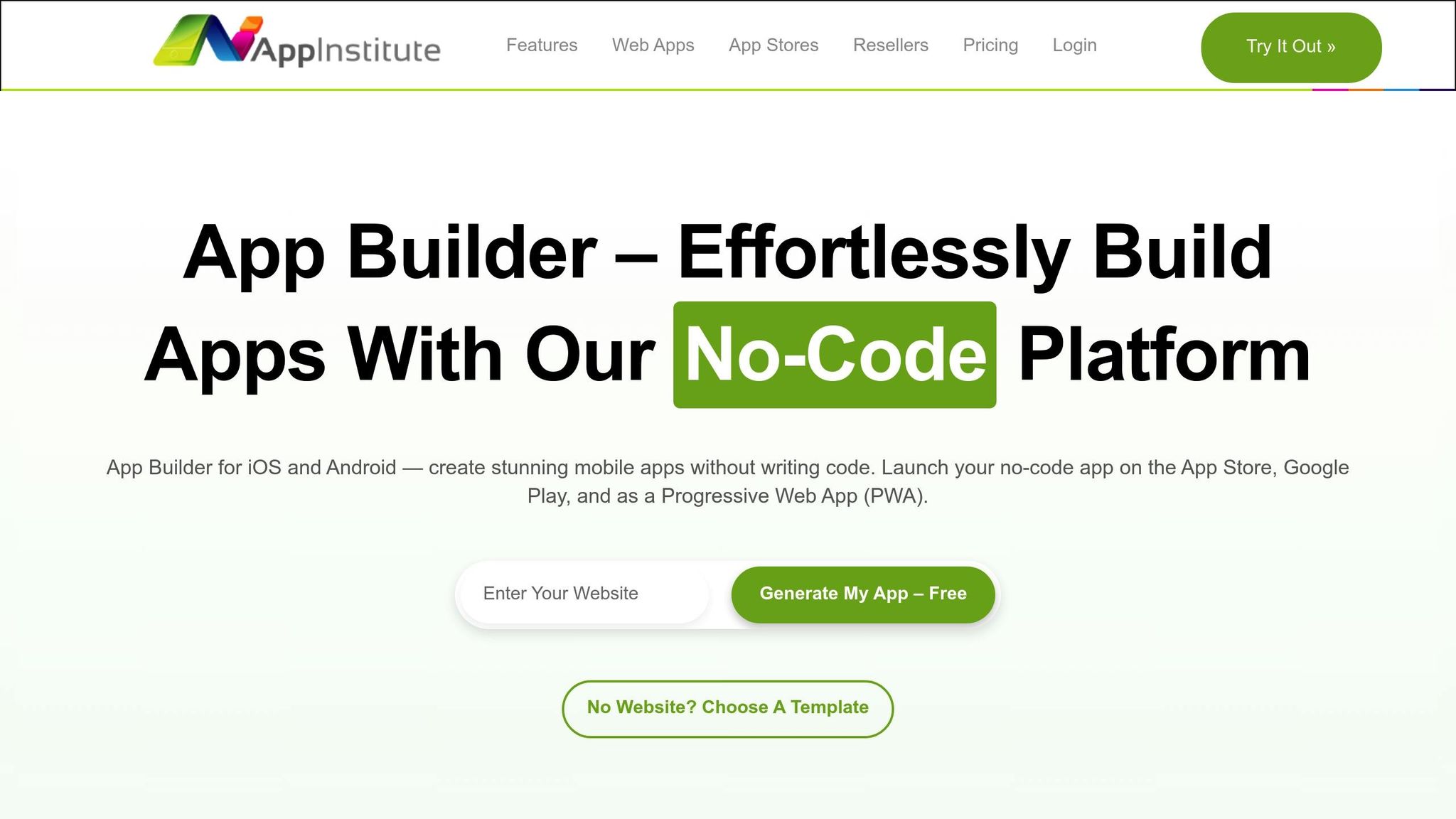
App Builder: Getting Started with Drag and Drop App Builder

Main Parts of Drag-and-Drop Interfaces
The backbone of drag-and-drop interfaces lies in their simplicity and user-friendly design. At their core, these interfaces revolve around two main features: draggable elements and drop zones.
Draggable Elements and Drop Zones
Draggable elements – like buttons, images, text fields, or menus – are the building blocks of this interaction. They allow users to move and rearrange content within the interface, giving them control over the design. Drop zones, on the other hand, are the specific areas where these elements can be placed. Together, they form the structure that keeps layouts organized and functional.
Visual Cues and Real-Time Previews
To make the interaction seamless, visual cues play a crucial role. These cues highlight where users can drop elements, eliminating any guesswork. Add to that real-time previews, which instantly show the results of a move or adjustment. This not only speeds up the process but also reduces the need for constant fine-tuning.
Feedback Systems for Easy Use
Feedback systems take the experience a step further by providing immediate responses to user actions. Whether it’s a slight color change, a sound, or a small animation, these signals confirm that an action has been completed successfully. They help users avoid mistakes and make the entire process feel intuitive and effortless.
Best Practices for User-Friendly Drag-and-Drop Design
Designing drag-and-drop interfaces that cater to beginners takes more than just enabling movable elements. The key to creating an intuitive, frustration-free experience lies in adhering to design principles that focus on user needs and expectations.
Keep Interfaces Simple and Consistent
Simplicity is crucial when designing for users who may not be familiar with drag-and-drop tools. Every element on the screen should serve a clear purpose, leaving no room for confusion about what can or cannot be dragged. Consistency across the interface builds trust and makes it easier for users to learn and navigate.
Establish visual patterns that users can quickly recognize. For instance, if a specific button style represents draggable items in one section, use the same style throughout the interface. This consistency helps users predict how elements will behave, reducing the learning curve. Once this foundation is in place, you can incorporate real-time feedback to further enhance the design.
Use Feedback and Error Prevention Methods
Providing immediate feedback is essential for building user confidence. When a user grabs an element, they should receive instant visual confirmation that the system has registered their action. Mimicking real-world interactions can make the experience feel more natural for users of all skill levels. Visual cues, like highlighting areas where items can be dropped, remove uncertainty and make the process more intuitive.
To encourage experimentation, include undo and redo options. These features allow users to try different actions without worrying about making irreversible mistakes, ultimately creating a more forgiving and enjoyable interface.
Design with User Experience in Mind
Dragging an element should feel smooth and predictable. Consistent behavior across all sections of the interface reduces confusion and makes the tool easier to learn. Predictability is especially important for beginners, who rely on clear and consistent interactions to build confidence.
Your design should accommodate a range of skill levels while keeping the interface simple. A great example of this is AppInstitute’s drag-and-drop editor, which starts with basic functionality and gradually reveals advanced features as users become more comfortable with the platform. This approach ensures that beginners aren’t overwhelmed while still offering room for growth.
sbb-itb-539ae66
Making Drag-and-Drop Design Accessible
Designing drag-and-drop interfaces that everyone can use means considering more than just traditional mouse interactions. With over one billion people worldwide living with some form of disability, creating accessible designs isn’t just considerate – it’s necessary to reach a broader audience. According to the Web Content Accessibility Guidelines (WCAG) 2.2, any dragging function must also work with a single pointer action, eliminating the need for drag motions. Let’s dive into how to make these interfaces more inclusive with specific adjustments.
Keyboard and Screen Reader Support
For users relying on keyboards or screen readers, drag-and-drop interfaces can present unique challenges. Screen readers might not detect draggable elements, and keyboard users can’t easily replicate click-and-hold actions. To address this, ensure all draggable items and drop zones are focusable by using tabindex attributes, enabling navigation with the Tab key. Once an item is selected, allow users to reposition it using Arrow keys, while the Spacebar or Enter key can function as the trigger to pick up and drop items.
To enhance screen reader compatibility, make use of ARIA attributes to communicate changes in the interface. For example, use aria-live="assertive" regions to provide instant updates like “Item grabbed,” “Current position,” or “Press Spacebar to drop.” Label interactive elements with descriptive aria-labels for clarity. Adding subtle sound effects or clear text updates can also provide real-time feedback, ensuring users who can’t rely on visual cues are still fully informed.
Other Input Methods
Traditional drag-and-drop actions can be difficult – or even impossible – for users with motor impairments or limited dexterity. To make these interactions accessible, offer alternatives. For instance, when rearranging items in a list, include up and down arrow buttons or a "move-to-position" dropdown menu for precise placement.
For sorting or categorizing items, dropdown menus or dedicated "Move" buttons can provide an effective alternative to dragging. File upload areas should always include a "Browse Files" button alongside drag-and-drop functionality to accommodate keyboard navigation. Similarly, for sliders or range controls, add numeric input fields, enable Arrow key adjustments, or include preset buttons like "Low", "Medium", and "High". Expanding accessibility further, consider supporting touch gestures, voice commands, and assistive devices like switch controls or eye-tracking systems.
Creating Inclusive Interface Design
Inclusive design goes beyond meeting basic guidelines – it involves addressing a wide range of user needs and challenges, offering benefits to everyone, from those with permanent disabilities to users dealing with temporary limitations or environmental obstacles. Testing interfaces with real users who depend on screen readers or alternative input devices can uncover issues that standard evaluations might miss.
Legal compliance also plays a role in accessibility. Failing to meet ADA standards can result in legal consequences. But beyond avoiding risks, inclusive design opens your product to a larger audience and improves the overall user experience.
A great example of this approach is AppInstitute’s editor, which provides multiple interaction options, including drag-and-drop and structured menus, ensuring an accessible app-building experience. By offering flexibility – whether through dragging, clicking, typing, or using assistive technologies – you create interfaces that are not just functional but welcoming to all users.
Solving Common Drag-and-Drop Design Problems
This section dives into common challenges with drag-and-drop interfaces and practical ways to address them. Even with thoughtful design, these interfaces can frustrate users if certain issues aren’t resolved. Tackling these problems head-on can transform a clunky experience into one that’s intuitive and user-friendly.
Common Problems and How to Fix Them
One frequent issue is inexact placement. Users often struggle to position elements accurately, especially on crowded interfaces or smaller screens. A helpful fix is integrating smart snapping and magnetic drop zones. These features automatically align items to grids or guide them into the nearest valid spot when they’re dragged close enough.
Another common headache is accidental drops, where items are mistakenly released in the wrong spot. This can be caused by touch sensitivity or mouse responsiveness. To reduce this, introduce a brief confirmation delay before a drop is finalized. Visual cues, such as highlights or border changes, can indicate when an item is in a temporary state, helping users avoid errors.
For mobile users, extended drags can be exhausting. To address this, offer a tap-to-select option alongside traditional dragging. With this method, users can tap an item to select it and then tap the destination to move it. This approach works especially well in complex layouts or when items need to be moved across larger distances.
Another issue is visual confusion – users might not know which elements can be dragged. Clear visual cues, like grab handles, cursor changes, or subtle shadows, can make draggable items stand out. These signals help users identify interactive elements without guesswork.
Lastly, performance issues during drag-and-drop interactions can make the interface feel slow or unresponsive. Using lightweight "ghost dragging" previews can keep the interface smooth and responsive, even in resource-intensive scenarios.
By addressing these common problems, you can create a drag-and-drop experience that feels intuitive and polished.
Why Undo and Redo Options Matter
Undo and redo features are game-changers for user confidence. They allow users to quickly reverse mistakes, making the interface feel forgiving and encouraging experimentation. These features align with core design principles that emphasize user control and easy recovery from errors.
Adding undo functionality with keyboard shortcuts, like Ctrl+Z (undo) and Ctrl+Y (redo) for Windows, as well as prominently displayed buttons, can make these options more accessible. Storing several recent actions in the undo system gives users a safety net, especially during complex tasks. Real-time previews, such as animations or highlights, can further enhance the experience by showing exactly what the undo action will do.
Comparing Different Interaction Methods
Different interaction methods can solve various user challenges, each offering unique benefits. Here’s a quick comparison of their strengths:
| Method | Best Use | Accessibility | Mobile Friendly | Learning Curve |
|---|---|---|---|---|
| Drag-and-Drop | Visual layouts, file uploads, quick reordering | Limited – relies on mouse/touch input | Good with touch optimization | Low for simple tasks |
| Point-and-Click | Precise positioning, complex selections | Excellent – works with all input methods | Excellent | Very low |
| Dropdown Menus | Moving items to specific categories | Excellent – screen reader friendly | Good | Low |
| Keyboard Shortcuts | Power users, bulk operations | Excellent for keyboard users | Not ideal for mobile | High initially |
| Context Menus | Multiple action options, right-click workflows | Good with proper ARIA labels | Limited | Medium |
Each method has its own strengths. For instance, drag-and-drop is great for tasks requiring visual feedback, like layout adjustments. Point-and-click, on the other hand, is highly accessible and works well across all devices. Dropdown menus are ideal for organizing items into categories, while keyboard shortcuts appeal to users who prioritize speed.
Many successful interfaces combine these methods for greater flexibility. For example, AppInstitute’s app builder uses drag-and-drop for quick layout changes while also offering structured menus for precise control. This mix allows users to choose the interaction style that suits their preferences, devices, and skill levels.
When designing an interface, think about the specific tasks users will perform. For creative work like design or layout, drag-and-drop with clear feedback is ideal. For administrative tasks or data entry, point-and-click might be the better choice. And for more complex applications, providing multiple interaction options can give users the freedom to work in the way that feels most natural to them.
Conclusion
Drag-and-drop design acts as a bridge between complex technology and user-friendly interfaces. By imitating real-world interactions, it simplifies digital tools, making them feel more natural and reducing mental effort. For beginners exploring interface design or app creation, understanding these principles can unlock the ability to create polished digital experiences without needing advanced technical expertise. Here’s a closer look at what makes this approach so effective.
Key Points for Beginners
The strength of drag-and-drop design lies in its ease of use and intuitive nature. When users can directly move and manipulate items on the screen, it provides a sense of control and precision that traditional menu-driven systems often lack. This method is particularly effective for tasks like organizing content, reordering lists, and designing visual layouts, where direct interaction feels more natural. For success, it’s crucial to include clear visual cues and immediate feedback, ensuring users feel confident in their actions.
Accessibility is a cornerstone of good drag-and-drop design. Supporting keyboard navigation with keys like Tab, Space, and Arrow, as well as offering alternative input methods for mobile users, ensures a more inclusive experience. This approach not only expands your audience but also reflects thoughtful and inclusive design practices.
Another vital aspect is error prevention and recovery. Features like undo and redo give users the freedom to explore and experiment without fear of making irreversible mistakes. Knowing they can easily correct errors encourages users to engage more deeply with your interface and discover its full potential. These principles are at the heart of platforms like AppInstitute, which simplify mobile app creation.
How AppInstitute Makes Mobile App Creation Simple
AppInstitute embodies these drag-and-drop principles, turning app development into an approachable and creative process. Its platform offers templates and an intuitive editor, allowing users to customize layouts, add features, and organize content with straightforward drag-and-drop actions.
For small business owners working within tight budgets and timelines, AppInstitute removes the traditional hurdles of app development. Instead of mastering complex coding or hiring costly developers, users can build professional iOS, Android, and Progressive Web Apps using familiar, user-friendly tools. The platform’s affordability further ensures that businesses of all sizes can access professional app development.
AppInstitute also provides a robust set of features, all managed through the same drag-and-drop interface. This consistency means that once users understand the basics, they can confidently manage every aspect of their app creation and maintenance, making the process both efficient and empowering.
FAQs
How does drag-and-drop design make interfaces more accessible for people with disabilities?
Drag-and-drop design enhances accessibility by incorporating features like tactile and auditory feedback. These elements assist users with visual impairments or cognitive disabilities in understanding how different components interact, creating a smoother and more user-friendly experience for all.
Additionally, many drag-and-drop interfaces are equipped with keyboard navigation and ARIA attributes, enabling users who rely on keyboards instead of a mouse to perform actions seamlessly. This approach promotes inclusivity, ensuring that individuals with diverse needs can efficiently navigate and engage with digital platforms.
What challenges do drag-and-drop interfaces often face, and how can they be resolved?
Drag-and-drop interfaces can sometimes feel tricky to use, especially when dealing with tasks that are complex or require moving items across large distances on the screen. These challenges can be eased by creating layouts that are easy to understand, giving users alternative ways to interact – like copy-paste – and including clear visual indicators to guide their actions.
Another key issue is accessibility. Users who depend on keyboard navigation or screen readers often encounter obstacles with drag-and-drop features. To make the interface more inclusive, it’s essential to add keyboard-friendly options and ensure feedback is clear and accessible for everyone.
Mistakes and time-consuming operations are also common pain points. Features like undo options, straightforward instructions, and well-organized workflows can make a big difference, helping users work more efficiently and with less frustration.
Why is real-time feedback essential in drag-and-drop design, and how does it improve user experience?
Real-time feedback plays a crucial role in drag-and-drop design by giving users instant confirmation that their actions are registered and executed properly. This minimizes any potential confusion and creates a more seamless, intuitive experience.
Visual cues – like highlights, animations, or color changes – help users quickly pinpoint valid drop zones and grasp the outcomes of their actions. These signals not only enhance accuracy but also boost user confidence, making the interaction feel smoother and more engaging.
Related Blog Posts
- Best Practices for Mobile App Navigation Menus
- Ultimate Guide to Faster Drag-and-Drop App Development
- Checklist for Designing Accessible Mobile Apps
- Mobile Accessibility Testing: Tools for Keyboard and Voice Control
Last Updated on October 8, 2025 by Becky Halls
0 thoughts on “Drag-and-Drop Design Principles for Beginners”