Cross-platform UI component libraries simplify app development by offering pre-built design elements like buttons, forms, and menus that work on iOS, Android, and web platforms. These libraries save time, ensure consistent design across platforms, and improve user experience. Here’s why they matter:
- Time-Saving: Write code once, use it everywhere.
- Consistency: Unified design across devices prevents user confusion.
- Customization: Easily match components to your brand.
- Performance: Optimized for responsiveness and speed, even on low-end devices.
- Accessibility: Built-in features meet accessibility standards.
Top Libraries for 2025:
- Material UI (MUI X): Ideal for web-first projects with mobile support.
- React Native Paper: Great for mobile-first development using Material Design.
- Tamagui: Balanced performance for web and mobile with efficient styling.
Choosing the right library depends on your priorities, such as platform compatibility, customization needs, and performance goals. Pairing these libraries with no-code tools like AppInstitute can further simplify development, while custom development services allow for tailored functionality. The result? Apps that look polished and work seamlessly across platforms.
Design UI agnostic cross-platform applications with .NET | .NET Conf 2023

How to Choose the Right Cross-Platform UI Library
Picking the right cross-platform UI library can significantly improve development efficiency and enhance user satisfaction. To make an informed decision, focus on three key factors: platform compatibility, customization options, and performance. Here’s a closer look at each.
Platform Compatibility
The library you choose should function seamlessly across iOS, Android, and Progressive Web Apps (PWAs). Ideally, its components should adapt to each platform’s native style while still reflecting your brand’s identity.
Some libraries prioritize platform-driven design, ensuring components mimic native UI elements for a familiar user experience. Others lean toward brand-driven design, maintaining a consistent look across all platforms to strengthen brand recognition. Your choice here depends on your priorities. If your brand’s visual identity is critical, go with a library that emphasizes uniformity. On the other hand, if user familiarity with native interfaces matters more, prioritize platform-specific design.
Testing on actual devices is crucial. Simulators might not reveal performance issues that can arise on physical devices, so hands-on testing ensures your library performs well across all platforms.
Customization and Theming Options
Customizing and theming your UI library is essential to align the design with your brand. Libraries that support theming through design tokens or stylesheet variables make it easier to apply global changes, like adjusting colors, fonts, or spacing, without diving deep into component source code. This approach allows you to maintain consistency across multiple products while saving development time.
Some libraries are designed as flexible foundations, making them ideal for further customization. However, it’s important to evaluate how much effort is required. While some libraries make small changes easy, they can complicate more extensive modifications. Collaborating with designers early in the process is key – designers should understand the library’s capabilities to avoid creating layouts that require excessive customization later.
Performance and Screen Responsiveness
Performance is a non-negotiable factor, especially for users on lower-end devices or slower networks. Many cross-platform libraries rely on abstraction layers, which can impact loading times and responsiveness. Choose a library optimized for speed, and test it under real-world conditions, such as varied network speeds and different types of devices.
Screen responsiveness is equally important. The library should handle transitions across mobile, desktop, tablets, and even foldable devices without breaking layouts or functionality. Features like tree-shaking, which removes unused components from the final bundle, can help reduce load times and improve performance.
Additionally, consider the library’s update frequency and community support. A library with active development ensures regular bug fixes, performance enhancements, and new features. Conversely, outdated libraries may leave you struggling with unresolved issues.
Best Cross-Platform UI Component Libraries for 2025
As app development continues to demand seamless performance across platforms, having the right UI component library is more important than ever. This section highlights three standout libraries for 2025, each offering robust cross-platform support, efficient performance, and flexible customization for modern projects.
Material UI (MUI X)
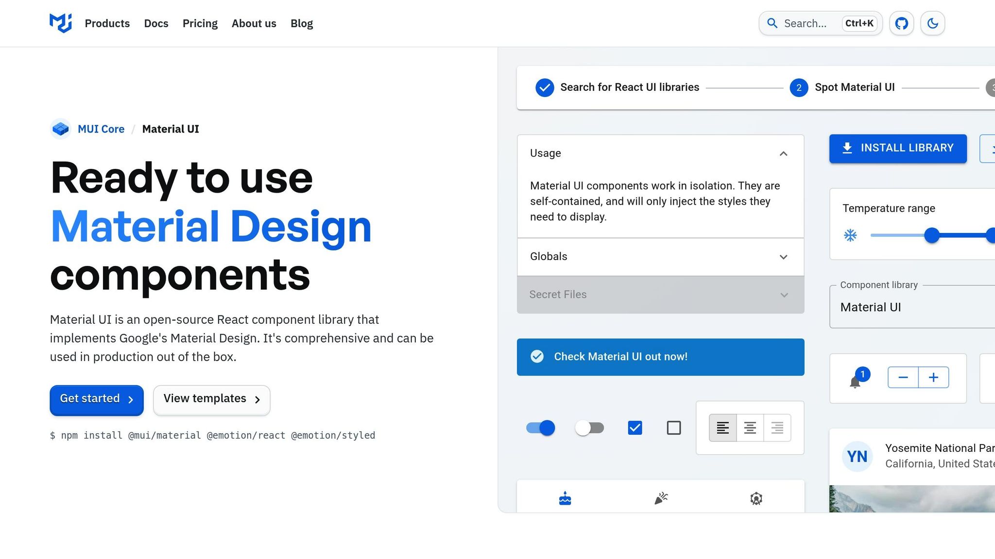
Material UI is a React-based library inspired by Google’s Material Design principles. With over 90 pre-built components, it’s a go-to choice for web development and can also integrate with React Native for mobile-friendly designs.
A key feature of Material UI is its theming system, which allows developers to customize layouts through a centralized theme object. This system supports CSS-in-JS styling, custom color palettes, typography, and spacing, ensuring consistent branding and user experience across components.
For business applications, the data grid component is a standout. It handles millions of rows efficiently using virtualization and includes advanced features like sorting, filtering, and real-time updates. Additionally, tree-shaking optimization can cut bundle sizes by 30-40%, making it a lightweight yet powerful tool.
TypeScript users will appreciate Material UI’s strong type definitions, which enhance code safety and development speed. Accessibility is also a priority, with built-in features that align with WCAG 2.1 AA standards, ensuring inclusivity without extra effort.
React Native Paper
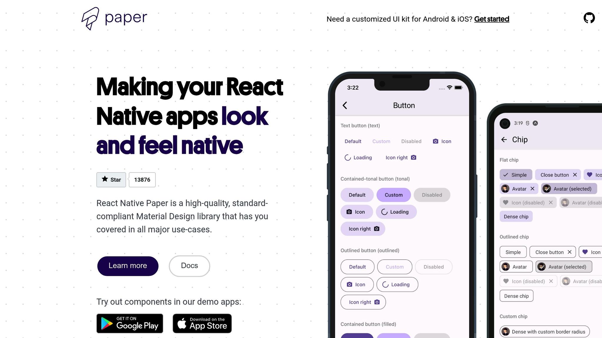
Designed with mobile in mind, React Native Paper brings Material Design principles to mobile app development. It’s tailored for touch interactions, gesture handling, and native performance, making it a strong choice for mobile-first projects.
The library includes 40+ components optimized for mobile, such as floating action buttons, bottom navigation, and modal dialogs. These components adapt to the design language of iOS and Android, ensuring a natural look and feel on both platforms.
React Native Paper also excels in animations. Using React Native’s Animated API and Reanimated library, it delivers smooth transitions at 60 FPS without the performance hit often caused by JavaScript bridges. Customizable themes, including light and dark modes, come standard, with automatic system-based switching for added convenience.
Tamagui
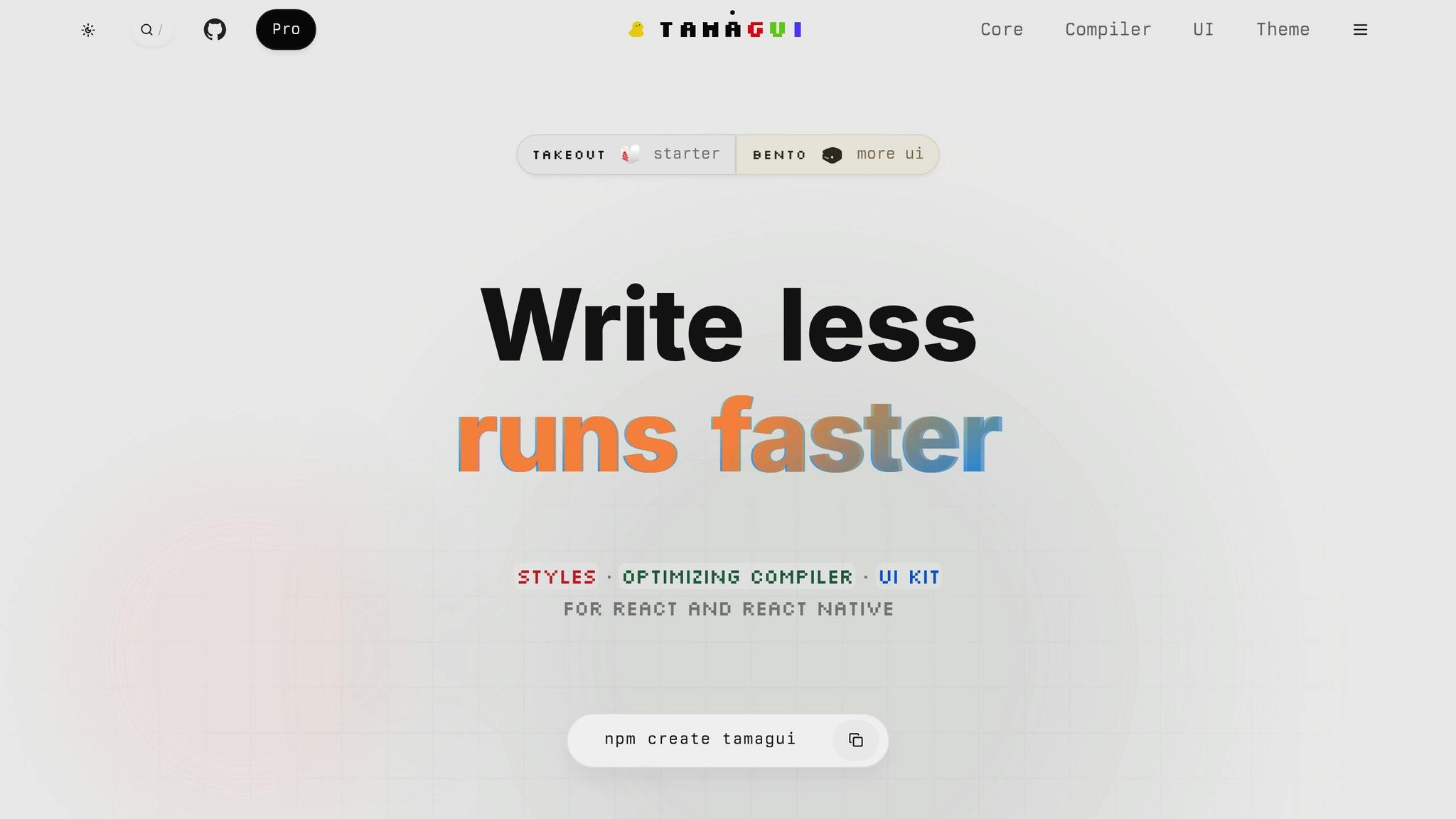
If you’re looking for a library that performs equally well across web and mobile, Tamagui is a strong contender. It achieves this by generating platform-specific code, avoiding the runtime overhead that often plagues cross-platform solutions.
One of Tamagui’s standout features is its compiler, which reduces bundle sizes by up to 50% by eliminating unused styles and optimizing rendering. This approach also enables static extraction, pre-generating styles during build time to improve web load speeds.
Tamagui’s styling system is inspired by Tailwind CSS but tailored for component libraries. Developers can define design tokens once, and the system automatically generates platform-specific styles, simplifying maintenance across platforms.
The library offers primitive components that act as building blocks for more complex designs. These handle responsive layouts, state management, and accessibility, freeing developers to focus on functionality. Tamagui also supports declarative animations, using CSS transforms for web and native drivers for React Native, ensuring smooth performance everywhere.
| Library | Best For | Learning Curve | Platform Support |
|---|---|---|---|
| Material UI (MUI X) | Web-first applications with mobile adaptation | Moderate | Web primary, React Native secondary |
| React Native Paper | Mobile-first applications | Low | React Native primary |
| Tamagui | True cross-platform applications | High initially, then low | Equal web and mobile support |
Material UI stands out for web projects, React Native Paper excels in mobile development, and Tamagui bridges the gap with optimized cross-platform capabilities. Choosing the right library depends on your team’s expertise, the project’s needs, and the long-term goals of your application. Factors like your existing codebase, familiarity with design systems, and performance priorities should guide your decision.
sbb-itb-539ae66
How to Maintain Consistency Across Platforms
Creating a seamless experience across iOS, Android, and web platforms requires more than just visual alignment. It demands a thoughtful approach to user experience, functionality, and accessibility – elements users expect to work effortlessly, no matter their device. While selecting a reliable UI library is a great start, maintaining consistency across platforms involves a mix of careful planning and the right tools.
Using Design Tokens
Design tokens are the backbone of consistent design systems. They store essential design elements – like colors, typography, spacing, and shadows – as reusable, centralized values. These tokens are often organized into a hierarchy:
- Global tokens: Define universal design values, such as a brand’s primary color or base font size.
- Semantic tokens: Assign contextual meaning to global tokens, like labeling a color as "primary button background."
- Component-specific tokens: Reference semantic tokens to style particular UI components.
This structure allows for quick and efficient updates. For example, changing a single global token automatically updates every related component, ensuring consistency across the entire system. Once you have a unified token system in place, you can tweak components to suit the unique expectations of each platform while maintaining a cohesive design foundation.
Platform-Specific Customizations
Consistency doesn’t mean making everything look identical. Adapting to platform-specific conventions is just as important for creating an intuitive user experience. Each platform has its own interaction patterns:
- iOS apps often rely on tab bars and top navigation bars.
- Android apps might use bottom navigation or navigation drawers.
- Web applications frequently feature horizontal menus or sidebar layouts.
Balancing visual alignment with native design patterns ensures users feel at home on their devices. For instance, date pickers should match the native style of the platform they’re on. Many cross-platform libraries help with this by supporting native UI elements where possible and providing custom solutions when needed, ensuring both familiarity and performance.
Responsive Design and Accessibility
Consistency also means ensuring your app works well across different screen sizes and input methods. Responsive design goes beyond resizing layouts – it’s about rethinking content hierarchy, interaction methods, and information density based on the device and context.
Accessibility is another critical aspect. Features like color contrast, keyboard navigation, and focus management must meet universal standards like WCAG 2.1 AA, while still leveraging native platform capabilities. For example, focus indicators might look different on iOS versus Android, but they should always make it clear which element is active.
At its core, a successful cross-platform application balances flexibility with consistency. It maintains a unified information structure and core functionality while allowing visual design and interaction patterns to adapt to each platform’s strengths and user expectations. This approach ensures a cohesive yet tailored experience for every user.
Using UI Libraries with No-Code Platforms
No-code platforms have transformed app development, making it possible to create professional applications without writing a single line of code. When these platforms incorporate cross-platform UI libraries, they combine visual development tools with design systems, giving you the best of both worlds: simplicity in design and consistency in user experience.
These platforms take care of the technical complexities, such as cross-platform configuration, so you can focus on what matters most – functionality and user experience. They ensure that your UI components render consistently across iOS, Android, and web environments without requiring any manual adjustments.
Setting Up and Configuring Libraries
Modern no-code platforms make integrating popular UI libraries straightforward. They handle technical tasks like version compatibility, dependency management, and build configurations, which traditionally demand a high level of technical expertise.
The process usually starts with selecting a design system from a curated list. Options might include Material Design for an Android-native look, iOS Human Interface Guidelines for Apple-focused apps, or custom systems that work seamlessly across platforms. Once you make your choice, the platform automatically configures the necessary components, making them accessible through its visual editor.
You can set your brand’s colors, typography, and spacing just once, and the platform applies these settings consistently across all components. Many platforms also offer real-time preview capabilities, so you can instantly see how your design choices will look on various devices. This immediate feedback helps you make better decisions about component selection and configuration without the traditional back-and-forth of coding, building, and testing.
Working with Pre-Built Templates
Platforms like AppInstitute provide pre-built templates tailored to specific business needs. For example, a restaurant template might include pre-configured menu components, ordering workflows, and customer review sections. A fitness app template could come with workout tracking features, progress visualization tools, and social sharing options. These templates ensure a consistent user experience across mobile and web platforms while saving you time.
Starting with these templates offers a major advantage: they help you avoid common design mistakes. By building on a foundation that’s already optimized for cross-platform use, you get layouts with proper spacing, logical information flow, and well-chosen components.
Moreover, these templates serve as a learning tool. They show how individual UI elements can be combined to create cohesive designs. This makes it easier to customize or expand the template to meet your specific needs while maintaining a polished look.
Advanced Component Customization
While templates and pre-configured components cover most needs, some projects demand unique functionality or specialized design elements. For these cases, AppInstitute’s ‘Hire A Pro’ service connects you with professional developers who can extend your app’s capabilities while preserving its no-code foundation.
This service is particularly useful when you need to integrate custom UI components not available in the standard library or implement complex interactions beyond drag-and-drop tools. By blending custom development with the no-code platform, you retain the ease of future updates while achieving the specialized features your app requires.
Custom development might include adding industry-specific components, creating intricate data visualizations, or designing unique interaction patterns that align with your brand. The key is to ensure these custom elements integrate smoothly with the existing design system, maintaining the app’s consistency and quality. This hybrid approach allows you to enjoy the speed and simplicity of no-code development while tailoring your app to meet specific needs, achieving a balance between efficiency and flexibility.
Conclusion
Cross-platform UI component libraries have become crucial for app development, allowing developers and businesses to deliver consistent, polished user experiences across various platforms. Picking the right library is key – one that balances platform compatibility, customization options, and performance.
When evaluating libraries, it’s important to ensure they align with your project’s needs. A poor match could lead to issues like inconsistent user experiences across platforms or performance bottlenecks. Additionally, limited customization options might lead to long-term maintenance headaches that overshadow the initial convenience of faster development. Making the right choice early on sets the stage for smoother integration with modern no-code tools.
Pairing these libraries with no-code platforms, such as AppInstitute, simplifies development by reducing technical complexity while offering strong design systems. This enables businesses to use professional-grade UI components without requiring deep technical skills or significant development resources.
For even greater flexibility, consider combining no-code tools with custom development services. AppInstitute’s ‘Hire A Pro’ service is a great example, providing access to standardized components while allowing for tailored functionality when needed.
Looking ahead, the focus is on solutions that emphasize consistency, efficiency, and accessibility. With the right UI library and implementation strategy, you can create apps that deliver seamless, intuitive experiences across devices.
Whether you’re launching your first app or expanding an existing one to multiple platforms, investing in a well-chosen UI library pays off in user satisfaction, faster development, and simpler long-term maintenance.
FAQs
What should I look for in a cross-platform UI component library?
When choosing a cross-platform UI component library, it’s essential to ensure it can provide a uniform design and seamless user experience across iOS, Android, and web platforms. The library should also offer flexible customization options so it aligns with your app’s branding and functional requirements.
Key factors to keep in mind include performance, how easily it integrates with your existing development tools, and whether there’s an active community to help troubleshoot issues. Also, opt for libraries that are frequently updated and well-maintained to guarantee compatibility with new technologies and long-term dependability.
By weighing these considerations, you’ll be able to select a library that not only streamlines development but also ensures your app looks polished and works smoothly across all platforms.
What are design tokens, and how do they help create consistent app designs across platforms?
Design tokens are reusable variables that define key design elements such as colors, typography, spacing, and animations. Think of them as the building blocks of your app’s visual identity, providing a consistent style across iOS, Android, and Progressive Web Apps (PWAs).
These tokens streamline the process of tailoring your app’s design for different platforms. Since they can be easily translated into platform-specific code, maintaining a unified look and feel becomes much simpler. This approach not only saves development time but also helps deliver a seamless and professional user experience across all devices.
What are the benefits of using a no-code platform like AppInstitute with cross-platform UI libraries?
Using a no-code platform like AppInstitute together with cross-platform UI libraries can make app development much easier and more efficient. It enables you to design sleek, consistent interfaces for iOS, Android, and PWAs – all without requiring advanced coding expertise.
AppInstitute’s drag-and-drop tools and pre-built UI components simplify the design process. These features help save time and ensure your app looks and feels consistent across different devices and operating systems. Plus, even if you’re not a developer, you can build, update, and launch apps with ease.
By pairing the ease of no-code tools with the versatility of cross-platform UI libraries, you can shift your focus to the creative and functional aspects of your app, while minimizing the technical challenges of development.
Related Blog Posts
- How to Build an App Without Coding Skills
- Small Business App Development: Complete Guide
- iOS vs Android: Where to Launch Your App First?
- Best Practices for Mobile App Navigation Menus
Last Updated on September 12, 2025 by Ian Naylor
0 thoughts on “Guide to Cross-Platform UI Component Libraries”