
Microinteractions are small, focused app features that enhance user experience by providing feedback, guiding actions, and minimizing errors. Think of a button that changes color when tapped or a loading spinner during data processing. These details make apps feel polished and user-friendly, especially for no-code platforms like AppInstitute, where you can add these features without coding.
Key takeaways:
- What they do: Confirm actions, reduce uncertainty, and guide users.
- Why they matter: Improve usability, build trust, and add personality to your app.
- How to create them: Use triggers, rules, feedback, and loops/modes via drag-and-drop tools.
Examples include pull-to-refresh gestures, button animations, success/error messages, and swipe actions. Keep interactions simple, consistent, and accessible for the best results. Whether you’re building a booking app or an e-commerce platform, microinteractions can elevate the user experience.
The 4 Components of Microinteractions
Microinteractions are the small, functional moments in your app that make it feel responsive and user-friendly. Whether it’s a button click, a loading spinner, or a notification, these interactions rely on four core elements: triggers, rules, feedback, and loops/modes. Dan Saffer’s Microinteractions: Designing with Details offers a framework that breaks down these components, helping to create seamless and intuitive app experiences. In no-code platforms like AppInstitute, these elements are easily configured through drag-and-drop tools, allowing you to define triggers, set rules, customize feedback, and manage loops or modes – all without a single line of code. Let’s dive into what each of these components entails.
Triggers: Starting the Interaction
Triggers are the starting point for any microinteraction. They kick off the action, whether initiated by the user or the system.
- User-initiated triggers: These include actions like tapping a “Pay $19.99” button, swiping to archive an email, or pulling down to refresh a feed.
- System-initiated triggers: These happen automatically, such as sending a push notification when an order is shipped or displaying an achievement banner when a user reaches a milestone.
In AppInstitute’s no-code builder, you can configure these triggers visually. For example, user triggers might be set as “on tap”, “on form submit”, or “on screen load”, while system triggers could include options like “when data changes” or “when a scheduled event occurs.” These triggers act as the starting point for the next step: defining the rules.
Rules: Defining What Happens Next
Rules determine the logic that follows a trigger. Think of them as the “if–then” instructions that guide the app’s behavior. For instance, “If the user taps Submit and all required fields are filled, then show a success message and navigate to the Home screen”.
In no-code platforms, building these rules is as simple as using visual blocks to set conditions and chain actions. Common examples include:
- Validating form fields before submission.
- Branching workflows based on user roles (e.g., customer vs. admin).
- Adjusting the interface depending on factors like network connectivity.
The goal is to ensure that each trigger leads to a clear and predictable outcome, avoiding confusion for the user. Once the rules are in place, the next focus is on feedback – how the app communicates the result of the interaction.
Feedback: Communicating the Outcome
Feedback is how your app lets users know what happened after they took an action. This can take various forms:
- Visual feedback: Changing button states, showing loading spinners, progress bars, or subtle hover effects to indicate interaction.
- Auditory feedback: Sounds like a soft “ding” for a successful payment or an error tone for invalid input. These should be minimal and respect user volume settings.
- Haptic feedback: A brief vibration during actions like long-pressing or swiping to delete.
In AppInstitute, enabling feedback is straightforward with options like “show toast”, “play sound”, or “vibrate on success.” Immediate feedback is essential to confirm that the app has registered the user’s input. Beyond immediate responses, loops and modes help manage how interactions persist over time.
Loops and Modes: Managing Repetition and States
Loops control how often or how long a microinteraction occurs, while modes adjust temporary states within the app.
- Loops: These dictate persistence, such as keeping a confirmation message visible for a few seconds or throttling a pull-to-refresh action to prevent overuse.
- Modes: These temporarily change the app’s behavior. For example, switching a list into “edit mode” might reveal checkboxes and alter swipe gestures from opening items to deleting them. Similarly, a “do not disturb” mode could silence sounds while still showing notification badges.
In no-code platforms, loops and modes are configured with options like “show until dismissed” or “display once per user.” Modes can be toggled based on conditions, such as displaying editing controls only when “EditMode” is active. These settings ensure microinteractions remain relevant and adapt to user contexts without becoming intrusive.
Types of Microinteractions for No-Code Apps
Now that you’re familiar with the four key components, let’s dive into specific microinteractions commonly used in no-code apps. These design patterns help keep users informed, confirm their actions, and make navigation smoother. Each type has a distinct purpose and can be easily set up in AppInstitute without needing to write any code. By building on the core components, these microinteractions fit seamlessly into your app’s design.
Pull-to-Refresh and Loading Indicators
Pull-to-refresh is that swipe-down gesture you’ve probably used on lists or feeds to refresh content. When you pull down, a spinner or progress circle pops up, signaling that new data is being loaded. This user-triggered action works hand-in-hand with a loading indicator – a visual cue that shows the app is processing something in the background.
Loading indicators help eliminate uncertainty. Instead of staring at a frozen screen, users see a spinner, progress bar, or skeleton screen that lets them know the app is working. In AppInstitute’s drag-and-drop editor, it’s easy to enable these features on list components or data-heavy screens like product catalogs, booking lists, or dashboards. The platform handles the technical aspects for iOS, Android, and Progressive Web Apps, ensuring users get consistent feedback whether they’re syncing data or waiting for an API response.
Button Animations and Hover Effects
Buttons are the bread and butter of any app, and microinteractions make them feel alive. For example, a button might change color when pressed or display a subtle ripple or scaling effect. On desktop or Progressive Web Apps, hover effects – like a shadow appearing or the button slightly lifting – hint that the element is clickable before the user even taps it.
These visual cues provide instant feedback, making interactions more engaging. With AppInstitute, you can customize button states (such as hover, press, or disabled) using built-in animations that work across all devices. The editor also lets you tweak colors, add haptic feedback for mobile taps, and ensure primary call-to-action buttons stand out – all without touching a single line of code.
Swipe Gestures and Feedback
Swipe gestures let users perform actions quickly, like swiping left to delete a notification or right to archive a message. The key to making this intuitive is pairing the gesture with clear feedback. For instance, as the user swipes, the card might slide to reveal contextual icons – such as a trash can or checkmark – along with matching colors. Once the swipe is completed, the card disappears or moves, and a toast message appears offering an “undo” option.
This interaction feels natural because it mimics real-world movements. In AppInstitute, you can set up swipe gestures on list-based screens like task lists, user management, or notification feeds. The platform’s gesture settings allow you to define different behaviors for swiping left versus right, add animations like fade-outs or slide-outs, and even include haptic feedback for a more tactile experience.
Success and Error Messages
Success and error messages are essential for communicating outcomes after users perform actions like submitting a form, making a payment, or updating their profile. A success message might appear as a green toast notification with a checkmark or a quick confetti animation. On the other hand, error messages often include a red icon, a shake effect, and clear text explaining what went wrong (e.g., “Invalid email address” or “Required field missing”).
Inline validation takes this a step further by checking fields as users type and flagging errors in real time, which reduces frustration and prevents form abandonment. With AppInstitute, you can configure success and error states using drag-and-drop modals, toasts, or push notifications. For critical flows like e-commerce checkouts or service bookings, adding a celebratory animation on success reinforces a sense of accomplishment and encourages users to continue. Just remember to keep these animations short – under two seconds – and make them accessible by including both text and icons, rather than relying solely on color cues.
Adding Microinteractions with AppInstitute
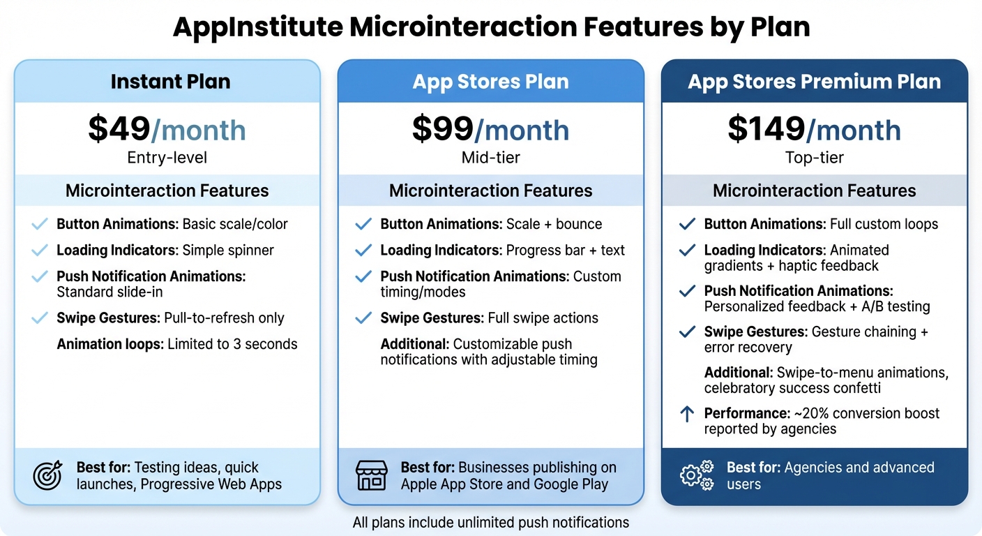
AppInstitute Pricing Plans: Microinteraction Features Comparison
AppInstitute makes integrating microinteractions into your app a breeze with its user-friendly editor.
Using the Drag-and-Drop Editor
With AppInstitute’s drag-and-drop editor, adding microinteractions is straightforward. Start by selecting a UI element – like a button, list, or form field – from the template library. Then, use the animation panel to assign triggers, such as tap or hover. For example, you can set a button to slightly scale up when tapped or change colors when hovered over in a Progressive Web App.
The properties panel allows you to fine-tune feedback. You can add a bounce effect to confirm a tap or display a progress spinner while data loads. The editor’s preview feature lets you instantly see how your microinteractions will look on iOS, Android, and PWA views without needing to publish or switch devices. This real-time preview makes it easy to adjust timing, colors, and animations until they’re just right.
For more complex gestures, like swipe-to-refresh or tap-and-hold, simply drag a gesture-enabled component onto your canvas and configure its behavior in the properties panel. Want to create a reaction menu similar to Facebook’s emoji options? Enable the tap-and-hold gesture and choose from AppInstitute’s animation options. You can even set up system triggers – like push notification arrivals – to activate modals or celebratory animations, creating a polished and seamless user experience.
These tools simplify the process, making it easy to build engaging microinteractions tailored to your app’s needs.
Microinteraction Features Across AppInstitute Plans
AppInstitute offers three pricing plans – Instant, App Stores, and App Stores Premium – each with varying levels of microinteraction capabilities.
- Instant Plan ($49/month): This entry-level plan includes basic button animations, such as hover glows, simple loading spinners, and tap feedback optimized for Progressive Web Apps. It’s perfect for testing ideas or launching quickly, though custom animation loops are limited to three seconds.
- App Stores Plan ($99/month): This mid-tier option adds scale-and-bounce button effects, progress bars with text, and customizable push notifications with adjustable timing. It’s ideal for businesses publishing on Apple’s App Store and Google Play, offering enhanced feedback for actions like form submissions or checkout flows.
- App Stores Premium Plan ($149/month): The top-tier plan offers advanced features, including full custom animation loops, animated gradients with haptic-like visual feedback, and personalized push notifications. It also supports A/B testing for different microinteraction styles, gesture chaining, and error recovery flows. Agencies using this plan have reported conversion boosts of around 20% thanks to premium features like swipe-to-menu animations and celebratory success confetti.
| Feature | Instant ($49/mo) | App Stores ($99/mo) | App Stores Premium ($149/mo) |
|---|---|---|---|
| Button Animations | Basic scale/color | Scale + bounce | Full custom loops |
| Loading Indicators | Simple spinner | Progress bar + text | Animated gradients + haptic feedback |
| Push Notification Animations | Standard slide-in | Custom timing/modes | Personalized feedback + A/B testing |
| Swipe Gestures | Pull-to-refresh only | Full swipe actions | Gesture chaining + error recovery |
All plans include unlimited push notifications, helping you keep users engaged. Whether you’re running a restaurant app or a booking service, AppInstitute’s microinteraction features ensure your app feels polished and responsive across all devices.
sbb-itb-539ae66
Best Practices for Microinteraction Design
Building on the basics discussed earlier, these best practices help turn microinteractions into smooth, user-friendly experiences. When done right, microinteractions feel almost invisible – they guide users effortlessly without drawing attention to themselves. The trick is knowing when to include them and how to keep them focused on helping users complete tasks quickly and without confusion.
Keep Microinteractions Simple
Simplicity is key. Microinteractions should be quick and subtle, lasting no more than 300–500 milliseconds to maintain their unobtrusive nature. Stick to one clear motion, like a fade or slide, to communicate both the action and its outcome instantly. Every interaction should clearly signal the result of the user’s action.
If users need extra instructions or experience delays, the microinteraction is likely too complicated. For common actions like button taps or form submissions, aim for transitions between 150–300 milliseconds. Use slightly longer feedback – up to 500–700 milliseconds – for scenarios like loading states, where users need reassurance that progress is being made.
Once you’ve simplified the interaction, ensure it directly supports your app’s main purpose.
Match Microinteractions to Your App’s Purpose
Microinteractions should align with the primary tasks users expect from your app. For example, a loyalty app might use a subtle confetti animation or a badge pulse when points are added, reinforcing the rewarding experience that keeps users engaged. A booking app, on the other hand, benefits from clear progress indicators or real-time validation during multi-step reservations, helping users feel confident that their booking was successful.
For local business apps, focus on lightweight interactions like small toasts or icon state changes for things like opening hours, order status updates, or map directions. These keep the app mobile-friendly without interrupting users with full-screen modals.
When selecting animations, aim for those that answer one of three questions: “Did that work?”, “What do I do next?”, or “Is something wrong?” For example, a restaurant app could use visual cues to update a digital stamp card, while a salon booking app might display confirmation screens with status labels that adjust when appointments are confirmed or rescheduled. These interactions should feel purposeful, not just decorative.
Test Microinteractions with Real Users
To ensure your microinteractions work as intended, run usability tests with 5–8 users on key flows like bookings, rewards, or sign-ups. Ask participants to think aloud as they navigate the app, and watch for signs of hesitation, repeated taps, or confusion about what happened after an action. These observations can highlight unclear feedback or missing elements that need attention before launch.
Track metrics like completion rates, time spent on tasks, and error rates to verify that feedback is clear and effective. Features like inline validation and clear error messages can reduce mistakes and prevent users from abandoning forms. Behavioral improvements – like fewer repeated taps, less back-and-forth navigation, and fewer support tickets about unclear outcomes – indicate better microinteraction design.
With tools like AppInstitute’s drag-and-drop editor, you can quickly tweak timing, messages, or animations based on test results. Preview changes across iOS, Android, and PWA views without needing to republish, making it easy to refine your app’s responsiveness and usability. By iterating based on user feedback, you ensure that microinteractions enhance the overall experience.
Common Mistakes to Avoid
When designing microinteractions for your no-code app, it’s easy to overdo it or make decisions that disrupt the user experience. Even with the convenience of drag-and-drop tools, which allow for complex effects, adding animations without a clear purpose can lead to a cluttered and confusing interface. By understanding common mistakes, you can create apps that feel polished and intuitive.
Using Too Many Microinteractions
Too many animations can overwhelm users and make your app feel chaotic. Stacking multiple effects – like hover animations, loading indicators, and success messages – on the same screen can create unnecessary cognitive load and slow down performance. For example, combining large parallax motions with bouncing buttons, animated backgrounds, and looping loaders all at once results in visual noise that distracts users from their tasks.
The solution? Keep microinteractions purposeful. If you can’t explain the reason behind an animation in one sentence – like “indicates the button was tapped” or “shows the form is processing” – it’s better to remove or simplify it. Stick to three to five microinteractions per screen, focusing on essential feedback, such as button states or validation messages, rather than decorative elements. Tools like AppInstitute’s editor let you preview your app across iOS, Android, and Progressive Web Apps (PWAs), helping you spot performance issues before they impact users.
Inconsistent Design Patterns
Inconsistent behavior – like one button bouncing on hover while another only changes color, or error messages appearing differently across screens – can confuse users and make your app feel disorganized. This unpredictability can lead to hesitation, errors, and a steeper learning curve.
To avoid this, standardize your microinteractions at the component level. Define how primary and secondary buttons should behave in all states – resting, hovering, pressed, and after an action – and apply these rules consistently throughout your app. Use a uniform motion language: if panels slide in from the right on one screen, they should do the same everywhere. AppInstitute makes it easy to create reusable components with consistent triggers, rules, and feedback. Regularly test your app to catch any inconsistencies and ensure a seamless experience.
Consistency not only simplifies user interactions but also builds trust and reinforces predictable, user-friendly patterns.
Ignoring Accessibility
Microinteractions that rely solely on visuals or haptic feedback can alienate users with visual, motor, or auditory challenges. Overlooking accessibility not only limits your app’s audience but also risks violating WCAG standards. For instance, haptic feedback without a visual or audio alternative won’t work for users who are deaf, and hover effects without keyboard navigation can exclude those who don’t use a mouse.
To make your app inclusive, avoid using color alone to indicate states – add icons or labels as visual aids. Pair haptic feedback with visual confirmations, and include captions for sound-based cues. Respect user preferences, like “Reduce Motion”, by offering simplified effects such as fades instead of sweeping movements, or instant state changes for users with vestibular disorders. AppInstitute’s drag-and-drop editor includes WCAG-compliant features, such as focus indicators, alt text for animations, and mode toggles, ensuring accessible design across iOS, Android, and PWAs without requiring custom code.
Conclusion
Microinteractions – like button states, loading indicators, and success messages – play a big role in improving clarity and efficiency. They help users feel confident by reducing uncertainty, confirming actions, preventing mistakes, and guiding them seamlessly without adding unnecessary complexity. For small businesses and agencies creating apps, these small details can lead to real benefits: higher user retention, better task completion rates, fewer support tickets, and stronger app store reviews. Here’s a quick look at the essentials of effective microinteraction design.
Key Takeaways
Great microinteractions are built on four main components: triggers, rules, feedback, and loops/modes. These principles, discussed earlier, form the foundation of engaging no-code app design. For example, you can set a button tap to show a spinner while data loads, display a checkmark when a booking is confirmed, or make a card snap back when a swipe is canceled. AppInstitute’s templates already include smart defaults for things like confirmation screens and error messages, and you can easily tweak colors, icons, and timing to match your brand across iOS, Android, and Progressive Web Apps.
Some of the most valuable microinteractions to focus on include: pull-to-refresh and loading indicators (to ease anxiety during wait times), button animations and hover effects (which signal interactivity), swipe gestures with clear feedback (like a card sliding off-screen or snapping back), and success or error messages with inline validation (to confirm actions and prevent errors). Keep these interactions simple, quick, and subtle – every movement should solve a problem or add value. Consistency is key: ensure buttons behave the same across screens, maintain strong contrast for accessibility, and avoid relying solely on color or sound to convey information.
Next Steps for AppInstitute Users
Now that you understand the basics, it’s time to improve your app’s user experience. Start by identifying a critical flow, like login, booking, or checkout, and pinpoint moments where users might feel uncertain. Add or refine microinteractions at these points: a loading indicator while data loads, a success message after a form submission, or an inline error hint for validation issues. Use AppInstitute’s drag-and-drop editor to set up triggers and feedback, then test your updates on real devices to make sure the timing and performance feel right. Ask yourself: Does every tap result in a visible change? Does every wait show progress? Does every success or failure provide a clear message?
Keep refining your microinteractions over time. Whenever you add a new feature, screen, or flow, think about what the user will see, hear, or feel. With AppInstitute, making adjustments is simple and low-risk – you can roll out small updates, monitor user feedback and engagement, and fine-tune as needed. This ongoing attention ensures your app stays modern, responsive, and in tune with user expectations as your product and audience grow.
FAQs
How do microinteractions improve the user experience in no-code apps?
Microinteractions play a key role in enhancing the user experience in no-code apps by providing immediate feedback that feels natural and intuitive. For instance, a quick animation triggered by tapping a button can confirm an action, cutting down on confusion and improving clarity.
These small design elements also help guide users through your app by drawing attention to important features or offering subtle prompts, which makes navigation easier and more fluid. Beyond functionality, microinteractions bring a touch of personality and charm to your app, making it more engaging and leaving a lasting impression on users.
What are the essential elements for designing effective microinteractions in no-code apps?
Creating great microinteractions hinges on a few essential elements that enhance user experience:
- Triggers: These are what kick off the microinteraction. They might be something the user does, like tapping a button, or an event initiated by the system, such as a notification popping up.
- Feedback: It’s all about showing users what just happened. This could be a button changing color when pressed or a message confirming their action was successful.
- Simplicity: Keep it straightforward. Animations and interactions should feel natural and stay minimal, ensuring they add to the experience without overwhelming or distracting.
When these elements come together, they create a smooth, engaging flow that keeps users connected and satisfied as they navigate your app.
How can I make sure my app’s microinteractions are accessible to everyone?
To make your app’s microinteractions accessible, start with inclusive design principles. Ensure visual cues are clear and that color contrast meets readability standards. Include alternative text for visual elements, so users with visual impairments can understand the content. Also, make sure your app supports keyboard navigation, which is essential for users who don’t rely on a mouse. Lastly, test your app’s compatibility with screen readers to ensure it works seamlessly for those who are visually impaired.
Focusing on accessibility doesn’t just benefit users with disabilities – it improves the overall experience for everyone.
Related Blog Posts
- Best Practices for Mobile App Navigation Menus
- How to Automate User Onboarding in Apps
- Drag-and-Drop Design Principles for Beginners
- 10 Mobile App Onboarding Tips for Small Businesses
Last Updated on December 18, 2025 by Becky Halls
0 thoughts on “Ultimate Guide to Microinteractions in No-Code Apps”