
Your app’s navigation is the key to a smooth user experience. If users can’t find what they need quickly, they’ll leave. For no-code mobile apps, navigation design is easier than ever with tools like drag-and-drop editors. Here are 8 navigation types to consider, each with specific strengths:
- Hamburger Menu: Saves screen space, ideal for apps with lots of content.
- Bottom Navigation Bar: Keeps essential features easily accessible, great for frequent use.
- Tab Bar: Simplifies switching between core sections, best for 3–5 options.
- Navigation Rail: Slim vertical sidebar, perfect for tablets or wider screens.
- Gesture-Based Navigation: Swipes and taps for a cleaner interface, ideal for modern apps.
- Bottom Sheets: Slide-up panels for secondary actions or details.
- List-Based Navigation: Vertical menus for apps with many categories.
- Full-Screen Menu: Displays all options clearly, suitable for content-heavy apps.
Each type serves different needs, from saving space to improving usability. For example, hamburger menus work well for secondary features, while bottom nav bars excel at one-handed use. No-code platforms like AppInstitute make these styles simple to implement, letting you focus on user experience.
Quick Tip: Combine styles for better results, like pairing a bottom nav bar with a hamburger menu for secondary options.
“We’ve found that the best navigation choice usually isn’t the most creative one – it’s the one users understand instantly. Familiar patterns consistently outperform clever designs in real usage.” Ian Naylor Founder of AppInstitute
Types of Navigation | 5 Most Used Navigation Style

sbb-itb-539ae66
1. Hamburger Menu
The hamburger menu, a concept first introduced by Norm Cox in the 1980s for the Xerox Star workstation, is a clever way to save screen space by tucking away secondary features. Fast forward to today, and it’s one of the most widely used navigation patterns, especially in mobile apps.
When you tap the familiar three-line icon (usually located in a top corner), a side drawer or modal menu slides open, showing a list of options. Tap again, and you’re taken to the selected destination. Popular apps like Amazon and Telegram rely on this design to keep primary features front and center while secondary options stay out of the way.
Best Suited Device (Phone/Tablet)
The hamburger menu shines on smartphones, where every pixel of screen space counts. On tablets, however, designers often switch to a navigation rail – a compact sidebar that better utilizes the extra horizontal real estate. For phones, the hamburger menu’s ability to prioritize content over interface elements makes it a go-to choice.
Maximum Menu Items Supported
One of the hamburger menu’s strengths is its ability to handle a larger number of options. Unlike tab bars, which typically limit you to 3–5 items, the hamburger menu can organize multiple categories. To keep it user-friendly, aim to limit each section to fewer than six items to avoid overwhelming users with endless scrolling.
Ease of Implementation in No-Code Platforms
No-code platforms like AppInstitute make adding a hamburger menu incredibly straightforward. With their drag-and-drop editor, you can customize the menu’s behavior – whether it slides in, fades, or animates at a specific speed – without writing a single line of code. These menus are often pre-built into industry-specific templates, making setup even easier.
Ideal Use Cases
Hamburger menus are ideal for apps with a lot of content or features that don’t need to be front and center. Think news apps, blogs, or utilities where settings, help pages, and other secondary options can stay tucked away. That said, hiding navigation can reduce discoverability, so if you’ve got features users need to access frequently, it’s better to keep those visible.
Next, we’ll dive into alternative navigation styles to see how they compare and when they might be a better fit.
2. Bottom Navigation Bar
The bottom navigation bar is a fixed row of essential icons placed at the bottom of the screen. With no-code tools, this design becomes incredibly straightforward to implement, anchoring key features where users naturally interact. Unlike a hamburger menu, which tucks options away, this approach keeps the app’s main destinations visible and within easy thumb reach. Apps like Instagram, YouTube, and many popular e-commerce platforms rely on this design for its simplicity and convenience.
“Obvious always wins.” – Luke Wroblewski, Product Director, Google
Take Redbooth, for example. When they switched to a bottom navigation bar, they saw a 65% increase in daily active users and a 70% jump in session time. Why? Users could instantly access key features without digging through hidden menus.
Best Suited Device (Phone/Tablet)
Bottom navigation bars are ideal for smartphones because they align perfectly with the thumb-friendly zone. On the other hand, tablets often benefit from a navigation rail (a vertical sidebar) to make better use of the larger screen space.
Maximum Menu Items Supported
For the best user experience, keep the bottom navigation bar limited to three to five items. Fewer than three makes the interface feel empty, while more than five can cause clutter and make touch targets too small. Research shows that confusing navigation is responsible for 70% of app uninstalls. Both Android and iOS recommend minimum touch target sizes – 48×48 dp for Android and 44×44 pt for iOS – to reduce accidental taps.
Ease of Implementation in No-Code Platforms
No-code platforms like AppInstitute make adding a bottom navigation bar a breeze. Using drag-and-drop editors, you can quickly add icons, reorder destinations, and customize colors and labels. Changes are previewed live, and built-in icon libraries, such as Material Icons or SF Symbols, simplify the process even further.
Ideal Use Cases
Bottom navigation bars shine in apps where users frequently switch between top-level views. For instance:
- E-commerce apps: Home, Categories, Cart, Profile, Search
- Social media apps: Feed, Discovery, Notifications, Profile
- Service/utility apps: Dashboards, Orders, Support, Account settings
The key is to focus on destinations that are equally important. Avoid including rarely used settings or single-function actions.
“In our experience, small navigation changes have a huge impact. When users can reach key actions in one or two taps, engagement improves almost immediately.” David Hall, CEO AppInstitute
Platform-Specific Differences
Here’s a quick comparison of how Android and iOS handle bottom navigation bars:
| Feature | Android (Material Design 3) | iOS (Human Interface Guidelines) |
|---|---|---|
| Standard Height | 56 dp | 49 pt |
| Icon Style | Material Icons / Floating elevation | SF Symbols / Minimalistic |
| Tab Behavior | Typically resets screen state | Retains previous scroll position |
| Text Labels | Preferred for clarity | Often omitted if icons are clear |
When designing, use one-word labels unless the icon’s meaning is obvious (like a house for Home). If users can’t figure out an icon’s purpose within five seconds, replace it. Highlight active states with brand colors or filled icons, while keeping inactive icons in medium contrast to avoid unnecessary distractions.
3. Tab Bar
A tab bar is a navigation tool that usually sits at the bottom of your screen, offering quick access to your app’s key sections. Think of it as a shortcut menu that keeps essential features – like Home, Search, or Profile – easily reachable within the “thumb zone” for convenience [14, 19].
To keep things simple and user-friendly, aim for 3–5 items in your tab bar. Adding more can make the interface feel cluttered. If your app needs more primary destinations, consider using a hamburger menu instead.
“It is not advisable to have more than 5 tab bar items in your tab bar. Each additional tab increases the complexity of your app, which makes it harder for users to locate information.” – Jovin Liew, Mobbin
Best Suited Device (Phone/Tablet)
Now that we’ve covered the basics, let’s talk about which devices are best suited for tab bars.
Tab bars are designed with smartphones in mind. On tablets, where screens are much wider, navigation rails are a better fit as they make better use of the extra space.
Ease of Implementation in No-Code Platforms
No-code platforms like AppInstitute make adding a tab bar incredibly easy. With their drag-and-drop tools, you can customize a tab bar in minutes. Simply choose the tab bar option from the navigation settings, add icons, edit labels, and arrange the tabs in the order you prefer. The platform takes care of the coding, so you can focus on showcasing your app’s most important features [2, 20].
Ideal Use Cases
Tab bars shine when you need to give users constant access to top-level sections. For instance, Spotify keeps it simple with just three tabs – Home, Search, and Your Library – offering a clean and focused music discovery experience. On the other hand, Google Maps on iOS uses a five-item bottom navigation bar (Explore, Go, Saved, Contribute, and Updates) to handle its broader feature set while keeping navigation straightforward. Reserve the tab bar for features your users will rely on the most.
“Navigation is rarely ‘done’ at launch. Tracking how users move through the app showed us which items belonged in the main menu and which ones were better hidden or removed.” David Hall, CEO AppInstitute
4. Navigation Rail
A navigation rail is a vertical sidebar menu – usually positioned on the left – that takes up a slim portion of the screen, typically between 52dp and 72dp wide. This design allows the main content to remain visible alongside it, making it a great alternative to bottom navigation bars, especially on larger screens.
One of the standout features of the navigation rail is its capacity for menu items. While bottom navigation bars are best limited to 3–5 items to avoid overwhelming users, a navigation rail can comfortably display 3 to 7 primary destinations without feeling cluttered.
Best Suited Device (Phone/Tablet)
Navigation rails shine on tablets and devices with wider screens. They’re also particularly effective in landscape mode, where the extra screen width makes them highly practical. However, for phones in portrait mode, a bottom navigation bar is often the better choice, as it’s easier to use with one hand.
Ease of Implementation in No-Code Platforms
No-code platforms like AppInstitute make incorporating a navigation rail straightforward. With drag-and-drop tools, you can easily add and customize the rail to fit your app’s design. These platforms also let you preview the navigation rail’s appearance, ensuring it integrates smoothly with your app’s content across different screen sizes and orientations.
Ideal Use Cases
Navigation rails are particularly useful in apps with a lot of content, such as reading apps, news platforms, or productivity tools. A great example is Gmail’s desktop version, which uses a persistent sidebar to provide quick navigation while maintaining plenty of space for content. They’re also effective in apps that adapt their navigation style – switching from bottom bars in portrait mode to side rails in landscape.
Next, we’ll dive into another navigation pattern that takes user interaction to the next level.
5. Gesture-Based Navigation
Gesture-based navigation takes interaction to the next level by replacing or complementing traditional button-based methods with intuitive touch gestures like swipes, pinches, and long-presses. For example, instead of tapping a button to delete an email, you can simply swipe left. Instead of clicking a back arrow, a swipe from the screen’s edge does the trick. These gestures mimic natural movements, making them feel more intuitive.
This approach also clears up screen space. By removing visible buttons and menus, gesture navigation creates a cleaner, more immersive experience where the app’s content becomes the main focus. This is especially important given that 49% of users rely on just their thumb to navigate mobile apps, and poor navigation can lead to a 40% increase in bounce rates.
“Gestures are not just actions; they are the bridge between users and technology, transforming touch into intuitive, emotional, and efficient interactions.” – Ananga Thapaliya, Senior UI/UX Designer, Codebridge
Apps like Instagram use horizontal swipes to move between stories and a double-tap to like posts, creating a smooth browsing experience. Gmail speeds up inbox management with swipe-to-archive and swipe-to-delete gestures. Tinder, on the other hand, made “swipe right to like” a defining feature of its app, turning it into a part of its brand identity. This fluid interaction style works well across different devices.
Best Suited Device (Phone/Tablet)
Gestures are effective on all touch devices but are especially critical for smartphones and wearables, where screen space is limited. They’re perfect for one-handed use, which is key since mobile devices accounted for over 58% of global web traffic as of 2025. Tablets also benefit from gesture navigation, particularly in apps that are heavy on content, like news readers or photo galleries.
Ease of Implementation in No-Code Platforms
No-code platforms make it surprisingly easy to integrate gesture navigation. Tools like AppInstitute offer drag-and-drop editors for adding gesture interactions, while platforms like Emergent, Adalo, and OutSystems provide pre-built components that support native gestures.
However, discoverability is crucial. Since gestures are invisible by nature, use onboarding tips or subtle animations to show users how to interact with your app. At the same time, always include button alternatives for essential functions. As Vxplore Technologies puts it, “Invisible should never mean inaccessible”.
Ideal Use Cases
Gesture navigation shines in apps where users need to quickly browse through information. Social media apps, photo galleries, email clients, and news feeds all benefit from swipe-based interactions. Task-oriented apps like to-do lists also make good use of gestures, allowing users to swipe to complete or delete tasks – saving time compared to multiple taps.
It’s also a great fit for apps focused on fast content discovery, like dating apps where users swipe through profiles or shopping apps where customers browse products. Just make sure to follow platform-specific conventions – like swiping left to delete on iOS or swiping from the edge to go back on Android – and ensure gestures remain consistent throughout the app.
6. Bottom Sheets
Bottom sheets are panels that slide up from the bottom of the screen to show extra content, actions, or options without pulling users away from their current view. A great example is Google Maps, where a bottom sheet displays details like photos, reviews, and directions, all while keeping the map in view. This approach keeps users grounded in their current context, making navigation more intuitive.
These sheets can work in two ways: as persistent elements that remain partially visible or as modal overlays that appear temporarily. They can also scroll to reveal more information without cluttering the main interface. Many retail apps use bottom sheets for features like shopping carts or quick-buy options, allowing users to adjust item quantities or choose shipping preferences without leaving the product page.
Best Suited Device (Phone/Tablet)
Bottom sheets are especially effective on smartphones because they align perfectly with the thumb zone, making them easy to use with one hand. While they can also function on tablets, their design is most practical and user-friendly on smaller screens where reachability is key.
Ease of Implementation in No-Code Platforms
No-code platforms make adding bottom sheets a breeze. For instance, AppInstitute provides a drag-and-drop editor where you can integrate bottom sheets by selecting custom screen modules or choosing “Bottom Sheet” as a transition style for pop-ups. You can easily customize colors, labels, and icons without needing to write any code. Just ensure that all interactive elements meet the minimum touch target sizes – 44×44 points for iOS and 48×48 dp for Android – to avoid accidental taps. This level of customization ensures the bottom sheet fits smoothly into your app’s navigation design.
Ideal Use Cases
Bottom sheets shine when displaying contextual actions or secondary information without interrupting the user’s workflow. They’re perfect for tasks like eCommerce checkouts, file option menus, search filters, or “More” menus that expand your app’s navigation. They also work well for progressive disclosure, where advanced options stay hidden until needed, keeping your interface clean and simple. For example, many eCommerce apps use bottom sheets for checkout options, streamlining the shopping experience. By integrating bottom sheets thoughtfully, you can maintain a user-friendly design while enhancing functionality.
7. List-Based Navigation
List-based navigation organizes menu items in a vertical layout, making it easy for users to scroll through options naturally. This approach shines when dealing with longer labels, like “Guidelines While Sailing”, or when presenting a large number of menu items. You’ll often find it in hamburger menus or full-screen overlays, where secondary features can be neatly tucked away without overwhelming the primary interface. This style also works seamlessly on mobile devices, keeping everything tidy and user-friendly.
“The solution suggests displaying links one by one, letting users follow a regular flow from top to bottom.”
– Nataly Birch, Web Designer and Developer, Designmodo
Best Suited Device (Phone/Tablet)
This navigation style is particularly effective on mobile phones, taking advantage of intuitive vertical scrolling to make the most of small screens.
Maximum Menu Items Supported
Unlike tab bars, which usually accommodate only three to five items, list-based navigation can handle longer, scrollable menus. To maintain usability, try not to go beyond three levels of navigation depth. If you’re using accordion-style (drop-down) lists, aim for fewer than six items per section to avoid overwhelming users with excessive scrolling.
Ease of Implementation in No-Code Platforms
Adding list-based navigation is straightforward with no-code tools. Platforms like AppInstitute provide drag-and-drop editors, allowing you to insert list modules without any coding. You can easily tweak colors, labels, and icons using pre-designed templates and visual editors. To improve readability, consider including small icons next to each label, helping users quickly identify different sections.
Ideal Use Cases
This navigation style is perfect for apps with a lot of information or categories that require detailed menu labels. It’s commonly used in settings screens, product catalogs, sub-menus, or for less frequently accessed areas like support or account preferences. For a cleaner interface, you can hide the list behind a hamburger menu, keeping these options accessible but out of the way.
8. Full-Screen Menu
Full-screen menus take over the entire display, putting navigation front and center. This design approach uses the available space to clearly present a range of options. Typically, these menus are triggered by a hamburger icon or a specific gesture, keeping the primary interface uncluttered until users need to dive deeper. This style is particularly useful when you have more than five main categories, which would be too much for a standard bottom navigation bar to handle.
The standout feature of full-screen menus is their visual clarity. With the entire screen available, you can use bold typography, striking images, or even videos to create an immersive navigation experience. Grid-style layouts are especially popular, as they organize options into evenly spaced, touch-friendly sections that are easy to scan. This design reduces distractions and helps users quickly see all the available options, making it simpler to find what they need without endless scrolling.
Best Suited Device (Phone/Tablet)
Thanks to their spacious layout, full-screen menus adapt well across devices. They work particularly well on mobile phones and scale effectively on tablets, where the added screen space can highlight larger visuals or additional content.
Maximum Menu Items Supported
Full-screen menus can handle a large number of links and even deep hierarchies, provided they’re organized thoughtfully. To avoid overwhelming users, it’s important to maintain a clear hierarchy. Use bold fonts, proper spacing, and structured grids to keep everything easy to navigate.
Ease of Implementation in No-Code Platforms
Platforms like AppInstitute simplify the creation of full-screen menus with their drag-and-drop editors. These visual tools allow you to design menus that align with your brand’s style effortlessly. This simplicity makes full-screen menus an excellent choice when you need a layout that offers flexibility without sacrificing ease of use.
Ideal Use Cases
Full-screen menus shine in apps where visuals are a key focus, such as portfolios, restaurants, travel, or creative projects. They’re also a great fit for knowledge-based apps or niche products with multiple subcategories that require a clear and organized structure. Be sure to include a prominent back or close button, as users leave their current screen entirely when accessing these menus and will need an easy way to return. Like other no-code navigation solutions, full-screen menus strike a balance between functionality and visual appeal, aligning perfectly with the goal of creating intuitive, user-friendly designs.
Comparison Table: Navigation Types at a Glance
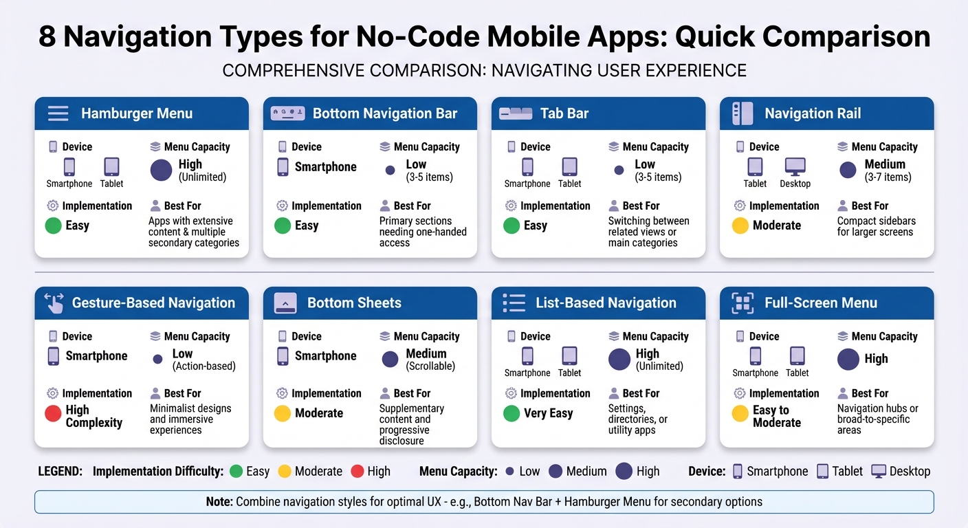
Mobile App Navigation Types Comparison Chart
When choosing a navigation style for your app, it’s essential to consider factors like device compatibility, menu capacity, and how easy it is to implement without coding. The table below provides a quick summary of eight popular navigation types, helping you decide which one fits your app’s needs best.
| Navigation Type | Device Compatibility | Menu Item Capacity | Implementation Ease | Best Use Case |
|---|---|---|---|---|
| Hamburger Menu | Smartphone, Tablet | High (Unlimited) | Easy | Apps with extensive content and multiple secondary categories. |
| Bottom Nav Bar | Smartphone | Low (3–5 items) | Easy | Apps focused on primary sections needing one-handed access. |
| Tab Bar | Smartphone, Tablet | Low (3–5 items) | Easy | Switching between related views or main categories. |
| Navigation Rail | Tablet, Desktop | Medium (3–7 items) | Moderate | Compact sidebars for larger screens. |
| Gesture-Based | Smartphone | Low (Action-based) | High | Minimalist designs and immersive user experiences. |
| Bottom Sheets | Smartphone | Medium (Scrollable) | Moderate | For supplementary content and progressive disclosure. |
| List-Based | Smartphone, Tablet | High (Unlimited) | Very Easy | Ideal for settings, directories, or utility apps. |
| Full-Screen Menu | Smartphone, Tablet | High | Easy to Moderate | Navigation hubs or guiding users through broad-to-specific areas. |
For apps with 3–5 primary sections, bottom navigation bars and tab bars are standout options. As Nick Babich highlights:
“Don’t use more than 5 options in a tab bar”.
This keeps touch targets large enough for users, with a recommended minimum size of 10mm by 10mm for mobile screens.
If your app requires more extensive menus, hamburger menus, list-based navigation, and full-screen menus are great choices. These styles support vertical scrolling or hidden drawers, making them perfect for content-heavy apps. Platforms like AppInstitute even offer drag-and-drop tools to streamline their integration.
On the other hand, gesture-based navigation is ideal for sleek, minimalist designs but often demands custom animations and triggers, which can add complexity in no-code environments. Meanwhile, navigation rails make excellent use of extra screen space on tablets, offering a clean and organized layout.
For complex apps, combining navigation styles can be a smart strategy. For example, you might use a bottom nav bar for your top 3–5 features and pair it with a hamburger menu for secondary options.
Conclusion
When deciding on a navigation style, consider factors like the volume of content, user behavior, and the type of devices your audience will use. For example, if your app has 3–5 main sections, a bottom navigation bar or tab bar ensures users can access everything with a single tap. On the other hand, apps with a lot of content might benefit from hamburger menus or list-based navigation to keep the interface clean and organized.
The goal is to make users feel in control. As Digital Doughnut explains, “Good navigation design makes it effortless for you to move between the different screens of an app, it is intuitive and makes you feel in control the whole time”. Following the three-level rule – where users can access any content within three taps – is a great starting point. Also, test your navigation flow thoroughly on actual devices before release. Combining navigation styles can also be a smart way to address diverse user needs.
For instance, pairing a tab bar for primary features with a hamburger menu for secondary options like account settings or support can be highly effective. Adding a search bar is another great way to help users quickly find content, especially when screen space is limited.
If you’re looking for an easy way to implement these navigation patterns, AppInstitute’s drag-and-drop editor simplifies the process. The platform optimizes your app for multiple devices and lets you preview changes instantly. You can even try it risk-free with a 30-day free trial, starting at $49 per month. This lets you focus on crafting a seamless user experience without getting bogged down by technical details.
Whether you’re creating a restaurant app, a fitness tracker, or a business directory, nailing the navigation is crucial for delivering a great user experience. Start by understanding your users’ needs, and let the right tools take care of the rest. A well-thought-out navigation design can transform your app’s usability and leave a lasting impression.
FAQs
How can I choose the best navigation style for my app?
Choosing the right navigation style for your app comes down to its structure and how users will interact with it. If your app has three to five main sections, a tab bar or bottom icon menu is a great choice. These options keep essential features within easy reach, especially for thumb navigation. On the other hand, for apps with more categories or complex hierarchies, a hamburger menu or nested grid can help organize additional options in a way that feels clean and uncluttered.
Think about how often users will need to access certain features. Frequent-use areas should have persistent navigation, like a tab bar, while tools that are used less often can be tucked into a side menu. Also, consider the overall design of your app. Icon-heavy menus can add a visual flair that complements a bold brand identity, while text-based lists might be a better fit for apps that focus on data or functionality.
Don’t forget to test your navigation choices with real users. Tools like AppInstitute’s drag-and-drop builder make it easy to create prototypes and gather feedback on usability. This step ensures your navigation not only meets user expectations but also supports your app’s purpose effectively.
Can I use multiple navigation styles in my no-code app?
Yes, you can mix different navigation styles in your no-code app, but it’s crucial to do so carefully to keep the experience clear and user-friendly. Usually, one navigation style – like a bottom tab bar – serves as the main way to access key sections, while others, such as side menus or in-page tabs, handle more specific navigation tasks.
Here are a few tips to create a seamless experience:
- Keep it simple: Stick to two or three navigation styles to avoid overwhelming users.
- Be consistent: Use the same icons, colors, and typography across all navigation elements to maintain a unified look.
- Define roles clearly: Assign specific purposes to each style. For instance, a bottom tab bar can highlight core features, while a side menu can house settings or less frequently used options.
With AppInstitute’s drag-and-drop builder, adding multiple navigation styles is straightforward and doesn’t require coding. For example, you can include a bottom navigation bar for primary sections, a side menu for additional features, and tabs within specific pages – all while keeping your app easy to navigate.
What are the advantages of using no-code platforms for designing app navigation?
No-code platforms make designing app navigation straightforward with drag-and-drop editors. These tools let you visually create and tweak menus, tab bars, and other navigation features in real time – no coding required. The result? A quicker, simpler way to build user-friendly navigation systems.
Many platforms also offer pre-built templates based on tried-and-true navigation patterns. These templates save time and ensure your design feels familiar and intuitive to users. On top of that, no-code platforms handle cross-platform compatibility, so your navigation works effortlessly on iOS, Android, and Progressive Web Apps – without additional development work.
By incorporating common navigation elements like hamburger menus or tab bars, these tools prioritize accessibility and consistency. They follow touch-friendly design standards, making buttons and menus easy to interact with. Plus, their visual workflows allow non-technical team members to review and refine designs collaboratively, cutting down on delays and minimizing costly revisions.
Related Blog Posts
- Best Practices for Mobile App Navigation Menus
- Guide to Cross-Platform UI Component Libraries
- Checklist for Accessible Mobile Navigation
- Ultimate Guide to Drag-and-Drop App Design
Last Updated on January 23, 2026 by Becky Halls
0 thoughts on “8 Navigation Types for No-Code Mobile Apps”