
Progressive Web Apps (PWAs) combine the best of web and mobile apps, offering offline access, push notifications, and installation on home screens. To ensure PWAs work seamlessly across devices, responsive design is critical. Here’s what you need to know:
- Why It Matters: A responsive PWA adapts to smartphones, tablets, and desktops. With 53% of users abandoning sites that take over 3 seconds to load, optimizing for speed and usability is essential.
- Core Principles: Start with a mobile-first approach, prioritizing key features for smaller screens. Use flexible layouts (CSS Grid, Flexbox) and media queries to adjust for various screen sizes.
- No-Code Options: Tools like AppInstitute simplify PWA creation with drag-and-drop editors, starting at $49/month, making it accessible for small businesses.
- Performance Optimization: Techniques like adaptive loading, image optimization, and smart caching (e.g., stale-while-revalidate) improve user experience and offline functionality.
- Testing: Use tools like Lighthouse and real device testing to ensure usability across browsers, devices, and screen sizes.
Responsive PWAs not only improve user satisfaction but also boost metrics like engagement and conversion rates, as seen with Twitter Lite (75% more tweets) and AliExpress (104% higher conversions). By focusing on speed, usability, and accessibility, you can create PWAs that perform well across all devices.
“We’ve seen that most PWA issues don’t come from missing features – they come from layouts that simply don’t adapt well to smaller screens. Responsive design is what turns a PWA from ‘usable’ into something people actually enjoy using.” Ian Naylor, Founder of AppInstitute
Building Responsive PWA Layouts
Starting with Mobile-First Design
Designing with a mobile-first mindset means focusing on the essentials. When your starting point is a small screen, there’s no room for clutter or unnecessary extras. As Luke Wroblewski, author of Mobile First, puts it:
“Mobile devices require software development teams to focus on only the most important data and actions in an application. There simply isn’t room in a 320 by 480 pixel screen for extraneous, unnecessary elements. You have to prioritize.”
This constraint forces you to create cleaner, faster Progressive Web Apps (PWAs). Start by ensuring core functionality works universally, using basic tools. Then, build on that foundation with advanced features like push notifications or offline sync for devices that support them.
The performance payoff is huge. Since Google prioritizes mobile-first indexing, the mobile version of your PWA directly impacts search rankings. Plus, designing for mobile ensures your app performs well on devices with limited resources.
To get started, always include this viewport meta tag in your HTML:
<meta name="viewport" content="width=device-width, initial-scale=1"> Without it, mobile browsers might display your PWA at a default desktop width (usually 980px), making users pinch and zoom to navigate.
“In our experience, responsive design has a direct impact on engagement. When a PWA feels natural across devices, users stay longer, interact more, and are far more likely to return.” Becky Halls, Strategist at AppInstitute
Using Flexbox, Grid, and Hybrid Layout Systems
Modern CSS tools like Flexbox and Grid make it easier than ever to create layouts that adapt to different screen sizes. Flexbox works best for one-dimensional layouts, such as navigation bars or button groups. By adding flex-wrap: wrap, elements automatically move to the next line on smaller screens – no need for extra breakpoints.
CSS Grid takes layout control further, especially for two-dimensional designs. A popular technique, known as “RAM” (Repeat, Auto, Minmax), allows you to create responsive card grids without relying on media queries. For example:
grid-template-columns: repeat(auto-fill, minmax(200px, 1fr)); This setup adjusts the number of columns dynamically based on the available space.
For a more versatile approach, combine Grid and Flexbox. Use Grid for the overall structure (like headers, sidebars, and main content) and Flexbox for aligning items within those grid areas. This hybrid system simplifies managing complex layouts while keeping your code organized.
Jen Simmons, Graphic Design Advocate at Mozilla, calls this approach intrinsic design:
“You can really make the layout be intrinsic to the content that we have and the design that we want to do.”
Instead of designing for specific screen sizes, this method lets the content determine its layout based on available space. This flexibility is especially important for PWAs, which might appear in unexpected formats – like desktop “mini-mode”, where apps can shrink to windows as small as 200×100 CSS pixels.
Creating Fluid Grids with Flexible Units
To maintain responsiveness, steer clear of fixed pixel values. Instead, use relative units like percentages, rem, vw (viewport width), and vh (viewport height). These units adapt naturally to different screen sizes. The fr (fractional) unit in CSS Grid is another powerful tool, distributing available space proportionally across grid tracks.
For typography, mix rem with viewport units using calc() to create text that scales smoothly. For instance:
font-size: calc(1.5rem + 4vw); This approach respects user zoom settings while ensuring your text adjusts fluidly across devices.
Media elements like images and videos also need attention. Applying max-width: 100% ensures they scale down within their containers without exceeding their natural size or causing layout issues. When defining breakpoints, use rem or em instead of pixels. This ensures your layout adapts to the user’s font settings and zoom preferences.
With smartphones accounting for 48.92% of all web traffic and holding a 64.25% market share, these techniques are crucial. Flexible layouts not only improve usability but also prepare your PWA for touch interactions and navigation patterns, ensuring it works seamlessly across devices.
sbb-itb-539ae66
Adapting Interfaces and Interactions
Designing for Touch Interactions
Touch screens don’t allow hovering, so any interaction that relies on a mouseover must also work with a tap or click. Hover-only interactions leave mobile users out of the loop. Instead, stick to semantic HTML elements like <button>, <a>, and <input> instead of custom divs. These elements are naturally compatible with touch, mouse, keyboard, and stylus inputs.
When designing buttons and other interactive elements, make sure they’re large enough and spaced properly to avoid accidental taps on nearby items. Bigger touch targets mean better accuracy and smoother navigation for finger-based interactions. The Pointer Events API can simplify your work by providing a single interface that supports all input methods, so you don’t need to write separate code for different devices.
It’s also important to give users immediate visual feedback when they tap buttons or links. This helps reassure them that their action was registered and makes the interface feel more responsive. Avoid disabling zoom by setting user-scalable=no or maximum-scale=1 in your viewport meta tag – doing so can make it harder for users with low vision to zoom in and read content. To prevent accidental text selection during touch interactions, apply user-select: none to buttons and menus, while keeping body text selectable.
Responsive Navigation Patterns
Navigation design needs to adapt to different screen sizes, especially when building on touch-friendly interactions. Bottom navigation works well for mobile devices since thumbs naturally rest near the lower edge of the screen. On wider screens, this navigation can shift to a sidebar or top bar. Hamburger menus are a space-saving option for small viewports but should transition into visible horizontal menus or persistent sidebars on larger displays. Similarly, tabs can help organize content effectively – use scrollable tabs for mobile and fixed grids or sidebars for desktop.
Each section of your PWA should have a unique URL to support deep linking, bookmarking, and content sharing. You can also define a shortcuts member in your web app manifest to create quick links to frequently accessed sections directly from the app icon on the operating system.
For desktop PWAs, which can be resized to very small window sizes (as little as 200×100 CSS pixels), navigation should adapt to offer a “mini-mode” view. This might include simple control buttons or quick actions instead of a full menu. On iOS, when using fullscreen modes like the black-translucent status bar, CSS environment variables can help ensure navigation elements aren’t hidden behind hardware notches or status bar icons.
“Once we tightened up responsive behaviour across devices, support requests dropped noticeably. A well-designed responsive PWA removes confusion before users ever need to ask for help.” David Hall, CEO at AppInstitute
Making Responsive PWAs Accessible
Beyond touch interactions and navigation, accessibility should remain a key focus in your PWA design. High color contrast ensures text is readable for users with visual impairments, and focus states provide clear visual cues for those navigating with a keyboard. Use feature detection with @supports in CSS and object detection in JavaScript to adapt to browser capabilities, instead of relying on unreliable User-Agent sniffing.
Typography should use relative units like em or rem, so text scales according to user preferences. The Web Content Accessibility Guidelines (WCAG) rule 1.4.4 requires that pages remain usable and readable even when text size is doubled. For fluid typography, the CSS clamp() function is a great tool – it allows you to set font sizes that scale between a defined minimum and maximum (e.g., font-size: clamp(1rem, 0.75rem + 1.5vw, 2rem)).
For optimal readability, aim to keep line lengths between 45 and 75 characters. As Robert Bringhurst explains in The Elements of Typographic Style:
“Anything from 45 to 75 characters is widely regarded as a satisfactory line length for a single-column page set in a serifed text face in a text size. The 66-character line (counting both letters and spaces) is widely regarded as ideal”.
To achieve this, use the ch unit to limit container width (e.g., max-inline-size: 66ch) and maintain proportional line spacing with a unitless line-height value like 1.5.
New techniques for responsive design – PWA #02

Optimizing Performance for Responsive PWAs
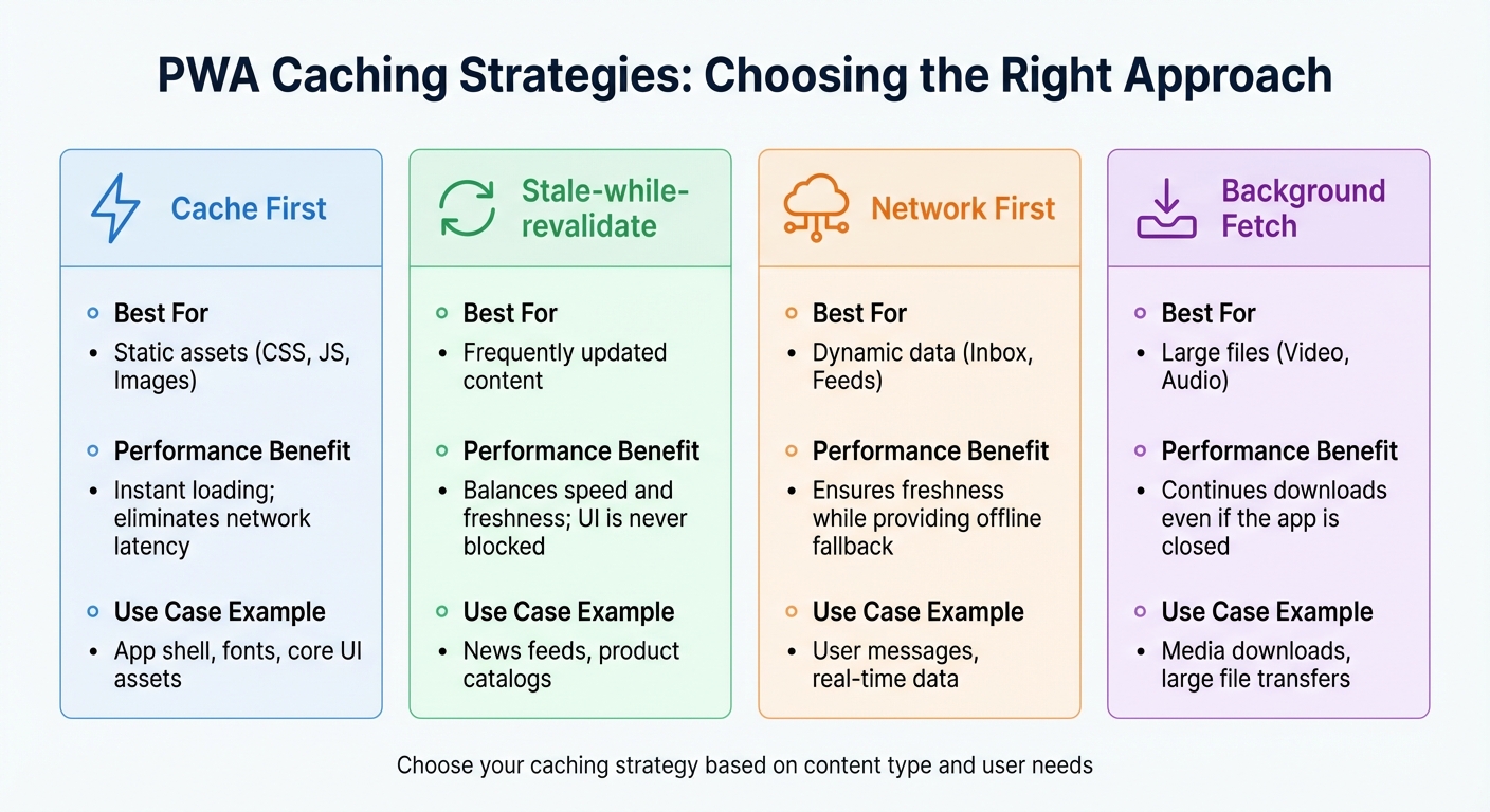
PWA Caching Strategies: Performance Benefits and Best Use Cases
Adaptive Loading and Conditional Rendering
Responsive design goes beyond just resizing layouts for different screens; it’s about tailoring your app’s behavior to match device capabilities and network conditions. This is where adaptive loading plays a crucial role, ensuring users stay engaged with your PWA.
Service workers are the backbone of this approach, intercepting network requests to deliver cached assets immediately. Different caching strategies can be implemented depending on the content type:
- Cache First: Ideal for static assets like CSS, JavaScript, and fonts. This ensures the app shell renders instantly without waiting for a network response.
- Network First: Best for dynamic content like message feeds. It prioritizes fresh data but falls back to cached versions when the network is unavailable.
- Stale-while-revalidate: Offers the best of both worlds by serving cached content instantly while fetching updates in the background.
When setting up your service worker, precache your app shell (key HTML, CSS, and JavaScript files) during the install event. This ensures the interface loads quickly on subsequent visits, even before the PWA is fully installed. Background tasks like Background Sync and Background Fetch further enhance performance by completing uploads or downloads in the background, even during network interruptions. For instance, the Background Synchronization API can defer form submissions or email sends until a stable connection is available.
| Strategy | Best For | Performance Benefit |
|---|---|---|
| Cache First | Static assets (CSS, JS, Images) | Instant loading; eliminates network latency |
| Stale-while-revalidate | Frequently updated content | Balances speed and freshness; UI is never blocked |
| Network First | Dynamic data (Inbox, Feeds) | Ensures freshness while providing offline fallback |
| Background Fetch | Large files (Video, Audio) | Continues downloads even if the app is closed |
Optimizing images alongside these caching strategies can further enhance performance and ensure offline functionality.
Optimizing Images and Media
Images often make up a large portion of a webpage’s load time and data usage. In fact, as of June 2022, images accounted for nearly half of the 2MB median total transfer size of a webpage. Serving desktop-sized images to mobile devices is wasteful, consuming 2–4× more data than necessary.
To address this, use the srcset attribute to provide multiple image versions and the sizes attribute to define display dimensions for different screen sizes. Modern formats like WebP and AVIF can reduce file sizes by over 50% compared to JPEG. For browsers that don’t support these formats, the <picture> element allows you to provide fallback options.
To improve layout stability and avoid Cumulative Layout Shift (CLS), always include width and height attributes on <img> tags. For images below the fold, use loading="lazy" to conserve bandwidth. However, for critical images above the fold – especially those impacting your Largest Contentful Paint (LCP) score – use fetchpriority="high" and avoid lazy loading. Considering that image performance plays a key role in LCP on over 70% of webpages, this step is crucial.
The decoding="async" attribute can further enhance responsiveness by decoding images off the main thread. To prevent images from overflowing their containers, apply CSS rules like max-inline-size: 100%; block-size: auto;. Tools like Lighthouse can help identify optimization opportunities, flagging images that are unnecessarily large or not served in next-gen formats.
Caching and Offline Support
Building on adaptive loading, effective caching strategies not only improve load times but also enable seamless offline experiences. Service workers are vital for this, ensuring assets load instantly on repeat visits.
Real-world examples highlight the impact of smart caching. Pinterest’s PWA saw a 40% increase in time spent on-site and a 60% boost in core engagement metrics by caching static assets with a cache-first strategy and using a network-first approach for dynamic feeds. Similarly, Google Maps uses a stale-while-revalidate strategy for map tiles, delivering quick responses while updating data in the background. For user-specific routes, a network-first strategy ensures data accuracy.
To manage storage efficiently, set limits on cached items – like capping the cache at 75 images or 5 pages – to avoid overloading the user’s device. For users on limited data plans, detect the Save-Data header or monitor network conditions to serve lower-resolution images or placeholders, reducing overall data usage.
Testing and Improving Responsive PWAs
Testing Across Devices and Browsers
Testing your Progressive Web App (PWA) on real-world scenarios is essential to ensure it performs well. Tools like Chromium DevTools, Firefox Responsive Mode, and Safari Web Inspector allow you to simulate various screen sizes, network conditions, and device pixel ratios.
For more precise testing, utilize the Apple Simulator (part of Xcode) for iOS devices and the Android Emulator (from the Android SDK) to create Android Virtual Devices (AVDs). When working with physical devices, remote inspection tools such as WebKit Remote Inspector for iOS and Chromium Remote Debugging for Android let you connect your device to your desktop’s browser tools. Alternatively, services like Samsung Remote Test Lab provide cloud-based access to physical devices.
Make sure to test your PWA on the latest OS version, the previous minor version, and at least one earlier major version. Validate input methods like mouse, keyboard, stylus, and touch across all screen sizes. For desktop PWAs, include tests for “mini-mode”, where windows can shrink to as small as 200×100 CSS pixels.
These steps form the foundation for refining your PWA’s responsiveness over time.
Using DevTools and Checklists to Validate Responsiveness
Once device testing is complete, use browser DevTools to fine-tune your app’s responsiveness. Running Lighthouse audits in Incognito mode can highlight issues like missing viewport meta tags or content that doesn’t fit properly within the viewport.
The Performance panel in DevTools is particularly useful for tracking Cumulative Layout Shift (CLS), which measures unexpected layout movements during rendering. Use the Application panel’s Manifest tab to confirm that your icons are “maskable”, ensuring they display correctly across various operating systems. Simulating slow network and CPU conditions can help you see how your layouts perform on low-end devices and under poor connectivity.
| DevTools Panel | Feature for Responsiveness | Use Case |
|---|---|---|
| Elements | Device Mode | Simulating screen sizes, touch sensors, and orientations |
| Application | Manifest Tab | Checking maskable icons and splash screen configurations |
| Performance | Layout Shifts Track | Pinpointing elements causing visual instability on mobile |
| Lighthouse | PWA/Accessibility Audits | Automated checks for viewport tags and proper content fit |
| Network | Throttling | Testing asset loading on 3G/4G connections |
Enable “Update on reload” in the Application panel to prevent cached CSS from interfering when testing service worker updates. Also, use the “Offline” checkbox in the Service Workers tab to ensure fallback layouts are just as responsive as the rest of your app.
Updating and Refining Responsive Designs
To keep your PWA’s design responsive, adopt a cycle of monitoring, improving, and re-measuring. Use tools like Lighthouse for lab data and Real User Metrics (RUM) from sources such as the Chrome User Experience Report or PageSpeed Insights to understand how users experience your app in real-world conditions.
Prioritize Core Web Vitals like Largest Contentful Paint (LCP), Interaction to Next Paint (INP), and Cumulative Layout Shift (CLS). Modern responsive design must also address desktop PWAs in small windows and evolving devices like foldables and hybrids. Use CSS @supports and JavaScript object detection to enhance the experience for advanced devices while ensuring a functional baseline for others.
Platforms like AppInstitute simplify this process by enabling you to test and update responsive layouts in real time without needing to code. Their drag-and-drop editor allows instant previews across different screen sizes, and their pre-optimized templates save time. This lets you iterate quickly based on user feedback, ensuring your PWA remains efficient and polished across devices. Regularly check your app against the “Core” and “Optimal” PWA checklists to confirm it stays installable, accessible, and reliable for all users.
Conclusion
Creating a responsive Progressive Web App (PWA) means juggling three key aspects: adaptable layouts, intuitive interaction design, and streamlined performance. Tools like CSS Grid and Flexbox make it easier to build layouts that adjust beautifully to any screen size, whether it’s a tiny 200×100 pixel desktop window or the expansive display of a foldable device. But a good layout is just the beginning. Your PWA also needs to handle all forms of user interaction – whether it’s tapping, clicking, or keyboard navigation – and stay functional even when offline.
When designing for mobile screens, where space is at a premium, prioritizing content and features becomes essential. Luke Wroblewski’s mobile-first approach encourages focusing on the most important data and actions, a principle that applies to all responsive design choices. This thoughtful mix of design and functionality is what keeps users engaged.
Performance is equally important. Slow-loading apps can drive users away. By optimizing Core Web Vitals – like Largest Contentful Paint (LCP), Interaction to Next Paint (INP), and Cumulative Layout Shift (CLS) – you ensure a smooth experience. Progressive enhancement plays a crucial role here, making your app functional across all devices while offering advanced features where possible.
While building responsive PWAs might seem daunting, tools like AppInstitute simplify the process. Their drag-and-drop editors and pre-optimized templates let you focus on crafting an excellent user experience without getting bogged down in technical details.
The web’s biggest strength lies in its universal accessibility – over half of all website traffic comes from organic search. By embracing mobile-first design, ensuring offline functionality, and continuously testing, your PWA can offer an app-like experience that’s discoverable and accessible to everyone, no matter their device or connection quality.
FAQs
Why is a mobile-first approach important for designing Progressive Web Apps (PWAs)?
A mobile-first approach starts with designing for smaller screens, ensuring that essential content, navigation, and interactions are simple, efficient, and easy to use. This method naturally leads to cleaner, more intuitive interfaces by cutting out unnecessary elements that could slow down your progressive web app (PWA).
Building with mobile as the foundation also boosts compatibility across devices. Features are added gradually, ensuring they function smoothly across various browsers without disrupting the core experience. On top of that, mobile-first design enhances performance by shrinking asset sizes, streamlining JavaScript, and fine-tuning CSS. The result? Faster load times that can lower bounce rates and keep users engaged. This, in turn, can lead to higher conversions and encourage repeat visits.
Since mobile users make up a large share of web traffic, prioritizing their experience ensures your PWA is both effective and widely accessible right from the start.
What are the best ways to optimize images for better performance in a Progressive Web App (PWA)?
Optimizing images is one of the easiest ways to boost your PWA’s performance while ensuring a seamless experience for users, particularly on mobile devices. Shrinking file sizes and employing smart techniques can make a big difference in how quickly your app loads.
Here’s how you can fine-tune your images:
- Switch to modern formats like WebP or AVIF. These formats keep file sizes small without compromising image quality.
- Resize images to fit the screen by generating multiple versions for various device sizes and serving the most appropriate one.
- Compress images with tools that minimize file size while maintaining visual quality.
- Enable lazy loading to ensure images outside the viewport load only when needed, lightening the initial page load.
- Cache images with a service worker to speed up access for returning users and enable offline functionality.
By applying these techniques, you can deliver crisp, high-quality visuals without slowing down your PWA, keeping users happy on both mobile and desktop.
How can I test my PWA’s responsiveness on different devices?
To make sure your Progressive Web App (PWA) looks great and works smoothly on all kinds of devices, try using a mix of these tools:
- Browser developer tools: Modern browsers like Chrome, Firefox, Safari, and Edge come with built-in responsive design features. These let you simulate different screen sizes, tweak network conditions, and test how users interact with your app.
- Mobile OS emulators: Tools like the Android Emulator (available through Android Studio) or the iOS Simulator (part of Xcode) allow you to replicate real device environments and behaviors.
- Physical devices: Testing on actual smartphones, tablets, and desktops is always a good idea. It helps you double-check touch interactions, font sizes, and overall layout responsiveness.
By combining these approaches, you can ensure your PWA provides a smooth and consistent experience across the wide range of devices people use.
Related Blog Posts
- How To Optimize PWA For Mobile Performance
- How To Optimize PWAs for Search Engines
- Checklist for PWA Performance Before Deployment
- Checklist for Optimizing PWA Caching Strategies
Last Updated on January 23, 2026 by Becky Halls
0 thoughts on “Best Practices for PWA Responsive Design”