

Source: depositphotos.com
Brands have been designing all kinds of landing pages as a digital marketing tactic for a while now.
However, only a few realize that the strategy is only effective when done with their ideal customer in mind.
Research proves that landing pages that address buyers’ fears perform 80% better than those that don’t. Additionally, featuring personalized CTAs rather than default ones can increase conversion rates by 202%.
With that in mind, we’ll help you turn your landing pages into customer magnets that not only catch eyes but hold attention and convert visitors into loyal fans. Let’s get into it.
1. Craft a Captivating Value Proposition
Have you ever stumbled upon a landing page and thought, “This looks nice, but what’s in it for me?”
That’s exactly why nailing your value proposition is like hitting the jackpot in the world of digital marketing. It’s your first (and sometimes only) shot at telling potential customers why they should care.
Your landing page needs to answer that question within seconds. A sharp value proposition cuts through the noise, making it clear why your offer beats the rest. It’s about making them feel understood and showing that you’ve got the solution they’ve been searching for.
Here’s how to get your value proposition right:
- Keep it clear and concise.
If explaining your offer takes longer than 15 seconds, it’s too complicated. - Focus on benefits, not features.
Highlight what your customer gets out of this. Will they save time? Money? Stress? That’s what they care about. - Pinpoint what makes you stand out.
Is it your unparalleled customer service, revolutionary technology, or unbeatable prices? Shine a light on it. - Test, tweak, repeat.
A/B testing isn’t just for emails. Try different versions of your value proposition to see what resonates best with your audience.
Let’s talk about Going, a specialized platform offering airfare deals. Their cheap flights landing page is a masterclass in crafting a compelling value proposition.

Source: going.com
With only a few short sentences, they make it crystal clear what visitors will get – the ability to find the best airfare deals around, plus a tangible savings figure. It’s direct, it’s appealing, and it speaks directly to the customer’s desires.
A/B Testing for Continuous Improvement
A/B testing is a powerful method to fine-tune elements of your landing pages for better results. By comparing two versions of a page, you can determine which performs better in terms of conversion rates.
Focus on testing one element at a time, such as headlines, CTA wording, or images, for clear insights. Even small changes can lead to significant improvements. Companies like Google and Amazon have successfully used A/B testing to optimize user experience, making it a tried-and-true technique for landing pages.
2. Address Your Audience’s Pain Points
When people shop for products or services, they’re looking for solutions to their problems.
You can offer them relief by articulating their challenges and fears better than they can. At the same time, you’re practically selling your product/service. You demonstrate empathy and understanding, making your solution their no-brainer choice.
Here’s how to effectively address your audience’s pain points:
- Do your research.
Dive deep into understanding who your customers are and what keeps them up at night. Use surveys, social media listening, or customer feedback to get there. - Speak their language.
Use words and phrases your customers use. It makes your message more relatable and your solutions more appealing. - Show, don’t tell.
Use real-life scenarios to illustrate how your product or service eases their pain. It makes the benefits tangible. - Offer a clear solution.
After highlighting the pain points, present your product or service as the hero that saves the day. Make the connection unmistakable.
eTraining, an online platform for workplace safety training, excels at this. Their rigging certification training course landing page focuses on demonstrating the benefits and addressing not-so-obvious customer pain points head-on.
For instance, beyond the benefit of compliance, eTraining underlines that its courses are crafted by industry experts.
They’re also addressing the underlying benefits that might not be immediately apparent to all customers – responsive design, ease of use, premium quality, 24/7 customer service, etc.

Source: etraintoday.com
This approach demonstrates a profound understanding of their audience’s broader concerns, making their offer more compelling.
Leveraging Behavioral Targeting
Behavioral targeting involves personalizing landing pages based on users’ past interactions and preferences. This approach can make your content more relevant, increasing engagement and conversions.
Use data from previous interactions, such as pages visited or products viewed, to tailor offers and messaging. When customers feel a page speaks directly to their needs and interests, they’re more likely to take action. Tools like HubSpot and Marketo offer solutions for implementing behavioral targeting effectively.
3. Showcase Social Proof
Decision fatigue is real. With endless options available, customers often look to others’ experiences to guide their choices.
Social proof simplifies decision-making by offering tangible evidence of a product’s value. The fact that 92% of consumers would think twice before buying a product with no customer reviews highlights the role of social proof in the buying process.
Here’s how to excel at showcasing social proof on your landing pages:
- Diversify the options.
Include different types of social proof, such as customer testimonials, expert endorsements, media mentions, or user-generated content. - Go for quality over quantity.
Choose reviews and testimonials that speak to specific benefits or overcome potential objections. - Make it visible.
Place social proof where it’s most impactful, like near CTAs or product features. - Keep it real.
Authenticity matters. Ensure that the social proof is genuine and relatable.
Transparent Labs, a natural sports nutrition supplement brand, utilizes social proof masterfully on their landing page for pre-workout supplements. By incorporating star ratings directly on each product, they offer a quick visual cue of endorsement from their community.
Customers landing on the page can instantly gauge the popularity and effectiveness of the products, easing any hesitations about their efficacy.
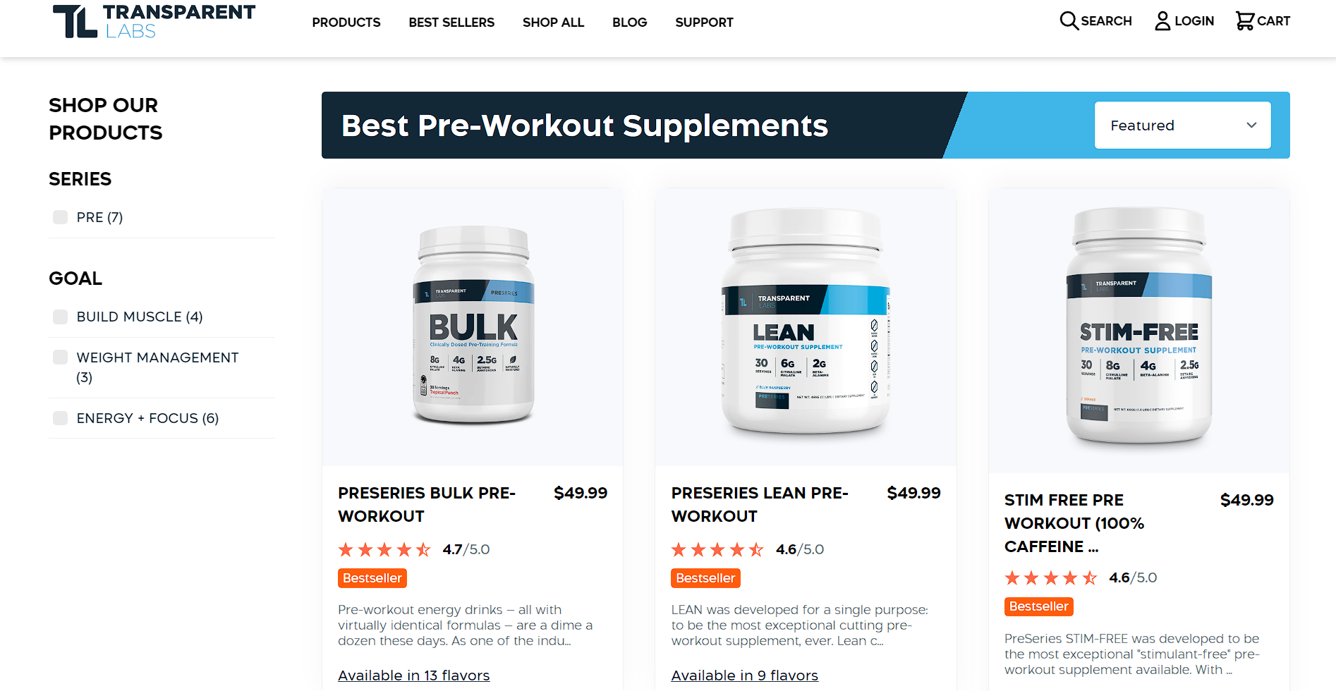
Source: transparentlabs.com
This strategy does more than just flaunt high ratings. It subtly communicates trust, quality, and satisfaction. Moreover, by aligning their social proof with specific products, Transparent Labs makes the selection process easier for customers.
Leveraging social proof should be less about bragging and more about guiding customers toward informed decisions based on collective approval.
SEO Considerations for Landing Pages
Search engine optimization (SEO) is key to driving organic traffic to your landing pages. Ensure your pages are optimized with relevant keywords in titles and meta descriptions.
Use alt text for images to aid search engines in understanding your content. A well-optimized landing page can rank higher in search results, increasing visibility and attracting more visitors. When paired with engaging design and content, SEO can significantly boost your conversion rates.
4. Use Clear Product Images
Visuals play a key role in the decision-making process.
Customers rely on images to gauge the quality, size, and details of a product. They’re the closest thing they get to holding a product in their hands, making them a cornerstone of effective online selling.
When customers see high-quality, clear images, their confidence in the product and their likelihood of purchasing amplifies.
Here’s how to make sure your product images speak directly to your customers:
- Ensure clarity and high resolution.
Allow customers to see product details without squinting or guessing. - Add a zoom functionality.
Ensure customers can zoom in to see the finer details. - Be consistent.
Maintain a consistent style across all product images for a coherent look that enhances the brand experience. - Provide context.
Whenever possible, show the product in use. It helps customers visualize how the product fits into their lives.
Digestive Warrior takes the presentation of their digestive health supplements seriously. On their DesBio page featuring homeopathic remedies, each product is displayed in its genuine form.

Source: digestivewarrior.com
This approach builds trust by showing customers exactly what they’ll get. The clear, detailed images allow customers to feel more connected to the product. They show the product’s texture and packaging and even hint at its ingredients and potential benefits.
Another example is Moto Machines, a company specializing in motorcycle accessories. Their landing page for motorcycle exhausts is a testament to the power of clear product imagery.
Each exhaust system is pictured in full form, offering a clear view of the design, finish, and compatibility with different motorcycles.

Source: motomachines.com
This clarity is invaluable for customers who rely on visual cues to verify the accessory will match their bike’s aesthetic and functional requirements.
This strategy aids the decision-making process and minimizes the risk of post-purchase dissatisfaction.
Importance of Mobile Optimization
With over half of all web traffic coming from mobile devices, optimizing your landing pages for mobile users is more important than ever. A responsive design ensures your page looks great and functions well no matter the screen size.
Mobile optimization isn’t just a nice-to-have feature; it’s a necessity for engaging today’s on-the-go consumers. Make sure buttons are easily tappable, images load quickly, and text is legible without pinching or zooming. Fast load times are also key, as users are likely to abandon pages that take too long to display.
Utilizing Heatmaps for Better Design
Heatmaps are an excellent tool for gaining insights into how visitors interact with your landing pages. They visually represent where users click, move their mouse, and scroll, providing good feedback on user behavior.
By analyzing heatmaps, you can identify which elements attract attention and which are overlooked. This information is a great help for making design tweaks that enhance engagement and conversion. For instance, if your CTA button isn’t receiving many clicks, a heatmap can help determine whether it’s due to placement, color, or other factors.
5. Create Urgency
Creating a sense of urgency is a psychological trigger that nudges customers from “maybe later” to “I need this now.”
It’s a strategy that taps into the fear of missing out, encouraging customers to take immediate action rather than postpone their decision.
When customers see that an amazing deal is about to slip through their fingers, the desire to grab it before it’s gone can override hesitation.
Here’s how to craft more persuasive landing pages:
- Display genuine scarcity.
Ensure that the urgency or scarcity you’re creating is real. Fake countdowns or perpetual “last chance” offers can erode trust. - Set clear deadlines.
Use timers or countdowns to show exactly how much time is left on the offer. It provides a visual reminder that time is ticking. - Highlight benefits.
Emphasize what customers stand to gain by acting now. Pairing urgency with value makes the decision easier. - Create limited offers.
Whether it’s a limited-time discount, exclusive access, or a gift with purchase, make it clear what’s unique about the offer. - Follow through.
If you say an offer ends at midnight, ensure it really does. Consistency maintains credibility.
Hostinger, a web hosting provider, cleverly uses urgency on its cloud hosting landing page. By incorporating a countdown timer that tracks the time left on their current hosting deal, they create a tangible sense of urgency directly above the main CTA.
This strategic placement draws attention to the offer’s time sensitivity. It also subtly encourages visitors to take immediate action. As the timer ticks down, it visually and psychologically emphasizes the brief nature of the deal, making the offer more compelling.

Source: hostinger.com
This approach is effective because it aligns urgency with genuine value. Use it well, and you’ll create a powerful motivation for customers to make a decision, thus enhancing conversion rates and customer engagement.
Final Thoughts
By incorporating these tips into your strategy, you’re building landing pages that feel like entire experiences. You present a story to your customers that feels personal, engaging, and irresistible.
So, go ahead, give these tactics a try, and transform your landing pages from mere digital windows to compelling narratives that convert visitors into loyal customers.
Last Updated on September 14, 2025 by Ian Naylor
0 thoughts on “5 Tips for Creating Customer-Centric Landing Pages (+Great Examples)”