Designing a website for your restaurant is tricky. But the best restaurant websites generally have some common features.
They have high-quality photos and other media. They are also easy to navigate, with menus and important links clearly accessible from all parts of the website. Importantly, they are as easy to view on mobiles as they are on desktop computers.
Restaurant owners have plenty of options for how to best portray their restaurant online. Hopefully, some of the methods websites on this list are using will provide inspiration for your own site.
Impact of Mobile Optimization on Restaurant Websites
Mobile optimisation has become a major factor for restaurant websites. As of 2025, over 60% of online traffic comes from mobile devices.
Customers often search for nearby dining options or make reservations using their phones. Ensuring your website is mobile-friendly enhances usability. Responsive designs adapt to different screen sizes, ensuring information such as menus or contact details are easily accessible.
Restaurants can benefit from increased conversions and improved customer satisfaction by prioritising mobile optimisation.
Restaurants that invest in mobile optimisation often see improved search engine rankings, as search algorithms favour sites that perform well on mobile devices. This change can lead to increased online visibility.
Additionally, mobile optimisation allows websites to offer features such as click-to-call or location services, making it easier for potential customers to engage. With a clean mobile interface, customers are more likely to make reservations or contact the restaurant directly, increasing foot traffic.
Restaurant Website Design Examples
Dishoom
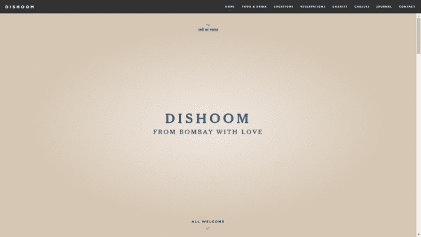
Dishoom is an Indian restaurant with a street food concept. The restaurant’s name and tagline are clearly displayed on the homepage of the website and the concept is well explained with text and relevant pictures.
Customers who already know about the restaurant can easily find links to the menu, different locations, and reservation pages.
Catch Fish and Chips

Catch Fish and Chips’s website uses a compelling animation to tell the restaurant’s story. The animation starts with the image of a fish and shows it being prepared as the user scrolls down.
Alongside it is text explaining how fresh the food at Catch is. It’s a simple yet eye-catching effect that makes this one of the best restaurant website designs.
Paesano Pizza
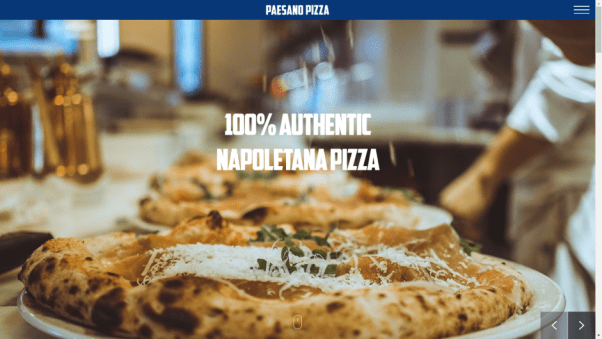
Paesano Pizza’s website uses a scroll-based design with no front page links other than those hidden by the menu bar. The first page is a slideshow with enticing images of pizza being prepared.
As users scroll through the page, they see an introduction to the restaurant, links to the menu, information about the locations, and the Instagram feed.
Bao London

Bao London’s website shows how you can use your website to offer additional services other than just a dining experience.
When you click the cool homepage illustration (or scroll down) you are presented with the option to reserve a table, book a karaoke room, or shop for merchandise.
Casa Vega

Casa Vega uses an engaging video to welcome visitors to the restaurant website. It offers customers a taste of the dining experience they can expect. The dark theme fits the brand well.
Use of High-Quality Imagery and Videos
High-quality imagery and videos play a key role in attracting potential diners. Studies show that websites with engaging visuals can increase visitor engagement by up to 94%.
Investing in professional photography can effectively showcase your restaurant’s ambience and menu items. Videos can further enhance this by offering virtual tours of dining spaces or showcasing the preparation of signature dishes. This visual storytelling helps set expectations, enticing customers to experience it in person.
The strategic use of videos extends beyond virtual tours. Story-driven content, such as a chef discussing their inspiration or the history behind a dish, captures the interest of potential diners.
Such content not only makes your site more engaging but also encourages longer visit durations, which can positively impact search engine ranking. User engagement metrics improve as visitors are more likely to explore the site further when drawn in by intriguing media.
Jeffrey’s Grocery
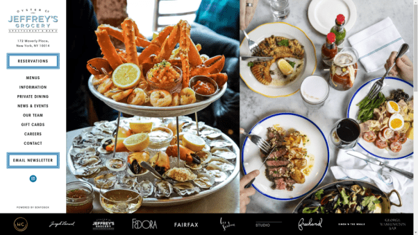
The highlight of the Jeffrey’s Grocery website is the mouth-watering images you see when you first load the website. The food the New York restaurant serves is visually impressive, and the images take full advantage of this.
Plant Miami

Plant Miami is a vegan restaurant that uses pure and sustainable ingredients. The restaurant’s website shows off its food and visitors learn about the restaurant’s dedication to using sustainable local produce.
Cesarina
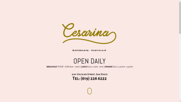
Italian restaurant Cesarina has a clean, simple restaurant website design. It contains just the most important information about the restaurant, a reservation link, menus, and a contact form. Despite its simplicity, the website is well put together and the one page looks great.
Tapeo and Wine

The Tapeo and Wine homepage has all the information you would expect from a good restaurant website design. There is a gallery page which features many simple photos of the food, the restaurant, and the events the restaurant puts on throughout the year.
Circa Brewing Co.
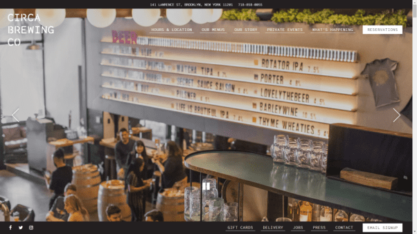
Circa Brewing Co’s website is highly visual. It uses a mix of pictures of food, beer, and the brewing equipment, ensuring there is a focus on all aspects of what the venue does.
The restaurant’s website takes a maximal approach to navigation menus. Links to opening hours, food, menus, jobs, and email signups are visible.
Dinner by Heston Blumenthal

Dinner by Heston Blumenthal’s website contains one page with clear links to the “Menu” and the “About” page. The rotating pineapples in the background is an interesting image that makes visitors want to know more about what is served on the menu.
Eleven Madison Park
The website for New York restaurant Eleven Madison Park includes links to social media, press, and an accolades page. Has your restaurant received any press attention or awards you can display on your site?
Core by Clare Smyth

The Core by Clare Smyth website puts a lot of focus on the input of the chef and other team members. Bringing the chef and other members of staff to the forefront of your website can be a good way to inject some personality into the restaurant.
Importance of User Experience (UX) Design
A well-designed website significantly impacts user experience. Key elements include a simple and intuitive navigation structure.
Visitors should easily access information such as menus, reservations, and location details. Quick load times prevent potential customers from leaving in frustration. Research indicates that even a one-second delay can reduce conversions by 7%.
Consistent branding throughout the website, including colour schemes and fonts, ensures a cohesive experience.
Incorporating feedback mechanisms can further enhance user experience design. Simple surveys or feedback forms allow restaurants to gather insights directly from users, ensuring the website meets customer expectations.
Regular updates in response to this feedback keep the site fresh and relevant. Elements such as accessibility features also ensure inclusivity, allowing all users to have a smooth browsing experience regardless of any physical limitations.
Arbor at H Queen’s

The Arbor at H Queen’s website features a simple menu with an interesting animation. The restaurant’s Michelin Star is displayed prominently.
Little is written about the food, but the concept section builds the restaurant up as a place for relaxation.
Minibar by Jose Andres
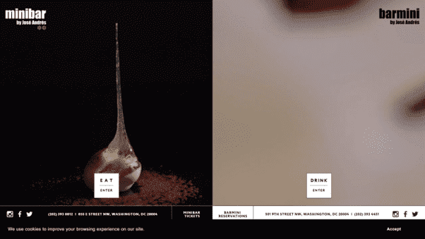
Minibar by Jose Andres gives website visitors the option between “Eat” and “Drink.” Two videos play that show the restaurant and bar’s concoctions being made.
It’s hard to tell what to expect, which gives the viewer the sense that the food at the restaurant will be interesting.
Dialogue
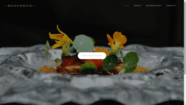
Dialogue has a simple restaurant website design. When visitors reach the site they are greeted with one pageof a single picture and a link to “Purchase tickets.”
There is no menu due to the restaurant’s “market-driven” course format that changes depending on the season.
Quay
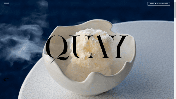
Quay’s website uses great images of the food and the restaurant. All the information you would expect to see is present including an easy-to-navigate reservation page.
At the bottom of the restaurant’s website are links to other restaurants in the Fink group.
Hide

Hide is another fine dining restaurant website design example that doesn’t actually talk much about the food. Instead, most of the pictures are of the restaurant itself. The main link on the site is to “Book a table.”
Daniel
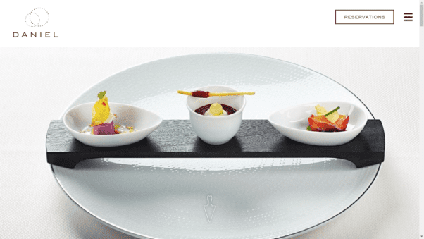
Unlike many of the restaurant websites on this list, especially those that offer fine dining, Daniel’s site has quite a lot going on.
When you first open the website, you’ll see a video. Scrolling down reveals a mixture of images of the restaurant, text, links, and more.
The Dome
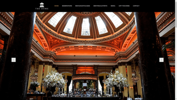
Much of The Dome’s appeal is the building it is located in and the restaurant website does an excellent job of getting this across.
The slideshow at the top of the homepage features stunning shots of the building (including its dome) while scrolling down allows visitors to choose which of the restaurant’s rooms they want to dine in.
Five Guys
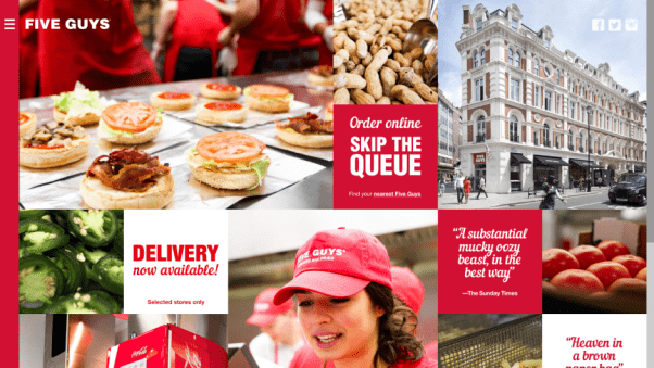
Five Guys’s website design has prominent links for its online ordering function. It also has plenty of pictures that show fresh ingredients, perhaps in an attempt to set it apart from other burger chains. In the top right corner are links to the brand’s social media pages.
Nando’s
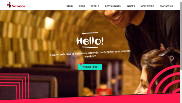
As a global restaurant, the most prominent part of Nando’s homepage is a button that points users to the website for their location.
On the UK version of the website, the main section makes it easy for users to order takeaways for either delivery or collection.
Role of Social Media Integration
Integrating social media into restaurant websites can significantly boost engagement. Platforms like Instagram and Facebook provide a direct line to potential customers, allowing diners to share experiences and promote your brand.
Consider linking your restaurant’s Instagram feed on your homepage. Showcasing user-generated content can create an authentic connection. Some restaurants even offer incentives for customers to take part in social media challenges, encouraging organic promotion of their dishes.
Engaging social media content can also enhance customer loyalty. Restaurants offering behind-the-scenes glimpses or showcasing the team on social channels tend to build a more personable brand image.
This human element can encourage repeat visits and create a community around the restaurant. Furthermore, social media platforms often support targeted advertising, which enables restaurants to reach specific demographics, expanding their customer base efficiently.
Leon

When you enter Leon’srestaurant website you are greeted with a video showing the food being made and highlighting the fresh ingredients.
Other interesting sections of the website include the “Vision” that lays out the beliefs of the chain’s creators and the blog which has a ton of information about the restaurant.
The Taco Stand

The Taco Stand website does many things well including using mouth watering photos and having a prominent “Order Now” button.
The first link on the scroll-down homepage is for its gift card offer. Users can buy either physical gift cards or e-cards and send them to people as gifts.
Pie Face

Pie Face stands out from other restaurants as it carves a smiley face into all its pies. This is a unique visual effect and it is shown in full effect on the website, where there are plenty of pictures of smiley-faced pies.
Pancho’s Burritos
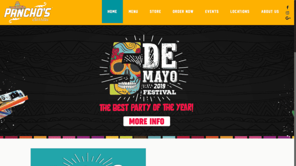
The first image on the well designed Pancho’s Burritoswebsite advertises the restaurant’s Cinco de Mayo event.
Additionally, the website has offers as well as the usual features you’d expect including menus and an online ordering button.
Shoryu Ramen

The top of the Shoryu Ramenwebsite features a video of the restaurant and the chefs preparing food.
This section is overlaid with the restaurant logo as well as “Find a Table” and “Locations” buttons. Just below is a slider that features several different offers that customers can take advantage of.
Luke’s Lobster

The top of the Luke’s Lobster homepage features a slider with images of fishing boats, presumably to reinforce the idea that the restaurant is all about sustainability.
The first slide (at the time of writing) advertises that the restaurant is hiring, showing how you can use your restaurant website in multiple ways.
Dog Haus
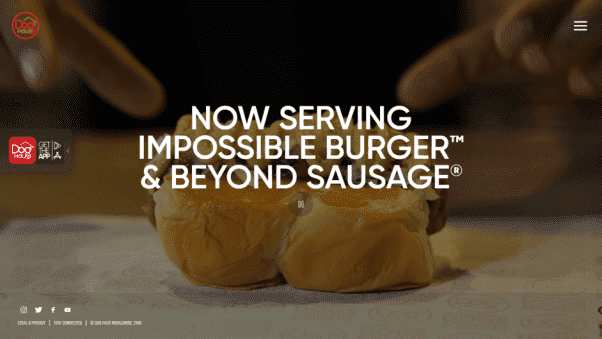
The Dog Haus landing page features a video with text superimposed on top. Links include the social buttons at the bottom of the page and those found within the overflow menu in the top corner. The main link, however, is one encouraging users to download the restaurant’s app.
Homegrown

The Homegrownrestaurant website opens with a video showing farmers working to provide ingredients and the restaurant’s staff preparing food. It is very clear throughout the page that the restaurant uses sustainable ingredients to enhance its customers’ dining experience.
Sustainable Practices Highlighted in Web Design
More diners are prioritising sustainability, making it important to highlight these efforts on restaurant websites. Clearly display your commitment to using locally sourced ingredients and reducing waste.
Some restaurants dedicate sections to explain their sustainability initiatives, such as energy-efficient equipment or composting practices. Others use labels or icons on their menus to indicate eco-friendly dishes.
Communicating these practices not only attracts eco-conscious diners but also enhances your brand’s reputation.
Giraffe
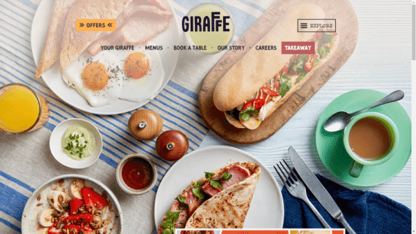
The Giraffe website is eye-catching, and everything from the bright colors to the text is fantastically on brand. The pictures are great, and all the links you need are easy to find. There’s even a tantalizingly clickable “Offers” button in the top left corner of the homepage.
Applebee’s

Applebee’s website automatically updates depending on your location. This ensures customers receive the most relevant information when they visit the restaurant website.
The main image is of the most recent offer which (at the time of writing) is a pretty irresistible deal of $1 margaritas.
RibCrib

The most noticeable thing on the RibCribrestaurant website design is the video in the background featuring high-quality footage of food being prepared.
However, the main reason we chose RibCrib is its effective use of Google Ads. In the example above RibCrib ads show up when you search for “family restaurant” plus a city with a RibCrib restaurant.
Bistro on the Greens

Unlike many of the restaurants in the family section, the Bistro on the Greens website design isn’t trying to appeal to kids.
Instead, the homepage highlights the food, family-friendly facilities, and kids’ play area to appeal to adults.
Bodean’s BBQ
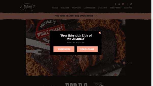
The most eye-catching thing about the Bodean’s BBQ website design is its strong use of social proof.
When customers first load up the site an overlay loads with a quote from Time Out describing the restaurant’s food as the “best ribs this side of the Atlantic.”
Pizza Pilgrims
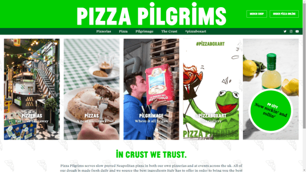
Pizza Pilgrims has a great restaurant website that is unique in that it uses the visible part of the page to show visitors the different menus.
This makes it easy for them to find out the information they need, whether that is finding their nearest pizzeria, seeing the food menu online, or finding out more about the restaurant.
Alice’s Tea Cup
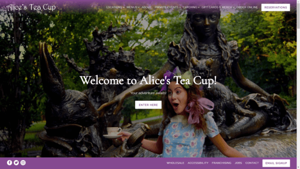
When you first land on the Alice’s Tea Cup page there is almost nothing to suggest the website is for a place that serves food.
Instead, there is a fun image with the caption “Your adventure awaits!” Scroll down further, however, and you’ll see options to make a reservation and information about the food.
Outback Steakhouse

Outback Steakhouse has stuffed its homepage with offers. These include lunch, discounts for military, referral schemes, loyalty schemes, and even a link to a further page dedicated to discounts. There are also links to help visitors find restaurants and order online.
Belgo Bar and Restaurant
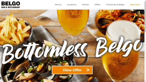
As well as high-quality photos, easy booking, and visible offers, Belgo Bar and Restaurant has a dedicated children’s menu that is displayed on the restaurant website. This comes with a pretty enticing offer that is splashed across the top of the page: “Kids eat free.”
Pizza Hut

At the time of writing, the Pizza Hut website put a huge emphasis on its new menu. As most people already know what to expect from the chain, this could be a good way to get people excited about the food. The website also has a distinctive theme and a dedicated family section.
Cliff House
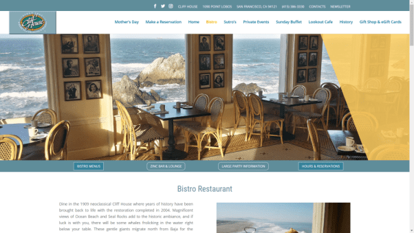
The first thing you’ll notice on the cliff house website is an image of the bistro with some spectacular San Francisco sea views outside the window. This showcases one of the restaurant’s main selling points: it’s fantastic San Francisco beachside location.
Café Angelina

The Café Angelina website focuses on the history of the venue, which is now over 100 years old. The site has both English and French language options which make it easy for the restaurant’s customer base to access.
Barbetta
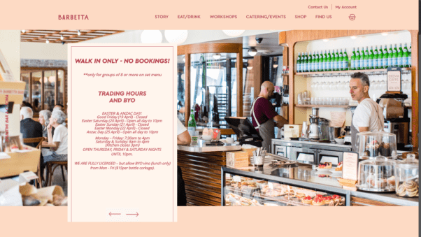
Barbetta’s restaurant website has all the information you need about eating in the restaurant including opening hours, and its BYO policy.
The website also has information about classes as well as a section sharing some of the restaurant’s recipes.
Cat Café

A café with cats is a pretty unique idea. Because of this, Cat Café has a large section on the website where it explains what it is.
The other main link on the homepage encourages people to book in advance if they want to be guaranteed a spot. It is one of the most interesting restaurant website design examples.
Murasaki Chicago
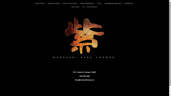
While simple, the Murasaki Chicago website features a distinctive theme that utilizes the restaurant’s logo. The website also has an effective and neat metatag with key SEO search terms that help it show up on Google.
Acme

The Acme website is a one page site that includes a full menu and a virtual tour of the restaurant using VR technology.
It also advertises a special offer for customers visiting the restaurant before heading to the theatre. Online ordering and reservation menus are constantly displayed while scrolling through the site.
Himitsu
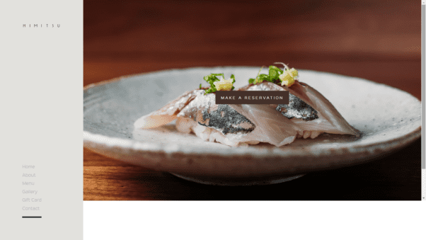
The Himitsu website design uses great photos that show its food in a positive light. It also has an extensive menu section with explanations of the food and the price. Perhaps the most interesting thing is the website’s use of the OpenTable plug-in to run its reservations.
Ellington’s
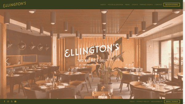
The Ellington’s website has a great mix of quality images and quirky illustrations that highlight the restaurant’s concept well. The website also prominently displays its events and the fact that the space can be hired for private events.
Au Cheval

The Au Cheval website makes use of a scrolling design that features nothing but images of the restaurant and its food.
The only text is the name of the restaurant almost hidden in the bottom left corner. Visitors have to find the side menu if they want to discover anything about the restaurant such as its opening hours, food, or contact details.
Wreckfish
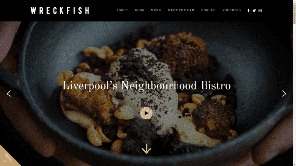
The Wreckfish website opens with great pictures of the restaurant’s food. It then has an introduction to the space and a simple to use reservation tool. Towards the bottom of the page, there is an embedded Google Map of the restaurant’s location.
Restaurant Website Designs: Final Thoughts
That’s the end of our list of the 50 best restaurant website design examples. As you will have seen, the best restaurant websites can be wildly different. There is no one-size-fits-all template that is optimal for all.
Restaurant owners have plenty of options for how to best portray their restaurant online. Hopefully, some of the methods websites on this list are using will provide inspiration for your own site.

One thought on “50 Inspirational Restaurant Website Design Examples”