Even if you are a relatively new internet user, you’re bound to have encountered the term A/B testing, or split testing. It’s hard to miss since we’re no longer just split testing websites, but also online ads, and apps – well, just about anything digital. But chances are you didn’t really pay much attention, which is understandable since many articles approach the topic as if you’re a seasoned professional.
In this guide, I will not only cover what A/B testing is, but also why it is important, and how you can go about setting up your own A/B testing strategy.
Table of Contents
A Brief Explanation of A/B Testing
A/B testing in the digital realm is an adaptation of concepts explored by statistician Ronald Fisher in the 1920s. In the 50s, his randomized controlled experiments were adapted for clinical trials of medicine, and then for marketing in the 60s and 70s – do more customers respond to a marketing postcard or letter? And from the mid-1990s onwards we have been using it for testing certain features of websites, apps, and digital marketing. More specifically, it is now a core principle of any business’s online conversion marketing strategy.
The transition from traditional marketing to digital marketing expanded the use of A/B testing significantly. In the digital space, this method became invaluable for optimizing not only website interfaces but also digital campaigns, email marketing, and mobile apps. As digital platforms evolved, the precision and scope of A/B testing improved, allowing businesses to experiment with nuanced user interactions and rapidly iterate based on solid empirical evidence.
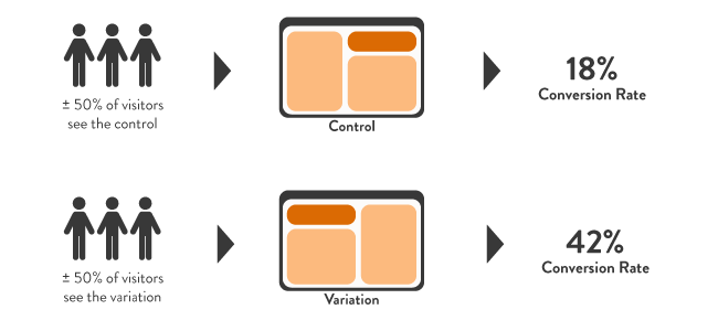
In plain language, an A/B test is little more than a controlled experiment where your online traffic is split evenly between a control and a variation. The control would be the current version of a specific web page, app screen, or digital marketing material. The variation would be almost identical, with one element changed. The purpose is to see which version visitors (or customers) respond to most, ideally with each visitor only ever seeing the control or the variation.
While it is possible to test more than one variation at a time, this should only ever be done on high-traffic pages to ensure you are able to generate statistically valid results. Additionally, only one element should be changed per test; changing more than one element per test will make it harder to determine what change generated the best results.
The Role of A/B Testing
Even with extensive market research, careful analysis of UI/UX principles, and standard best-practices, a lot of what goes into a website or app is guesswork. We assume that what works for others will work for us. We assume that what the results of our market research tell us will apply to the majority of our audience. If we didn’t, all work would stall because of doubt. But if we are smart, we only rely on large-scale assumptions in the beginning. In time, we find ways to turn a cautious “I think” into a confident “I know”. And one of these ways is through ongoing A/B testing, or split testing, various aspects of our website or app. We use A/B testing to replace guesswork and assumptions with fact; with data that conclusively shows that X is better than Y. Or if you want, that A is better than B.
As mentioned earlier, A/B testing should be a core principle of your conversion marketing strategy, allowing you to constantly investigate ways to maximize conversions through your website. In his book “You Should Test That!”, Chris Goward defines conversion optimization as:
the science and art of getting more revenue-generating actions from the same number of visitors.
so while we may often refer to conversion optimization, what we are actually working towards is boosting revenue. This means that the role of A/B testing isn’t just to see whether a red call-to-action (CTA) button generates more clicks than a blue one, it is to determine which button results in better conversions, leading to a lift in revenue.
What to Test
It is possible to run A/B tests on nearly every single component on your website, but your priority should always be on elements that could influence conversions. These could include:
- Email sign-up modals
- Search modals
- Landing page copy and CTA
- Homepage copy and CTA
- Sign-up or account creation flow
- Checkout flow
- All CTAs: text, design (if using buttons), and positioning
- General navigational elements
- Lead form components
- Promotions, both presentation and copy
- Search results
- Pricing structure
- Free vs paid delivery
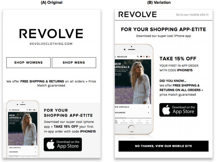
Revolve found that the more aggressive promotion of their mobile app – shown in the variation above – resulted in a 350% increase in app downloads.
You can also test things like your website’s typography (size, font, etc.), color scheme, and secondary images, but these are less important unless you are somewhat sure they are impacting conversions. You should also remember that mobile now accounts for the bulk of all website traffic, so a lot of testing should also focus on optimizing the mobile user experience.
The A/B Testing Process
A/B testing is not a one-off exercise, but should, instead, form part of a continuous improvement cycle. W. Edwards Deming, the father of modern-day quality control, popularised the Shewhart Cycle for continuous improvement of processes and products. This breaks the continuous improvement cycle into four phases: plan, do, check, act, or PDCA. The goal with continuous improvement is to move your business closer to perfect operation. And in the case of A/B testing, it would be to get your website closer to flawless conversion.
But perfection isn’t achieved instantly, which is why A/B testing is not a one-off exercise. And while PDCA adds structure to a continuous improvement cycle, you should still break the cycle down into a stepped process that almost anyone can follow.
1. Collect Data
Once you’ve acknowledged the importance of A/B testing, and accepted that it is something you need to start doing, your first step would be to identify what can be improved through testing and to prioritize the order in which to test. While there might still be some supposition involved in your A/B testing process, we do want some evidence to guide us, and for that, we turn to data.
Web Analytics
Web analytics is an easy place to start with data collection: it is something we all have access to, and since we should already be analyzing it on a regular basis, something we already have a firm knowledge of. And you don’t even need any special tools for this; what you can gather from Google Analytics is quite sufficient. Metrics to look at include:
- Top exit pages (Behaviour>>Site Content>>Exit Pages in Google Analytics) – these are the last pages visitors see before leaving your site. Don’t confuse them with your bounce rate, which indicates visitors who only see a single page before leaving your site. Look at pages with a high number of page views and exits, but consider them too in context to the purpose of the page. Exits on pages that only display after conversion aren’t a problem; you’re interested in exit pages that come before conversions.
- Funnel drop-off rates (Conversions>>Goals>>Funnel Visualisation in GA) – assuming you have properly set up goals in Google Analytics, you’ll be able to see how many visitors actually complete a goal, and how many visitors abandon the process. You’re obviously interested in identifying pages (or steps) in the conversion process where users drop-off.
- Top entry pages (Behaviour>>Site Content>>Landing Pages in GA) – you don’t want to ignore the first page visitors to your site see, particularly if it has a high bounce rate.
In all instances you are looking to identify pages with problems – a high number of pageviews, coupled with a high exit, drop-off, or bounce rate – along with pages you believe could be performing better.
Heatmaps
Web analytics help you to identify problem pages on your website, but they don’t necessarily reveal what the problem might be. Website heatmaps, however, can show you:
- Where people are clicking – every web page has at least one clickable element and many more non-clickable elements. Behavior Flow in Google Analytics shows you how visitors move through your website, but it doesn’t show you where visitors clicked. With heatmaps, you would now have access to this information, including visualization of visitors clicking on non-clickable elements.
- How far visitors scroll on each page – useful for identifying how much of your copy most users see, and whether or not important elements such as your call-to-action are positioned optimally. There’s little value in positioning your call-to-action halfway down a page if only a third of your visitors scroll that far.

Heatmap software like CrazyEgg won’t only reveal what elements your visitors are interacting with on any given page, it can also reveal how far down a page they scroll.
There are several heatmapping tools available, but CrazyEgg is one of the original tools, and also the most affordable for small businesses. You’ll also benefit from a setup that requires zero technical know-how.
Surveys
Brief surveys asking highly specific questions can also give you valuable insights into where customers and visitors encounter problems on your website. These can either be implemented as on-site surveys (capturing input from customers and casual visitors), or an email survey sent to actual customers. Ask questions like:
- Why they visited or used your website?
- Are they always able to complete the task that caused them to visit your site? If not, why not?
- What difficulties do they encounter on your website?
- What features, services, or products they wish you offered?
2. Assign Goals
Once you have collected your data and identified which pages are hampering your conversions or could potentially boost conversions, you need to prioritize them and assign goals to them. Goals will help you decide which page performed better: the control, or the variation. And prioritizing obviously allows you to test according to potential, importance, and ease – the PIE framework.
Potential
These are typically your worst performing pages, pages in your conversion funnel with the highest drop-off or exit rates, or steps in your checkout where most carts are abandoned. Fixing these pages offers the highest potential for improvement, so they should always be your top priority.
Importance
These are pages that attract the most traffic, pages with the highest number of page views. They will also be pages with a high bounce or exit rates. Also included here are pages that cost you the most in terms of attracting visitors. These are landing pages linked to any paid marketing campaigns you have running, from social media marketing to paid search marketing. Any improvements to these pages that increase conversions will also result in a lower customer acquisition cost (CAC).
Ease
The final thing to check when prioritizing your tests is ease. Some tests will be easy to put in place, while others will need some technical know-how: pages that use a content management system (CMS) or e-commerce platform, pages with dynamic content, or even certain sitewide elements like navigation. In larger organizations, there is also the approval process to consider, which smaller businesses often don’t need to worry about.
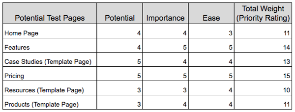
Using a weighting table, assign a value of between one and five to potential, importance, and ease for each page, with a higher value indicating a higher potential, importance, or ease. You will start testing pages with a high total (a maximum of 15) first, working your way down to pages with a low total.
Your goals will – for the most part – relate to increasing conversions, and decreasing drop-offs (or, for e-commerce, abandoned carts). But conversions don’t always follow after a visitor has viewed just one page, so when running an A/B test on any page, you’ll often use:
- Click goals – how many visitors click on specific elements on the control versus the variation? And if a page includes multiple CTAs, which one attracts the most clicks? This helps you determine which page is more successful at moving visitors further along the conversion funnel.
- Visit goals – how many visitors are reaching a predetermined URL? But you aren’t necessarily measuring how many people reach the URL as a landing page, but rather after first visiting other pages on your site.
- Revenue goals – conversions don’t always translate into revenue, so it is important to sometimes measure revenue rather than conversions. An A/B test on an e-commerce site might see the control leading to more visitors registering an account, but the variation results in more actual sales, making the variation more successful than the control.
You cannot run a single A/B test without first identifying the goal of the test.
3. Propose Hypotheses
Earlier in this post, I discussed how A/B tests can be used to replace guesswork and assumptions with fact, but getting there still requires some guesswork. A hypothesis in the context of A/B testing sees you putting forth an assumption that changing an element on a certain web page could lead to more engaged visitors, better conversions, or even higher revenue.
But your assumptions need to be realistic and supported by some evidence. Evidence can be a little hard to produce when you’re just starting out with A/B testing, so look at case studies produced by other brands, and also other pages on your site that are performing well. What tests did other brands run, and what did the results look like? Why are some pages on your website better at conversion than others, and what could be replicated on underperforming pages? In “You Should Test That!”, Chris Goward breaks down six conversion factors to consider when proposing hypotheses:
- Value proposition – Any potential for improving your conversion rate is determined by the strength of your value proposition, which is itself based on your visitors’ perceived benefit and cost of what you are offering. Visitors are motivated to take action when the perceived benefits outweigh the perceived costs, remembering that each person perceives value and cost according to their own set of metrics. Your value proposition needs to be strong – and communicated clearly – for conversion to happen. Changing a page’s copy or layout won’t improve conversions if your value proposition is weak.
- Relevance – How does the page your visitors end up on relate to what they thought they would see? If they clicked on a “Learn more” CTA, does the page they are directed to help them learn more? It probably will if it discusses features and benefits, but not so much if it is a collection of customer testimonials. But relevance isn’t only about the copy, it is also the overall design and layout. They might already be familiar with the layout of your site, and if they suddenly end up on a page that differs too much from what they’ve seen before, they’ll be confused rather than motivated.
- Clarity – Do all the elements on the page complement each other, while reinforcing the value proposition? Does the layout guide the visitor towards the CTA?
- Anxiety – Do the words and elements on a page help establish trust? We inherently trust well-established brands, so show no anxiety in shopping on Amazon, and signing up for one of their newsletters when prompted. But visitors who don’t know your business will be less confident unless you find ways to convey trust in your copy and design.
- Distraction – Visitors are less likely to convert if they are confronted with too many options or too much information to process at once.
- Urgency – Sales and promotions simulate urgency, especially when combined with phrases like “limited time” or “limited quantities”: if we don’t act now, we’ll miss out. But you can’t include “limited” in all your copy, or on all of your offers, though there are other ways of creating a sense of urgency.
It is now possible to go back to the pages we have identified as having the potential to lift conversions, and see which of these six conversion factors are missing, or weak. This might lead you to observe that your pricing page lacks clarity, that there is too much copy at the top of the page, with the pricing options right at the bottom of the page. Your hypothesis would be that reducing the amount of copy could lead to an increase in sign-ups.
A second hypothesis would suggest that positioning the pricing options above the copy would also result in an increase in sign-ups. And your tests would then look to see which page results in more sign-ups, the control, or the variation. It is important when proposing a hypothesis, that you focus on testing one element at a time. Testing more than one change at a time will mean you won’t know for sure which change led to better results, and you’re looking for certainty, not assumptions.
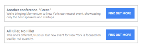
TNW found that just changing the copy led to a 26% jump in visits to their conference page.
A great hypothesis won’t only help you determine what helps lift conversions on one page, it can also reveal new marketing insights that you could test throughout your site.
4. Build Variations
You’re finally at the stage where you’re almost ready to start running your experiments: you’ve collected your data, identify areas with potential, assigned goals, and proposed hypotheses. Most of that relied on information and tools that you, as a small business owner, already had access to. But building variations, running tests, and analyzing results are only possible with specialized solutions:
- Optimizely (No pricing available, but does offer 30-day free trial) – standard plan gives you access to A/B testing, a visual editor for building your variations, and basic targeting and visitor insights.
- VWO (From $49 /mo, with a 30-day free trial available) – similar features to those offered by Optimizely, but includes access to heatmap reports.
- Convert (From $449 /mo, with a 15-day trial available) – although more expensive than VWO, the Plus plan at Convert gives you access to advanced targeting and easy integration with most e-commerce platforms.
- CLOSED:
Google Optimize (Freemium) – as would be expected, the free version of Google Optimize gives you access to a limited set of features but is still a great option for SMBs that are just getting started with A/B testing. You can’t select your own experiment objectives, but you do get access to advanced targeting, and easy integration with Google Analytics. - PageTest.AI (Freemium)
With the advent of AI a new breed of testing tools have arisen, non more prominent than PageTestAI. Mixing code-free implementation, to AI-powered content suggestions and success predictions. This is A/B Content Testing for 2025! - Omniconvert (Freemium) – The “Forever Free” plan of Omniconvert gives you access to more than 100 features, but limits you to no more than 5,000 tested views per month. Not a bad option for anyone just starting with A/B testing, and not concerned about limited segmentation, or the inability to test mobile websites.
- SiteGainer (From 199 € /mo, with a 14-day trial available) – nice robust conversion optimisation tool, with the Startup plan, not only giving you access to A/B testing but also to heatmaps and site surveys.
- AB Tasty (No pricing available, but contact for more information). Features include a full CRO suite (WYISIWYG editor, insights, A/B testing, customer activation, and personalization), advanced reporting, as well as account management for more advanced testing.
Another noteworthy tool is A/B Tasty, which now provides advanced personalization features that help target different audience segments based on behavioral data. This enables more refined testing strategies that can respond dynamically to user preferences. Additionally, tools like Crazy Egg have enhanced their heatmap functionalities, offering deeper insights into user navigation and interaction patterns that complement A/B test findings.
There are other testing tools available, and the one you choose to use should be based on your budget, along with the features you actually need. A good testing tool will include a visual editor, making it easy for you to create variations of your control, with very little technical skill required. What is extremely important is that your control is never changed or modified in any way for the duration of the test. A good testing tool will also make it possible to test variations on a single page, template pages, and site-wide sections (headers, footers, etc.).
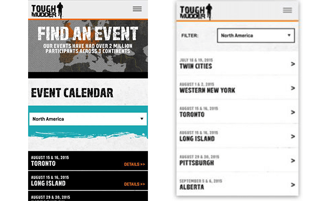
Tough Mudder found that simplifying the event calendar on their mobile site led to an immediate 9% lift in session value. The filter was more compact, but more importantly, they reduced distractions.
Finally, proper implementation of A/B testing should in no way affect your site’s performance in search results. Google does offer some guidelines on what to do when running A/B tests on your website, and you should keep these in mind when building your variations:
- No cloaking. Showing one set of content to humans, and a different set to Googlebot is against the Google Webmaster Guidelines, and this applies even when running a test. Using a good testing tool will ensure you don’t make the mistake of serving a different page when ‘seeing’ the Googlebot user-agent. Doing this could result in your site being demoted or removed from Google search results.
- Use rel=“canonical”. When running an A/B test with multiple URLs, it is better to use the rel=“canonical” link attribute on all of the alternate URLs to indicate that the original URL is the preferred version. Google recommends using rel=“canonical” instead of the “noindex” meta tag because it more closely matches intent in this situation. Using “noindex” instead of rel=“canonical” could have unexpected effects, such as the original URL being dropped from the index because Google sees it as a duplicate.
- Use 302s, not 301s. When running an A/B test that redirects users from the original URL to a variation URL, use 302 (temporary) redirects, not 301 (permanent) redirects. This tells search engines that this redirect is temporary and that they should keep the original URL in their index rather than replacing it with the target of the redirect (the test page).
- Only run the experiment as long as necessary. Once a test is concluded, update your site with the successful variation, and remove all elements of the test as soon as possible, including alternate URLs, testing scripts, and markup. Running an experiment for an unnecessarily long time may result in Google interpreting this as an attempt to deceive search engines, and they may take action accordingly.
As noted earlier, good testing software should take care of most of these points, with you only having to concern yourself with ending the test after an appropriate amount of time and updating your site content according to the test results.
5. Run Your Experiment
Once you’ve built your variations, set up goals for them, and maybe included some custom targeting, you can let the experiment run. From this point on there is very little for you to do aside from waiting for the test duration to end so that you can start analyzing the results. The testing tool you have chosen will ensure that visitors to your site are randomly shown either the control or the variation and that their interactions are measured for analysis.
6. Analyze The Results
Once you have ended a test (see the next section for deciding “How Long to Run Tests”), you need to analyze the results and decide whether the control or the variation performed better and that the results support your hypothesis.
The first thing to consider is statistical significance, which helps you establish whether any differences in performance are real, or the result of chance. The higher the statistical significance is, the more confident you can be that they are genuine, though it is up to you to decide what level of significance you accept.
A lower threshold – for example, 80 percent – allows you to run more tests over a shorter period of time, but also exposes you to a higher risk of errors. The software you choose to run your A/B tests with should include statistical significance in the results they return, along with other metrics that allow you to see which page performed better.
When examining the results, it is important to always view them in relation to the goal (and hypothesis) of the test. If you are testing for a lift in revenue, the successful page is the one that generated the most revenue, not the one that generated the most click-throughs or sign-ups. Sometimes the results will support your hypothesis, and sometimes they won’t, but neither outcome is a reason to stop testing.
Once you have identified an element that results in higher conversions or revenue, you need to look at the rest of the elements on the page and assess them against the six conversion factors highlighted under “Propose Hypotheses”.
Similarly, after running several A/B tests, you might detect a pattern in terms of what changes lead to better results, and these need to be evaluated in relation to the entire site. Because A/B testing is not just about making one change to one page or page template, it is also about discovering deeper marketing insights that could be applied much more broadly.
Finally, it is important to remember that whatever percentage change (or lift) you observe during a test doesn’t always translate into a permanent lift or change of the same scale.
Common Mistakes in A/B Testing
Even seasoned marketers can fall into common pitfalls when conducting A/B tests. A frequent error is using a sample size that is too small to yield statistically significant results. This can lead to incorrect conclusions and misguided strategy adjustments. Another common mistake is making multiple changes in a single test, which complicates the ability to pinpoint what change led to a better outcome. Tests should be focused and meticulously documented.
Another oversight is the testing of biased sample groups. Ensuring that the audience exposed to the test variations is representative of your general user base is essential for obtaining applicable results. Moreover, interpreting test outcomes requires cautious statistical analysis to differentiate between causation and correlation, ensuring conclusions are truly reflective of user behavior and not spurious coincidences.
How Long to Run Tests
There is no magic number when it comes to deciding how long to run each test since there are a number of variables that influence this.
The biggest factor is site (and page) traffic. Tests on pages with a high volume of traffic can usually be shorter since they reach a valid statistical significance sooner. But you also need to factor in that some conversion decisions take a little longer to make, which may result in the performance of both your control and variation converging a few days into the test. Instead of giving up when this happens, allow the test to run for a few more days to see if the results don’t separate again.
You also need to factor in the time of the year (or month) and how this normally influences site traffic and conversions. If you normally see a lift in conversions over month-end or seasonal events (like Christmas), allow the test to run longer over these periods to negate any influence. As a general rule, tests should run for at least 10-days, preferably with two weekends falling within the test period. As long as the test achieves a valid statistical significance within this period.
Tips & Ideas to Get You Started
This post can be a little intimidating if you’ve never paid any attention to conversion optimization and A/B testing, so I’d like to end it with a list of tips and ideas for you to consider. These will hopefully alleviate any anxiety while inspiring you to start taking action and seeing how conversion optimization and A/B testing can benefit your business.
- Test all your CTAs: don’t only test the color of buttons used, but also location, and the copy used. Just not all at once.
- Does your site include trust indicators: customer testimonials, awards, reviews, etc.? If not, would adding them reduce customer anxiety? And if it already does, would changing them result in any impact?
- What impact would larger product images on category pages produce?
- If you show related products with each product detail, would increasing or decreasing the number of products shown impact basket size?
- Would conversions benefit from increasing or decreasing the number of options on any of your products?
- Does your value proposition promote features or solutions? Features are important, but only if your customers can see how the feature will benefit them, how it will address the problem they have.
- Do your lead generation forms perform better when embedded in a page, or appearing as a popup modal?
- Distraction is a very important conversion factor. How can you reduce distraction on any given page? Don’t only consider images, but also the number of links on a page.
- Do your CTAs actually guide visitors towards conversion? If it is a multi-step process, could any of the steps be eliminated or combined?
- Can any steps be eliminated from your sign-up or checkout process? What impact does this have on conversions and revenue?
- What impact does free shipping versus paid shipping have on basket size? Similarly, what changes can you make to your shipping options, and how does this influence basket size?
Over to you
Do you currently have a conversion optimization strategy? Does it include A/B testing? We’d love to hear what changes to your website have resulted in positive lifts to conversions and revenue, and what changes haven’t worked for you.
Once you understand the basic premise of A/B testing, and how your business can benefit, it can be tempting to look at case studies of how other brands have been affected. And there’s nothing wrong with doing this, as long as you don’t view these as examples of best practices to follow without testing it on your own audience. What works for one audience doesn’t always work on another. That’s why we do A/B tests; and why it needs to be an ongoing practice.

Last Updated on February 12, 2025 by Ian Naylor
12 thoughts on “The Ultimate Beginner’s Guide to A/B Testing”