Four best practices to load your mobile website in under 1 second
Performance has never been so important for mobile websites.
In January Google announced that from July onwards, the speed of mobile websites is going to be a ranking signal. This change has been in development for years and now that the rules are being put into place, webmasters around the world are gearing up to join the race to load their mobile websites as quickly as possible on all connection types.
Research indicates that a one-second delay in mobile page load time can result in a 7% reduction in conversions. Furthermore, about 40% of users will abandon a page that takes longer than three seconds to load. Such statistics underscore the importance of optimizing your website’s performance to meet user expectations and retain engagement. By focusing on strategies to reduce load times, businesses can significantly enhance user satisfaction and reduce bounce rates, ultimately impacting their bottom line positively.
For over six years Marfeel has been working to optimise the mobile websites of publishers around the world. Speed is a huge factor for publishers, so we have learned a lot along the way. In this guest post we will share four key techniques that you can apply to your business’ website to get ahead of the crowd and help it to load in under just one second.
Step 1 – No JavaScript or CSS Dependency
Every character in your code adds to the overall weight of your website. Many websites, however, have an unnecessarily high dependency on CSS and JavaScript, making them sluggish and slow to load. When 53% of mobile readers abandon websites that take longer than 3 seconds to load, you need to pull out all the stops to keep your users engaged. The back button is just one tap away.
Eliminating dependencies on JavaScript and CSS is a big step towards giving your users the blazingly-fast experience they demand. This can be done by using above-the-fold styles. Essentially, this means using the minimum possible amount of CSS that is needed to render the first viewports of content that don’t require any JavaScript files to load. You can find a great walkthrough on this technique on css-tricks.
This technique means that your readers will be able to begin reading as quickly as possible. It also improves the quality of that experience by helping to stop content shifting that is caused by elements loading on your page in a random manner.
When it comes to reducing dependency on CSS and JavaScript, this can be an art form that developers work to constantly improve. Take, for example, this thread on Drupal where users are collaborating to reduce dependency on JavaScript to get a toolbar to display in a non-JavaScript context.
One effective method is using asynchronous loading. By adding the “async” attribute to your script tags, you allow the browser to continue parsing the HTML while the JavaScript is being fetched and executed. This reduces the perceived load time and improves the user experience. Similarly, the “defer” attribute can be used, which ensures that your scripts are only executed after the HTML parsing is complete, preventing any render-blocking scripts from delaying the initial page display.
Test Your Performance
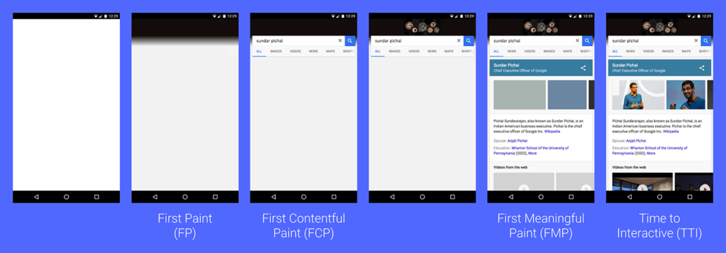
You have probably heard of Google’s PageSpeed Insights tool. Version 4 was recently released, and it uses two critical metrics when determining the score to hand out to websites: First Contentful Paint (FCP) and DOM Content Loaded (DCL).
These scores essentially measure how quickly your website is capable of displaying content that can be consumed in a meaningful way by your audience, which generally means simply reading. In the past, First Paint was used in the place of FCP, but this metric was satisfied by menial changes, such as a change in background colour. This new metric gives us a much more objective way to judge how user-friendly our websites are. You can see in the graphic below how Google defines those metrics.

When it comes to offering a blazingly fast mobile website, you naturally want to be able to achieve the quickest “Time to Interactive” (TTI) possible. This can be done by eliminating dependencies that your mobile website has on CSS and JavaScript.
Step 2 – Optimise Your Resources
When we talk about loading a mobile website in under a single second, we have to save time wherever we possibly can. Publishers traditionally have media-rich mobile websites that include ads, which can introduce latency and contribute to a higher bounce rate.
Is your site also media-rich, with a lot of content and a range of media? Well, efficiently reducing the weight of heavy assets via the latest optimization techniques can mean that you reduce the number of round trips to the server that your user’s device has to make. Depending on where the endpoints are located, this can result in large speed boosts.
The latest optimization techniques include WebP and Brotli.
WebP is an image format that Google is now developing further, after it acquired On2 Technologies. This format uses lossy and lossless compression to make images 26% smaller when compared to PNGs, and 25-34% smaller than comparable JPEG images. You can learn all about how WebP works in this Google Developers blog post.
Brotli is a lossless data compression algorithm that was also created by Google. It reduces bandwidth consumption, making content load faster for users. Gzip is another common compression algorithm, and Brotli is around 20% more efficient than it. Naturally, this means huge time savings. Learn more about Brotli in this simple explanatory piece.
What’s more, optimising your resources in this way means that you can take big steps toward eliminating layout thrashing and scroll jank, giving your users a seamless and smooth viewing experience.
Image Optimization Strategies
Applying responsive image techniques such as the “srcset” attribute ensures that different image sizes are delivered based on the user’s device resolution and screen size. This optimization not only enhances performance but also improves visual quality on various devices. Additionally, leveraging Content Delivery Networks (CDNs) that automatically serve images in next-gen formats like AVIF or JPEG XL can further reduce load times and bandwidth usage while maintaining image fidelity.
Step 3 – No m.redirection
Given that mobile-first indexing is going to go up a gear in 2018, having a responsive website is truly essential. This advice has been given for years, and webmasters that still use a separate mobile website with an m.redirect could find that they will soon encounter all manner of SEO issues.
By having a website that is well-optimized for mobile, you will find two key benefits: responsive
- Firstly, you will of course eliminate the threat of non-responsive content. This means that wherever your audience encounter your website, they will enjoy a fluid experience that makes sense regardless of device.
- Secondly, you can dramatically improve your load time by around 1 second. This extra second can spell the difference between a reader sticking around on your website and find the content they need, or leaving in frustration.
But there are numerous reasons that the m.redirect technique is poor practice that could negatively impact your website.
Why m. redirections are bad
Redirects harm SEO
M.redirects mean that there are two versions of your website, and users are redirected between them. This practice is frowned upon by Google, meaning that you run the risk of damaging your SEO.
Cross-platform sharing is an issue
If a user on mobile shares a link to an m. website and another user opens that link on desktop, the mobile version will open. This can be terrible for user experience and jarring for users, leaving a bad impression on the business that hosts the website.
Managing sites becomes a pain
Given that an m. website is distinct from its desktop version, this means that content and changes have to be made twice. Naturally, this can be problematic and time consuming, as well as a hassle to keep track of.
Removing m. redirects
To eliminate your m.redirects, you will naturally need to ensure that your mobile website resides on your main domain, thereby removing the need to redirect a user to the m. site.
For those unfamiliar with responsive design, W3Schools has an excellent explanation and also provides all of the technical guidance that a developer could need. Though naturally, developing a responsive website or app is no easy feat, and is where a partner like AppInstitute is important!
The benefits of removing m. redirects
When it comes to performance, eliminating mobile redirects means that you eliminate the need for a second DNS resolution and thereby a whole round-server trip, cutting loading times by up to a second. This is a huge saving when it comes to performing on mobile.
Step 4 – Implement Lazy Loading
Again, the final impact that this technique has will depend upon how media-heavy your website is. But lazy loading – a progressive enhancement technique – can really improve the speed of websites and give your readers a much more refined user experience.
This technique also ensures that users don’t encounter render-blocking media or other assets that stop them from viewing content. If your mobile website features ads, those assets should also be lazy loaded to achieve even bigger speed and user experience improvements.
To better understand exactly what lazy loading is, check out this screen capture from Google Maps:

As you can see, a grey placeholder is used to ensure that elements load to the correct proportions, and the required images are loaded as and when the user requires them. Not only does this improve speeds and protect a strong user experience, it can result in bandwidth savings for your user which will be appreciated by them.
Developers achieve lazy loading using a range of techniques, and this excellent piece, “Five Techniques to Lazy Load Images for Website Performance”, gives an in-depth look into five different techniques that all achieve lazy loading in different ways.
Critical Rendering Path Optimization
Delving into the critical rendering path, strive to minimize the number of critical resources in the initial loading sequence. Prioritize styling and scripts essential for above-the-fold content, while deferring others to load asynchronously. Removing unused CSS can dramatically cut the render-start time. Tools like Chrome’s DevTools allow you to diagnose and optimize your critical rendering path, contributing to perceptible improvements in load speed and responsiveness.
There you have it – four techniques that can help you to speed up your mobile website and keep it on top in a mobile-first world!
Author Bio:
Christopher Hendrickson is a copywriter and content editor for Marfeel. Marfeel is an ad tech platform that helps publishers create, optimize, and monetize mobile websites.

Last Updated on February 3, 2025 by Ian Naylor
2 thoughts on “Four Best Practices to Load Your Mobile Website in Under 1 Second”