
Many components of your web design contribute to the overall user experience and push prospects through your sales funnel, but few are quite as important as your calls to action. A call to action is an instruction — often placed on a button — that nudges users to take an action you desire. For example, the desired action might be to sign up for a consultation or add a product to their cart.
Learning how to ace your calls to action can help you move more prospects along the buying journey faster. The result? Your bottom line grows. Let’s dive into how you can put your calls to action to work to get more conversions.
Make them eye-catching so website visitors can’t miss them
The visual design of your calls to action is no less important than the wording. For your calls to action to effectively boost your website’s conversion rate, they have to be unmissable. This means the design of your CTAs should stand out from the rest of the page, rather than blending in and potentially getting lost in the rest of the design.
The main tools at your disposal to ensure your calls to action are eye-catching are color, font, and location. And, the public records search tool US Search provides a perfect example of how you can use color to guarantee your visitors see your CTA, without having to stray from your brand palette.
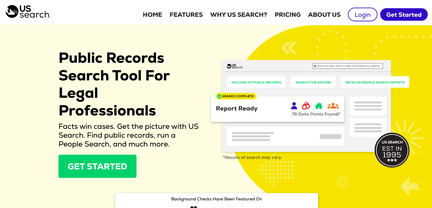
The shade of green used for the CTA button here appears throughout the rest of the web design in small doses, so it isn’t off-brand, but it really stands out in the website’s hero section against the pale yellow background. Since there isn’t much green elsewhere in this section, the bold color of the button is the first thing you notice.
You don’t necessarily have to go big and bold to stand out, though; take these CTAs from apparel retailer Thesus as an example.
The white CTA buttons with green font don’t use distinct colors to stand out in the design, but the fact that they are placed in the center of the page without any other text around them ensures that they are spotted.
If your website’s branding and typefaces are similarly minimalistic, you can still use the right layout to your advantage to make your CTAs eye-catching.
Ensure your calls to action have plenty of personality
Every aspect of your web design offers a chance to showcase your personality, and your calls to action are no different. A CTA is the perfect place to put your brand voice to use and lean into the type of language that makes your brand unique.
Your brand voice is the tone you use throughout your communications, and it should reflect your brand personality. To identify your brand voice, it helps to first identify what your personality is so that you can make sure it’s properly reflected.
A good way to do this is to brainstorm as many adjectives as you can come up with to describe your brand. Then, narrow those down to the top 3-5 that are most representative. Now, you should have a pretty good idea of what qualities you want your brand voice to convey.
For example, a family restaurant might land on adjectives like welcoming, casual, and lively. Therefore, their brand voice should also reflect these three adjectives. The restaurant would stay away from language that is overly formal or stuffy, opting for a familiar, friendly tone.
A similar exercise that can help you further home in on your brand voice is to come up with adjectives that your brand is not. Having a list of adjectives to avoid embodying in your communications can help ensure that you always stay on brand.
Here’s an example of what a personality-filled CTA can look like in action.
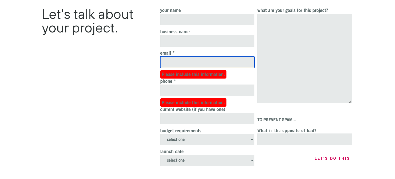
Seattle-based web design studio Bizango aims to appeal to “founders and marketers, business owners, builders, and storytellers”, so a confident, savvy brand voice is a must. Their CTA, “let’s do this”, captures these qualities and helps prospects feel enthusiastic about the idea of working with Bizango. They could have just as easily used a more generic CTA, like “submit info”, but this CTA would fail to convey their brand voice and, in turn, wouldn’t build excitement in their prospective customers.
Another example of a personality-infused CTA comes from Thinx Underwear, who make period-friendly underwear for women.

In their characteristically cheeky brand voice, they invite visitors to “period better” by trying their product risk-free. Period isn’t a verb, but that doesn’t stop Thinx from using it like one in their CTA. The result is a short, punchy, and effective CTA that shows using your brand voice is more important than following every grammar rule.
Provide different calls to action for different audiences
People landing on your website can be at different stages of the buying journey. This means a CTA that is perfect for one user might not align with the stage that another user is at. For example, it might be appropriate to invite one user who is already familiar with your product or service to make a purchase, while it might make more sense to invite a user who is earlier in their journey to schedule a consultation for more information.
A great way to handle this situation is to have multiple CTAs on the same web page for different segments of your audience.
For an idea of how to use this technique, take a look at how resume software company CVmaker places two CTAs in its blog post about a dental receptionist resume example and writing tips.
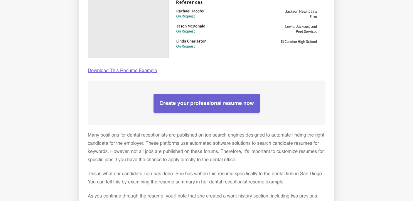
Someone who is newer to CVmaker likely just wants to see what kind of resume can be created with the software, so they might click the CTA “download this resume example”, while someone who is farther along the buying journey and ready to use CVmaker to create their own resume will be more drawn to the CTA “create your professional resume now”.
You can highlight one CTA over the other, as CVmaker does in this example, to emphasize moving customers towards a conversion while still having an option for those who aren’t quite ready to make a purchase yet.
Sometimes, your different audiences might require access to different tiers of your product. This is particularly common for software companies, which may have a free starter plan and more advanced enterprise plans. Here’s how video messaging company Loom uses different calls to action to reach every conversion-ready audience:
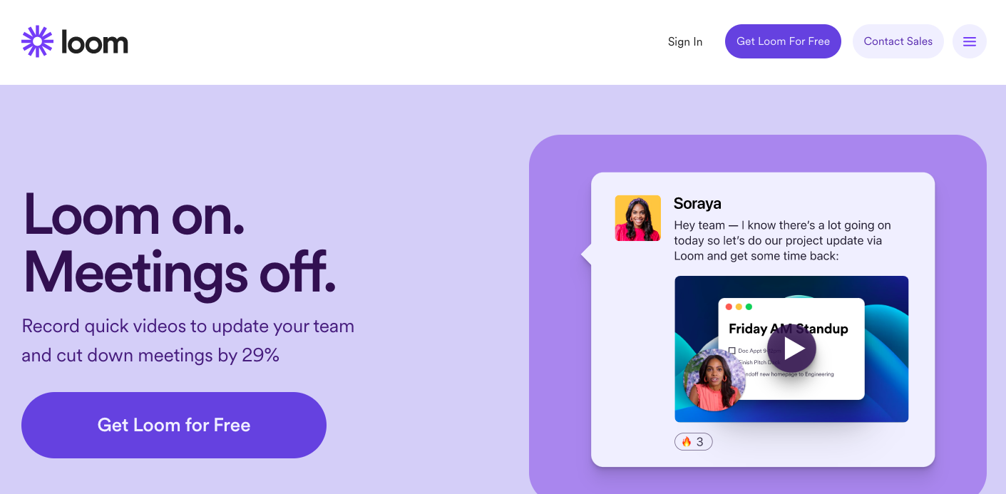
Loom has a free option that users can download and start using right away, but business clients will likely require their more advanced tiers. Their header menu includes two CTAs, “get Loom for free” for individual users and “contact sales” for enterprise users.
This way, both audiences can take the next step on their journey right away, without having to navigate to a different page (and potentially getting distracted). In other words, all of Loom’s prospects can easily take the next step toward signing up, thanks to the use of multiple CTAs.
Aim to create a sense of urgency
By creating a sense of urgency for your website visitors, you can encourage more of them to click your CTA, take the desired action, and ultimately land you more sales. The idea is to make your customers feel like, if they don’t take action right away, they’ll miss out. None of us likes missing out, hence the effectiveness of little tricks that create a sense of urgency.
One of the most common and effective ways to do this is through the words you use in your CTA. For example, take a look at how public records search tool TruthFinder creates a sense of urgency in its CTA.
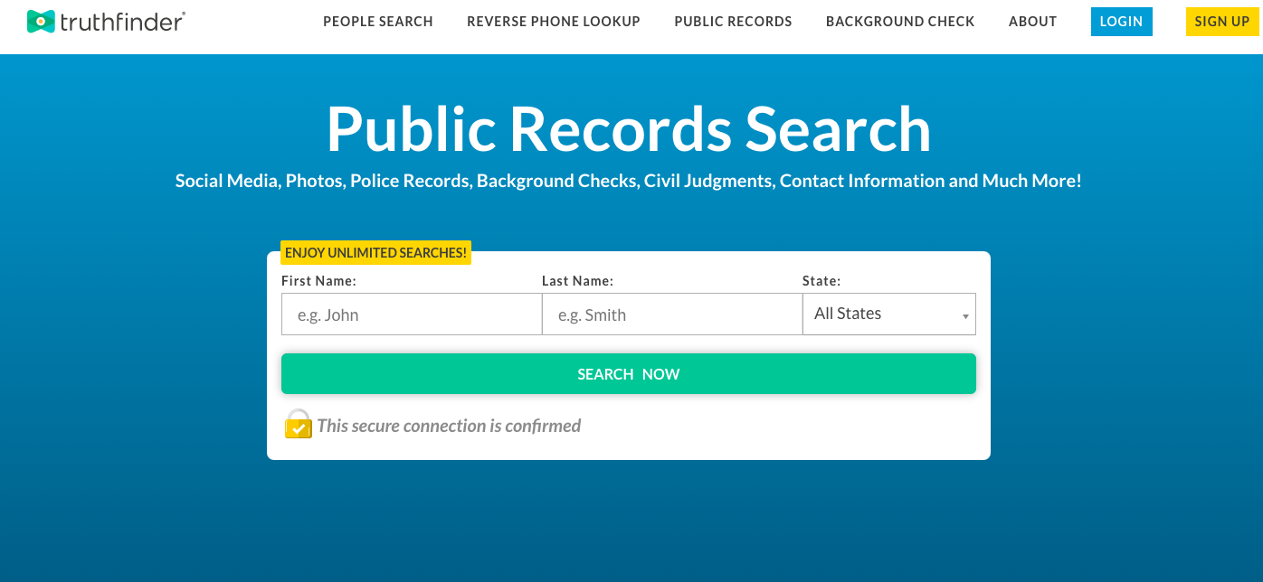
Just by reading the word “now” on the CTA button, users are nudged towards using the tool right away. The size and prominence of the button, combined with only 3 form fields and the text “search now”, invites users to complete the quick form and find the information they’re interested in immediately.
If you want users to take a similar action, such as completing a form or using a tool on your website, consider using words and phrases like “now”, “today”, and “don’t wait”, and ensuring your CTA takes prominence on your web page. You may be surprised at just how many conversions you get.
Another effective way to stir up a sense of urgency is through the use of timers. For example, take a look at this pop-up from the skincare brand Curology.
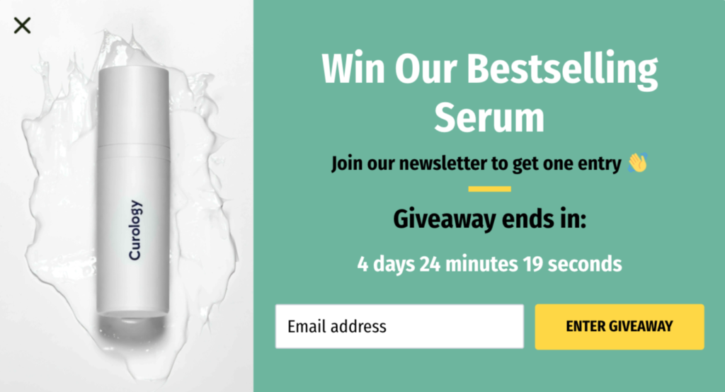
The action they want users to take is to “enter giveaway” but, by adding a timer to indicate when the giveaway ends, users are nudged to sign up now before it’s too late.
Whether you want users to enter a giveaway, sign up for your webinar, or take advantage of a sale, strategically using timers around your CTA can offer that extra push that drives up your conversions.
Make it clear if you’re offering something for free
Who doesn’t love a freebie? If you’re creating a CTA to promote something that doesn’t require your audience to spend any money, don’t hesitate to make that very clear.
Whether you’re offering free templates, a free trial, or a complimentary consultation, the key is to clearly communicate that the offer is completely free.
Offering freebies is an effective way to build your email list, but it’s also an excellent marketing tactic. Your freebies can demonstrate the quality of your work to your audience, giving them a sneak peek of what they’ll get if they become paying customers, and making them more likely to feel comfortable spending their hard-earned money with you.
Here’s a good example from App Institute’s pricing page.
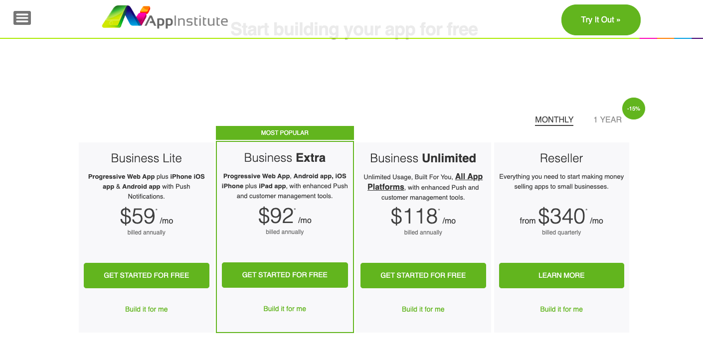
Since the free trial is available for the lite, extra, and unlimited plans, this is made clear with a “get started for free” button under every plan. This way, there can be no misconception that the free trial is only available for, say, the lite plan.
The benefit of this is that customers have an extra incentive to try a more advanced plan, given the free trial period. If they fall in love with the advanced features during their trial, they’re more likely to buy that plan rather than a reduced one in the future.
If you have a variety of free trials on your website, take a page out of App Institute’s book and make sure to emphasize that every type of free trial is free.
Another illustrative example comes from automatic time-tracking platform TimeCamp’s Evernote time-tracking integration page:

There are two CTAs in this section, one inviting users to “Try TimeCamp for free” and another inviting them to “contact sales”. However, the CTA with the free offer is made more prominent through the use of a bold yellow button, which stands out more than the contact sales CTA. The effect of this is that the free offer is unmissable, and the user is nudged by the design to take advantage of it.
It’s also an uncluttered interface, which further makes it easy for anyone landing on this page to quickly spot the free offer. If you want your visitors to take advantage of your freebie, don’t clutter the interface too much with other noise, and instead opt to keep it simple.
Play on your website visitors’ fear of missing out
Fear of missing out, also known as FOMO, is a powerful motivator in most people. Playing on this feeling can be a very effective way of supercharging your CTAs. The idea behind this technique is to make your website visitors feel that other people just like them have taken your desired action and are better off because of it.
In other words, by failing to take action, they would miss out on something special that other people are enjoying. That feeling of FOMO will nudge more of your website visitors towards taking you up on your CTA.
If you have a product-based business, your product pages are the perfect place to inspire a little FOMO. For example, take a look at this product page from athletic apparel company Alo Yoga.
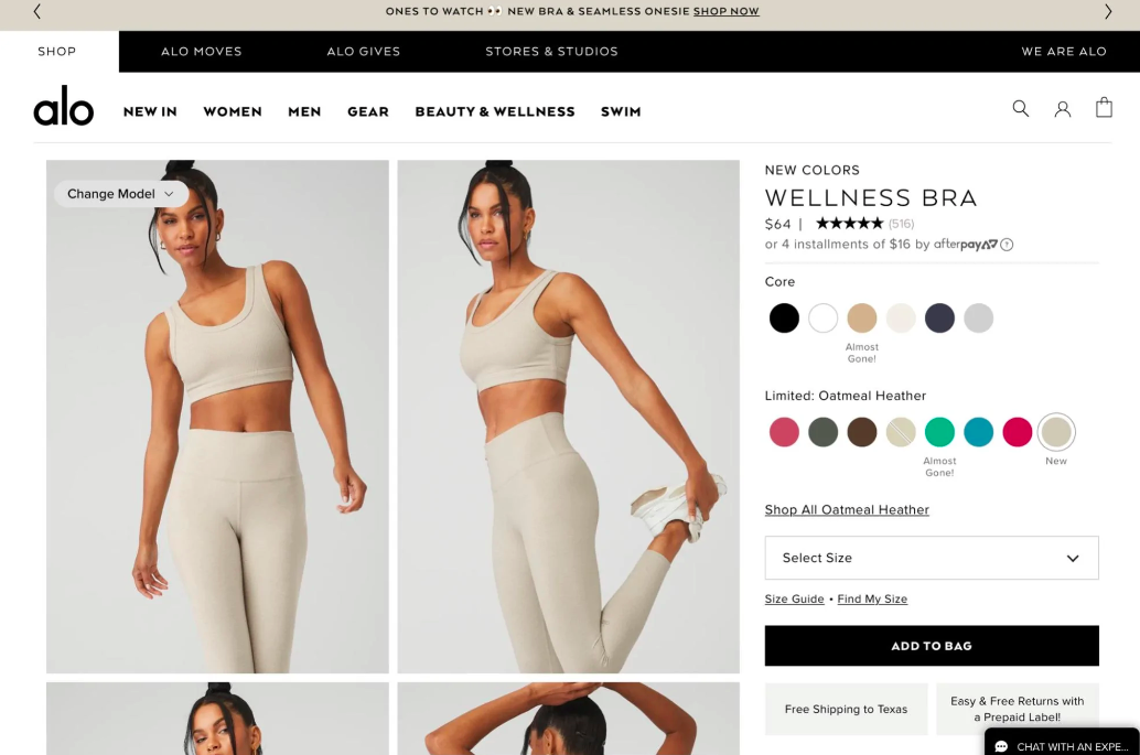
The CTA here is “add to bag” and, by stating that certain popular colors are “almost gone!”, a sense of FOMO for anyone considering this product is created. After all, this must be a very popular garment if certain colors are almost gone.
You could use a similar label to indicate low stock and stoke the fear of missing out, or you could even have an inventory counter that shows how many items are left in stock for key products. These additions around your CTA make it all the more appealing to complete the desired action.
Another way to generate FOMO is with the language you use in and around your CTA, like this example from hand sanitizer brand Touchland.
The CTA reads “get yours”, which implies that everybody else has already got theirs. The fact that this CTA follows some copy about their new limited edition collab takes the FOMO even further up a notch since there is an air of exclusivity to the product.
The language used by Touchland creates a sense of hype around their product and shows that, with just a few well-chosen words, you can turn up the dial on your website’s ability to generate FOMO.
Summary
The moment your website visitors see your CTAs is critical: it’s when they decide if they’re going to take the desired action and move along the path to becoming paying customers, or scroll away to see if there are more exciting things to be found online.
With the 6 tips we’ve outlined today, you can evaluate your website’s CTAs and make sure they are as powerful as possible, converting more of those browsers into happy paying customers.
–
Author bio & headshot:
Aaron Haynes is the CEO of Loganix, an SEO fulfillment partner that supports marketing agencies and professionals. The company specializes in helping businesses to improve their online visibility and ultimately make more sales. The Loganix blog has a lot more information and advice, so make sure you check it out if you found this article helpful.

Last Updated on June 23, 2023 by Ian Naylor

0 thoughts on “6 ways to supercharge your website’s calls to action and channel more people into your sales funnel”