When you’ve made the decision to develop a mobile app for your business, there are lots of things you’ll need to think about to ensure you create something that pushes your business forwards and makes an impression on all of the potential customers who come across it.
As the old saying goes, ‘first impressions count’, which therefore means the first thing that users come across when they land on your mobile app has to grab them, draw them in and ensure it doesn’t see them heading off to shop elsewhere. When it comes to the first thing a potential customer sees when landing on your mobile app, we’re talking about the splash screen, or the launch or boot screen as it is often referred to as.
Importance of Loading Time
First impressions are formed quickly, so it’s important that your splash screen is optimised for fast loading. Mobile users can be particularly impatient when waiting for an app to open.
By reducing the size of your graphics and using lighter image formats, you can help ensure that your splash screen loads in the blink of an eye. This speedy opening can encourage users to stick around and explore what your app has to offer, making sure that the splash screen aids rather than hinders your user engagement.
This is a great opportunity for you to sell your business to a prospective customer, and the first chance the user gets to make an impression on what lies ahead if they explore your app any further. It is therefore imperative that you strike the right cord from the outset, so here’s a few tips on how you can make that all important positive first impression.
Keep It Simple, but Be Creative
The idea isn’t for the user to be spending a great deal of time on your splash screen as you want them to delve deeper into what your app offers, so keeping the design simple is key. However, one thing you don’t want to be with the design is ordinary, so don’t be afraid to be creative with colours, backgrounds and logos.
Your logo should be one of the major design factors of your splash screen, instantly letting users know who you are. This isn’t the place to waffle on about who you are, your history or how you have the best product or service available on the market though, so keep text to an absolute minimum; the fact that you are showcasing a mobile app should already highlight the fact that you are at the very top of your game.
Graphics and imagery appeal to the mobile user, so don’t be scared to play around with what you’d normally add to a traditional website, making it more accessible and eye catching to the mobile visitor.
Size Really Does Matter
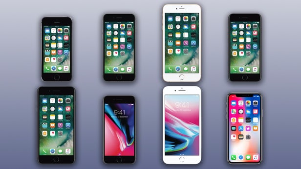
How many different mobiles are there currently on the market? Hundreds right? Each model or make has its own screen size and resolution, so ensuring your splash screen works on every size and resolution is vital.
For instance, consider you make a splash screen for the very latest iPhone, what about all those people who have an older version of iPhone? That first impression won’t be great if they are left with a distorted, poorly proportioned splash screen when landing on your app.
With our app builder platform, we enable you to design and upload just the one splash screen, however, we ensure the correct functionality is in place so that it effectively resizes to each and every screen size. This therefore saves you the time of having to design different sizes and makes sure you aren’t leaving out any potential mobile customer, no matter what device they are on.

Source
Experiment with Different Designs
When it comes to the design of your splash screen, don’t be concerned if your first design doesn’t quite tick all the right boxes. Experimenting with the design is a must, as different background colour, logo placement and where you drop further graphics will all take time until you find the right combination.
Using free tools like Canva enable you to try, try and try again until you find the perfect design to be the welcome mat to your app. This online tool lets you select a custom size, so you aren’t restricted to their own templates, meaning you can create a design for the designated splash screen size, adding different backgrounds, your own uploads including logos and graphics or alternatively select from their extensive catalogue of graphics, elements and fonts.
A/B Testing for Design Improvement
A/B testing is a powerful tool for evaluating how different splash screen designs impact user engagement. Create variations by altering elements such as background colours or logo placements and observe which designs resonate more with your audience.
These insights can inform better design decisions, leading to an enhanced user experience. Continuously experimenting with A/B testing allows your splash screen to evolve alongside user preferences and expectations.
Make the Design Fun
Does your company have a really cool character, theme or style? If so, why not introduce this to the splash screen, instantly adding a bit of fun and that all important feel good notion to the design? As we mentioned above, keep the design simple though as you don’t want to overwhelm the visitor or clutter the screen too much.
Accessibility Considerations
Creating an inclusive splash screen is important for reaching a wide range of users. By employing high-contrast colours and readable font sizes, your app becomes more accessible to individuals with visual impairments.
Integration with screen readers further enhances inclusivity, allowing a smoothly navigable experience for all your users. By prioritising accessibility, you are welcoming everyone, which not only broadens your user base but also enhances your brand reputation.
Show Off How Great Your Brand Is
Traditionally one of the main ways a brand displayed a message to a customer was via the logo and a motto, however a splash screen doesn’t really lend itself to this or enable you to show off how great your brand is in a really appealing, visual manner.
Instead, capture attention through incredible visuals that exhibit the culture, ethics and true spirit of your brand. This could be images of the great work that you do, the fantastic team at the disposal of a potential customer or a series of graphics which showcase all that the user can expect when entering into your mobile app.
Branding Consistency
Maintaining a consistent brand identity across all platforms is more important than ever. Your splash screen is a fantastic opportunity to reinforce your brand, using consistent colours, fonts and logo placement that tie in with your broader branding strategy.
This coherence helps users instantly recognise your brand, prompts trust, and creates a seamless experience as they transition from the splash screen to using the app itself.
Designing a great splash screen for your visitors can go a long way to improving overall user experience, which is vital for any mobile application. Apple and Google both recommend launch screens to improve a customer’s experience, and as the two main players on the mobile market, you’d be mad to ignore such advice!
Quick Fire Examples

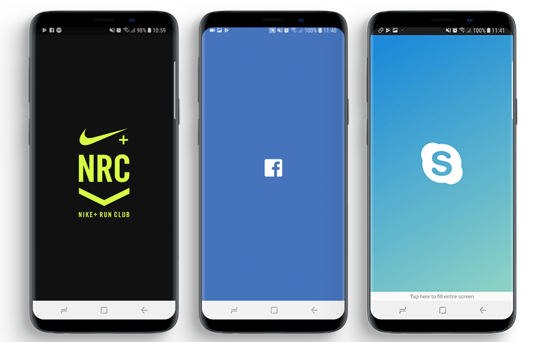
Having explored what makes a great looking splash screen, it’s time to take a look at some that really work. From those below, you’ll instantly notice how simple, but incredibly effective they all are.
Nike+ Running
Bold, bright and eye catching. The deep red background is punctured by the iconic Nike tick, whilst the faint outline of the running track towards the bottom of the screen instantly showcases what and who the app is targeted towards.
As one of the world’s biggest brands, Facebook haven’t needed to do an awful lot with their splash screen. Simple, clear and concise. All you are presented with is the iconic white Facebook logo on the equally iconic blue background; what more do you need for an instantly recognisable brand around the world?
Skype
For capturing the feel of a whole app, the Skype splash screen does just the trick. The colours suggest fun and excitement, just as you get to experience when using the app to talk to friends and family around the world, with the cartoon style logo fitting in seamlessly to this great looking design.
With the goal of connecting with your users in just the few seconds available, your splash screen has a very important role to play in a customer’s whole experience with you online, so take the time to explore the different options available in order to create a design that creates a great perception of your app.
Legal and Copyright Concerns
Ensuring you have the legal right to use all images, graphics, and logos on your splash screen is very important. Using copyrighted content without permission can result in legal challenges and damage your brand’s credibility.
Always verify the licensing agreements of any third-party content you use, or consider creating your own assets. By doing so, you respect intellectual property rights and safeguard your app from potential legal proceedings.

One thought on “How to Design the Perfect Splash Screen for Your App”