
It is becoming increasingly difficult for business owners to ignore mobile, and that’s good. Ten years after the launch of the first iPhone, more than half the mobile phones currently in use are smartphones. And two years have passed since Google first announced that the number of searches taking place on a mobile device exceeds those taking place on a computer.
Despite this, one doesn’t need to look very hard to find businesses that are still not optimised for mobile. They either don’t have a mobile-friendly website, aren’t visible on local search, or still rely too heavily on traditional marketing, without ever accounting for how their customers’ behaviour has changed.
It’s okay if you still use a feature phone, and only ever browse the internet using your desktop or laptop computer. And it’s okay if you personally don’t have any social media profiles, much to the consternation of your friends and family. Nobody can force you to accept and embrace a mobile-centric world.
The same, however, cannot be said for your business.
Ignoring the shift in consumer behaviour when it comes to your business is downright foolish.
In this article, I will guide you through some of the steps you can take to catch up, from finally updating your website, through to optimising other areas of your business for mobile. And even if you already have a mobile-friendly website, you may discover that there are some things you have overlooked in aligning your business with a mobile-centric world.
Optimising Your Website
The one area where many small and medium businesses are still lagging is the company website. That website you had developed in 2010 may include the latest company information, but it probably looks awful on a mobile phone. Sure, smartphones allow users to pinch and zoom, but nobody wants to browse the internet like that. Before reading any further, I want you to visit Google’s mobile-friendly test site, enter your business URL, and wait for the result.
Regardless of whether you get a pass or fail, you should continue reading this section, since it isn’t intended only for businesses whose website fails the test. That test only looks at some of the factors that go into making a website mobile-friendly.
The 3 Types of mobile-friendly Websites
There are three distinct approaches to creating a mobile-friendly version of your website. These are:
- Responsive – The same code (HTML, etc) and images are used regardless of what device your website is displayed on. Specific CSS rules adapt the size of the text, images, etc. according to the screen size. This is the design pattern recommended by Google, and also the easiest for SMBs to implement using pre-built templates.
- Adaptive/Dynamic Serving – As with a Responsive design pattern, the URL remains the same regardless of device. However, with Adaptive/Dynamic Serving, the HTML and CSS are completely different depending on the device.
- Separate Mobile Site – With this approach, the server attempts to detect what device is being used to view your website, and then automatically redirects the visitor to a different URL. The code on each URL is specific for each device type.
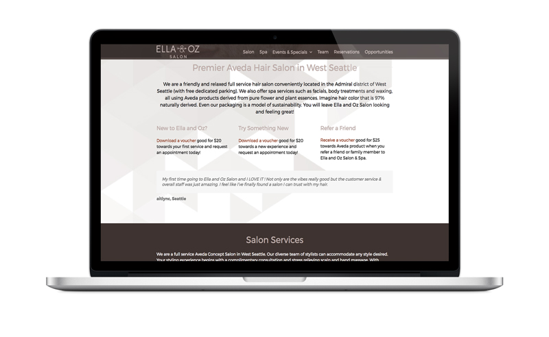
The desktop version of the Ella and Oz website
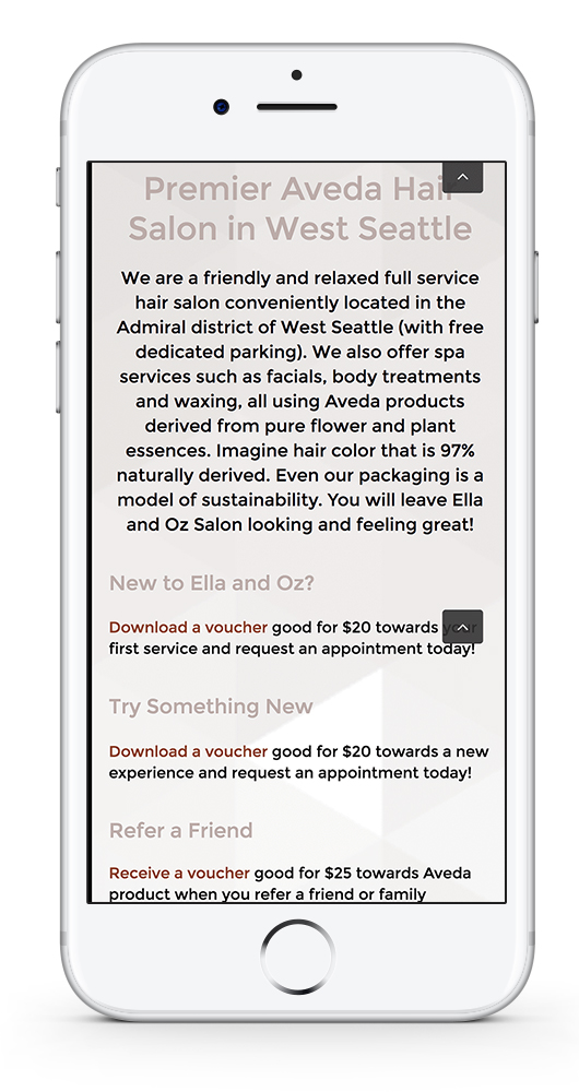
The responsive (mobile) version of the Ella and Oz website. Note how the information and design are consistent, even if the layout is slightly different on mobile. The inclusion of a navigation button in each section of the mobile version make it easy for visitors to jump back to the top of the page, without having to scroll.
As you would expect, there are pros and cons for each of the above solutions, but responsive web design (RWD) is perhaps the most accessible for smaller businesses. With both Dynamic Serving and an independent mobile site you need to manage at least two different sets of content, which not only makes data management more difficult, but it also increases the risk of errors creeping in.
But accessible isn’t synonymous with easy, and with RWD you are expected to do some planning before implementing. This hinges too on whether you are redesigning your entire website, or only converting the existing design to a mobile-friendly one.
If you are doing a complete redesign, you will be able to follow a mobile first strategy. With mobile first, your entire site is first designed for mobile devices, and then adapted for desktops and tablets. The rationale is that anything that works on the mobile version of a website will work on the desktop version.
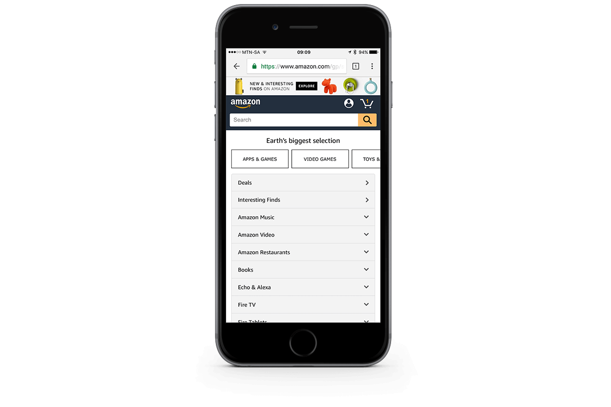
The navigation on Amazon’s mobile-friendly website closely resembles that of the desktop version, and even though the drop-down menu obscures the content, this is only when accessing the menu and is preferable to making visitors squint to make out very small text.
Unfortunately, the reverse of this does not always apply, so if you are converting an existing – desktop only – version of your website for mobile, your task is less simple. You would need to do a full audit of your website, looking for the following:
- Content and elements that don’t need to be modified at all. This would primarily be text and images that, with the simple addition of a few CSS rules, still display perfectly on a mobile device.
- Content and elements that need to be modified, or won’t work on mobile devices at all. This includes Adobe Flash based content, especially videos. If you are embedding YouTube videos, you won’t have any problems, since YouTube switched to HTML5 way back in 2015. But if you are using a custom video platform or plugin, you will need to check whether it uses Adobe Flash or HTML5.
- Login, subscription, signup, and contact forms. These can easily adapt to displaying properly on mobile devices, but you may have to alter the layout slightly to ensure that completing them is as simple on a mobile device as it is on a desktop computer.
- Visitor flow. Website navigation is more complex on a mobile device. If your current navigation includes multiple submenus, you will need to find a way to simplify it. And knowing how visitors normally move from one page to another can help. This is particularly important for websites with an e-commerce component, in which case you should look at the mobile websites for large online retailers for some inspiration.
- The number of CSS files, external scripts, and API’s used by your website. These can all negatively impact the speed of your website on mobile devices.
Being Accessible on all Devices

Source:Bagha Shams
Depending on how involved you were with the development of your company’s website, you may already know that there is inconsistency in how each browser implements web standards. And when it comes to developing a mobile-friendly website, you now also have to contend with the fact that there isn’t a uniform screen size for smartphones. This means you have to ensure that your mobile-friendly website displays properly regardless of the screen size. Fortunately, Chrome, Safari, and Firefox all come with a built-in tool for this, so you won’t need to first buy a half dozen smartphones of different sizes.
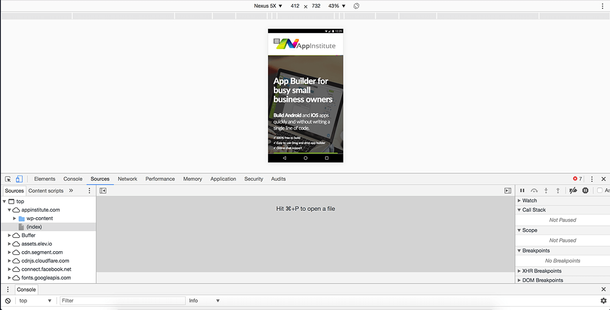
Open your website using any of the browsers listed above, and then do the following:
- In Chrome, navigate to View > Developer > Developer Tools using the browser menu bar. Just to left of the menu bar of the panel that appears is a small phone and tablet icon which, when selected, will switch to displaying your website as if viewed on a mobile device. Just above your website is a toolbar which allows you to switch between different devices and screen sizes, along with switching between portrait and landscape mode.
- In Safari you will select Develop > Enter Responsive Design Mode from the browser menu bar. Although you can switch the OS being used, you are limited to only seeing how it displays on screens the same size as Apple mobile devices.
- In Firefox, navigate to Tools > Web Developer > Responsive Design Mode in the browser menu bar. As with Chrome, you can switch between a variety of devices, not just Apple devices, along with switching between portrait and landscape mode.
Alternatively, you can use Screenfly, an online tool which allows you to see what your website looks like on different screens.
Unless you frequently visit your company’s website on a mobile device, I would recommend using the developer tools to view your website in responsive mode, even if it was done by a professional developer. This allows you to get a better understanding of how your website functions on different mobile devices and allows you to look for opportunities to improve the user experience.
Making Your Website Mobile-Friendly
The purpose of this article is not only to explain why having a mobile-friendly website is important, or what many of the terms and concepts relating to a mobile-friendly website mean. The purpose is to also guide you through the process of making your website mobile-friendly. In addition to the owners and employees of small businesses having to act in more than one role, small businesses also have limited resources. So any delay in implementing a mobile-friendly website is more likely linked to cost than to fear, uncertainty, or lack of knowledge.
While it is still better to use a professional developer to work on your business website, it is not impossible – or too difficult – to do it yourself. Especially if your budget simply cannot accommodate the use of a professional.
Using a content management system (CMS) such as WordPress is not only easier than trying to navigate your way around HTML and CSS, it also makes adding new content to your website a breeze.
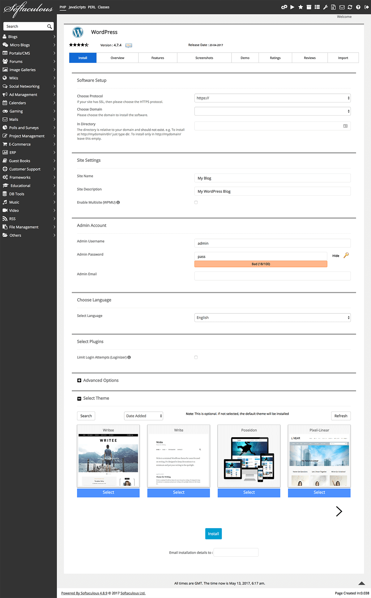
Installing WordPress through cPanel
Many web hosts take care of the complexities of installing WordPress, with you needing to do little more than enter a few basic settings before your new WordPress-based website is ready to use. There are literally hundreds of free themes or templates you can use for your website, but more professional designs can be bought for less than $100. And you really should invest in a professional design. Recommended marketplaces for finding professional WordPress templates include:
- ThemeForest – part of the Envato marketplace, you not only have access to WordPress templates, but also regular HTML templates (if you choose not to use WordPress), scripts, and other digital files. WordPress templates at ThemeForest are categorised according to industry, and priced at $59 or less. You will find detailed descriptions for each template, including a handy summary of what browsers the template supports, and whether or not it is responsive. Many ThemeForest WordPress templates come with a built-in editor, which allows you to customise fonts, colours, logo’s, and even the layout, without any HTML or CSS knowledge required. But if you do feel too intimidated to do it yourself, you can always hire a freelancer through Envato to do it for you. And doing so will definitely not break the bank!
- WooThemes – WooThemes – and WooCommerce – are part of Automattic, the primary contributor to WordPress. WooThemes are all designed to work perfectly with WooCommerce, a plugin which enables businesses to easily integrate e-commerce to their website. Themes are priced from $59, and you can add a bundle of e-commerce products for only $299, or only buy the plugins you need for your online store. As with ThemeForest, WooThemes also has a directory of experts who can help you with your website.
- Elegant Themes – this is a membership site, where the $89 /year fee gives you unrestricted access to more than 80 WordPress themes and some powerful plugins. Although they do offer comprehensive online support, they do not provide easy access to freelancers who can help customise your site. However, as with ThemeForest, the templates are fairly easy to customise, with a powerful “site builder” plugin provided as part of your membership.
Of course, there are other options available to you if you prefer to not use WordPress. These include:
- Shopify – if your website includes e-commerce, Shopify makes it easy to not only create a powerful e-commerce-enabled website, but also one that is mobile-friendly. Pricing is from $29 /mo and this gives you access to all the e-commerce components of Shopify, along with an easy to use website builder. There are also dozens of pre-built free themes and hundreds of professionally designed themes priced from $140. Shopify also integrates seamlessly with other website builders such as Squarespace, WordPress, Wix, and even Facebook. Not forgetting the Shopify mobile app, which allows you to manage your website and product catalogue from your phone. Oh, and you even have access to experts who can help you with all aspects of your Shopify website.
- Squarespace – Squarespace and the other website builders listed below are all – at first glance – very similar to Shopify. They give you access to an easy to use website builder, dozens of pre-built themes, and even e-commerce features. Like Shopify, Squarespace has been around since 2004, so it is an established brand. Pricing is from $16 /mo for a regular website, and from $26 /mo for online stores. There is no shortage of features you can add to your website with little hassle, including powerful analytics for both regular websites and online stores.
- Wix – Pricing for business websites on Wix starts at $12.50 /mo, which gives you access to the website builder, hundreds of pre-built themes, and features that include online chat for your website. For e-commerce businesses, Wix offers various e-commerce products or – as mentioned earlier – you could integrate it with Shopify.
- Weebly – this website builder is priced from $25 /mo, which includes various e-commerce features. Again you have access to dozens of pre-built themes that you can easily customise, without ever worrying whether they are mobile-friendly or not. Like Wix, Weebly has been around since 2006, so it is an established brand.
Shopify and Squarespace both offer a 14-day trial, while Weebly and Wix offer a free plan. The free plan is not suitable for business use, but it will give you an opportunity to set up a test account to see whether you are comfortable using the website builder before creating a premium account. If you want to go the route of using an online website builder, always use the free plan or trial first to see whether it has all the features you need, and whether you understand the builder.
Most of the solutions listed above don’t require extensive knowledge of HTML and CSS, but some understanding will certainly help. Most of them also make it easy to connect with experts and freelancers who, for a fee, can help you setup and customise your website. The fee for these experts vary, but for fairly complex e-commerce websites you should be prepared to pay several thousand dollars. You should be able to manage setting up your own online store if you only carry a small range of products. But if you carry hundreds, or thousands, of products, across dozens of categories, it is better to involve a professional. Preferably someone with UI and UX experience.
Finally, regardless of whether you are using a pre-built template, or have developed your mobile-friendly site using a site builder, make sure your business address and telephone number are tappable links. By doing this you make it easy for customers to get directions to your location, or call you, just by tapping the appropriate link.
The HTML code for turning your address into a tappable link would look similar to this:
<a href=”http://maps.google.com/maps?q=39+Stoney+Street,+Nottingham,+NG1+1LX,+UK”>
39 Stoney Street, The Lace Market, Nottingham, NG1 1LX, United Kingdom</a>
while for your telephone number it would look something like:
<a href=”tel:08001601602″>0800-160-1602</a>
Further Tests and Common Mistakes
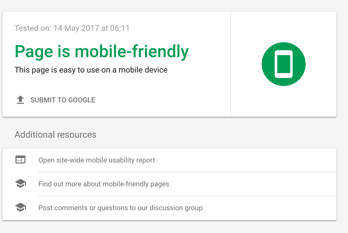
Google offers two handy tests for checking how mobile-friendly your website is. The first simply tests whether or not your website is mobile-friendly. If you have added your website to the Google Search Console, you can follow a link to see details of any mobile usability errors Google picked up.
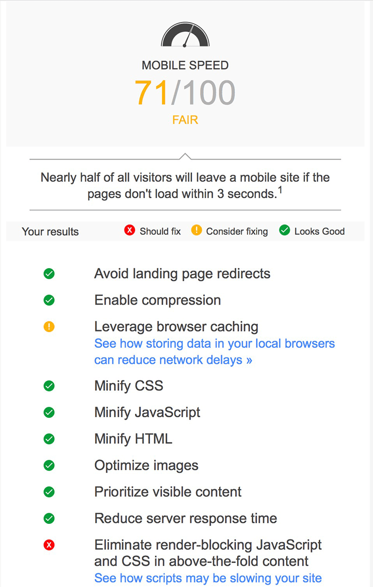
The second performs a more detailed test that not only looks at your site being mobile-friendly, but also at site speed. You are presented with a score out of 100 for mobile-friendliness, mobile speed, and desktop speed, and you can ask for a more detailed report to be emailed to you. The detailed report will list each item that is tested, and whether or not it looks good, could be improved, or should be fixed. Common mistakes that are found on mobile websites include:
- Blocked files – if your robots.txt file disallows crawling of JavaScript, CSS, and image files, Google won’t be able to “see” your site as an average user would. This could affect how your site ranks in search engine results.
- Unplayable content – Adobe Flash content and some types of media cannot be played on mobile devices. You should use HTML5 instead of Adobe Flash, and embeddable video that automatically adapts to mobile devices. If you cannot, then this content should be hidden on mobile devices.
- Small fonts – all text should be set to scale according to the device the web page is being displayed on. A baseline size of 16px is generally best, depending on the font. Use the browser developer tools discussed earlier to see whether this size is suitable for all devices, and adjust your CSS breakpoint rules accordingly. At the same time, your default line-height should be 1.2em to ensure there is enough vertical space between each line of text.
- Tap targets are too close – any elements that can be touched or tapped – such as links or buttons – should not be spaced too closely to other tap targets. This helps avoid the user accidentally selecting a neighbouring element, remembering that fingers are less precise than a mouse cursor.
- Slow load times on mobile – people are less tolerant of slow loading web pages on mobile devices, with many people leaving a website if it hasn’t loaded within 3-seconds on a mobile device. Google’s PageSpeed Insights will help you identify specific problems on your website, along with recommended actions to take. Depending on how your website is set up, not all actions will be possible. But you should be minifying as many of your JavaScript, CSS, and HTML files as possible. Additionally, you should enable compression, configure browser caching, and optimise all images using TinyPNG and TinyJPG.
- Intrusive interstitials – interstitials are those popups and banners that appear on websites soon after the page has loaded. Sometimes they share important information (like the use of cookies), while other times they’re suggesting you subscribe to the site owner’s newsletter. If they don’t take up too much screen space, and are easily dismissed, then they’re not intrusive. But if they block most of the site’s content, and have to be dismissed before being able to see any content, then they are intrusive, and Google will possibly penalise sites that do this. The reasoning is that these interfere with the overall user experience on mobile, which should be pleasant.
- Faulty redirects – if you are using a responsive design, then faulty redirects are something you don’t have to worry about. But if you have a separate mobile site, with a different URL to your desktop site, then you need to ensure that all the internal links on the mobile site point to the mobile version, and that your desktop site always redirects to the mobile site regardless of what mobile device the visitor is using.
- Hidden CTAs – not every page of your website includes a call-to-action (CTA), and on the desktop version of your website they might appear quite prominent. But on the mobile version, you may have to rearrange the layout of your content to ensure it is still prominent, and not hidden down towards the bottom of the page.
If you don’t already have a mobile-friendly website, then hopefully some of what I have written above will encourage you to finally get around to developing one. Of course, nobody can force you into developing a mobile-friendly website, and nobody will try to. Because your business not being accessible on mobile devices doesn’t affect anyone but you and your business. However, for those of you who are now determined to develop a mobile-friendly website, or who already have one, you should be aware that it is only one step in the process of optimising your business for mobile. Let’s take a look at some of the other things you need to consider, or do.
Optimising for Search and Discovery
If you’ve had a website for some time now – mobile-friendly, or not – you would already know all about the importance of search engine optimisation (SEO). You would also have a fairly solid SEO strategy in place, and be able to show the impact it has had on your website and business. So I am not going to waste any of your time by discussing SEO again, other than to say that your SEO strategy does not need to be modified to accommodate a mobile-friendly website.
That is, if you went with a responsive design. If you implemented dynamic serving or a separate mobile website, you need to use annotations in your HTML, or user-agent redirects, to let Google know that it isn’t duplicate content but content meant for specific devices. And this is just one of many reasons why a responsive design is better, especially for small businesses.
So if you’re not having to make any changes to your SEO, what exactly are you optimising for in search and discovery? Local search, that’s what.
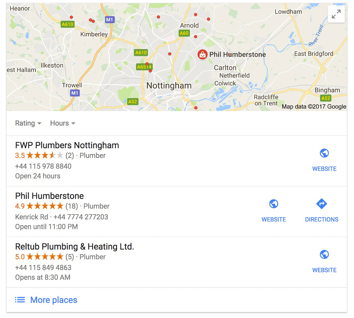
Local search is a powerful tool for boosting discoverability of small businesses, but one that is often overlooked. When searching for a plumber in Nottingham, I’m immediately presented with three options. Each of these includes the business name, contact number, and trading hours. If the business has a website, and a physical location, then the listing includes a link to the website and directions using Google Maps. Selecting the More places link underneath the listings brings up many more listings, with location markers on the adjacent map. Notice how these listings stand out from the search results, and even from the ads that sometimes appear above them? And the best part is that it costs nothing to have your business appear in these listings.
What happens when you do a similar search for your business?
Don’t use the name of your business. Use only the name of your location (town or suburb), and the industry or service you are known for.
Does your business show up?
If it doesn’t then you are once again missing out on a lot of potential business. On a mobile device, users (and potential customers) are less inclined to scroll through dozens of results, so anything that stands out, and appears close to the top of the page, attracts more attention. And getting your business to show up in local searches is incredibly simple:
- Make sure your business details have been added to Google My Business. Try to add all the information that is allowed. And if you are already on Google My Business, check that all the information is still correct.
- Add your business to other local business directories. These include Bing, Yelp, Foursquare, TripAdvisor, etc. Hubspot has a list of 50 local directories, though some are limited to US based businesses only. Yahoo!, through Localworks, provides a method to easily list and manage your business with more than 60 local directories,8 but this is a paid service, costing from $29 /mo.
- Ensure your website includes use of the LocalBusiness and Place schema’s, along with the correct properties for each. You could also consider using the hcard microformat when adding your businesses details (address, contact number, etc.) to your website.
Other factors to consider when optimising your local search presence include:
- Your local link building strategy – how many local sites link to your business? These could include local newspapers, local blogs, local government sites, and even local business chambers.
- Local citations – any online mentions of your business – with or without a link. This could either be your full business details, or only partial. Whitespark has a local citation finder, which you can use to find mentions of your business, discover opportunities, or even research your competitors.
- On-page optimisation – does your SEO strategy include a component for local search, and do your keywords and key phrases include location-based information?
- Social media profiles – do your social media profiles include any location-based information?
A good example of how important local search is can be found in a Santa Cruz-based business that, after having their website optimised for mobile and local search, saw a 400% increase in website traffic.
Optimising your Social Media Presence
All the popular social networks automatically take care of displaying most of your posts in a mobile-friendly manner, but there are a few things you can do to guarantee that they are always perfect:
- Check that the media you include with any posts (images or videos) is correctly sized. Hubspot has a great visual guide showing the proper dimensions for nine social networks, so you’ll always know the perfect size.
- Videos should ideally include captions or text overlays. Many social media users view videos without sound, and including text in the video ensures they are still accessible.
Additionally, as mentioned under local search, you should ensure that your social profiles are fully complete, and include your location. On your Facebook Page you should include as much information about your business as possible, not just physical location, but also trading hours, etc.
When people aren’t browsing the internet on their phones, they’re using apps. And when they aren’t doing either of these activities, they’re using social media on their phones. In fact, as early as December 2015, 61% of social media consumption happened on a smartphone. Meaning that if you are spending money on online advertising, a good portion of that spend should be allocated to social media advertising. Look at which social network the bulk of your audience uses before compiling a social media advertising strategy:
- Set a clear goal for your social media advertising.
- Have a process in place for measuring the performance of each ad, along with the overall campaign.
- Define more than one audience, so you can see which audience responds best to your ads.
- If you are a small, local business, make sure your audience is limited to your geographical location. Unless you also have an online store that ships internationally, there is no value in advertising your business to users who aren’t even in the same country, let alone town.

Don’t dismiss social media advertising without first trying it – with a proper strategy in place. A lack of positive results can often be attributed to targeting the wrong network, or improperly defined audiences.
Optimising Beyond Your Website
Optimising your business for mobile is more than just having a mobile-friendly website, being visible in local search, and having a mobile-friendly social media presence. For one, it is about adopting a mobile-first mindset. In many ways Google popularised the mobile-first approach to web design, first by recommending responsive design above other approaches to mobile-friendly websites, and then by announcing a mobile-first index in 2016. It is possible to extend the mobile-first approach by adopting something similar in your marketing: all your digital marketing should be created for mobile first, then adapted for other devices.
Source:comScore
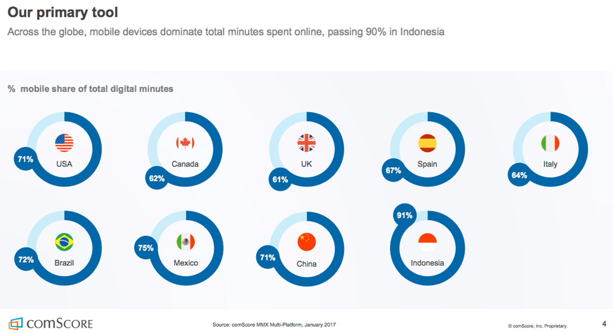
A comScore study in early 2017 found that mobile devices accounted for more than 60% of total minutes spent online. So if your customers are spending more than half their ‘online’ time on a mobile device, shouldn’t your marketing be targeting them there?
And one of the best ways of marketing directly to your customers via their mobile devices is with your own mobile app. Creating your own mobile app is even easier than making your website mobile-friendly (not that you should skip that step!), with app builders taking care of all the complex work for you. With your own mobile app, you:
- are more visible to your customers. Your business now has a home on your customers mobile devices, and can be reached with a single tap. Faster, and more top-of-mind than being tucked away inside a browser.
- have access to more direct and immediate forms of marketing. From sending out relevant push notifications to all (or a segment) of your customers, to sending out location-based messages when customers are near your physical location.
- make it easier for your customers to engage with you. Despite having our phones with us almost all of the time, we are making fewer phone calls. An online booking form is convenient because it eliminates the need for a phone call, and it allows customers to easily see what time-slots are available.
- promote loyalty. Many small businesses avoid loyalty programs because they aren’t always easy to manage. But by incorporating a loyalty program into your app, it is both easier for your to manage, and less of a hassle for customers to enrol in.
- are able to launch spontaneous promotions. Regular promotions require some advance planning to ensure you have enough time to print up any relevant materials, and to book ad space. With a mobile app you can launch, and market, a promotion with only a few hours of planning. Using push notifications, you can announce the promotion, and know that the message is actually reaching your customers.
Be sure to update your marketing strategy to include promotion of your mobile app. Your customers won’t know you have a mobile app unless you tell them.

Google won’t penalise you for promoting your app on your website, as long as you use browser supported banners instead of an intrusive interstitial.
Conclusion
In this article I have not only provided cost-effective solutions for small and medium businesses that still lack a mobile-friendly website, but also highlighted how optimising your business for mobile is about more than just your website. Optimising for mobile is also about being discoverable on mobile devices, and about adjusting your marketing specifically for mobile devices. More than half the time people spend online is done using a mobile device, so if your business is not accessible on smartphones, it may as well not exist.

6 thoughts on “How to Optimise Your Business for Mobile”